Responsive Redesign to help independent workers get insured

Stride's goal is to make it easer for the independent workforce with health insurance.
Goal
Growth in membership-Improve the application process and increase number of people signing up for insurance.
My Role
As the lead designer for the marketplace team, I worked on various end to end aspects of the redesign, including, UX research, user testing, sketching, lofi and midfi wire-framing.
Reviewing the current design
I started my process with meeting the member experience team to understand past issues and pain points that users came across while filling out the form.
Who are the Stride users?
I worked closely with the member experience team to understand more about stride users and what their needs were. These are the people that work independently and could consist of Uber drivers or artisans selling their work on Esty, or anyone that doesn't receive insurance through their employer.
Understanding the flow
A challenging and essential aspect of this was to work with government entities. While it is important to make the user experience better, I still needed to full-fill strict government requirements.
Working with the team
This is my favorite and most rewarding part of working as a designer. I have to opportunity to collaborate with engineers, product managers and other stake holders. This not only pushes the best designs forward, but I am also able to grow as a designer. As the primary designer on this project, I worked closely with engineers in providing a bigger picture and understanding of
Results page and evolution of design
One of the important pages that was added to the application, was a result overview page, to make it easier for the user to get a quick glance at their eligibility and next steps.
I conducted two rounds of testing to receive feedback and develop new iterations.

Early Iteration Feedback for Landing Page and Decisions
✓ Eligibility was clear to user
X The essential deadlines for not present.

Mid Process Iteration and Validation Testing
✓ Easy to read and understand mission
X Users still not understanding what their action items are
X The steps at the beginning were not noticed by users.
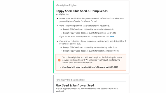
Final Iteration
✓ Easier to know important action items and deadlines
✓ Adds more specific exceptions for each member
✓ Shows details as required by government
✓ Less screen space is taken up by names of eligible, allowing user to scan more quickly through the page
Testing and Validation
Going through two rounds of testing, one internal and one external. I worked with the Product Manager to conduct user testing.
Learnings
I learned to work quickly and to understand that not all of my designs have the capacity to come to life. I think in the future I need to learn to pushback on certain user experiences and stand firm on some important user experiences.
Tools
