Prince is a legend, and you’d be hard-pressed to find anyone who will argue with that. He rose to international acclaim in 1982 with the album 1999 and the single “Little Red Corvette.”
A brief list of his accomplishments include 7 Grammy Awards, an Academy Award for Best Original Song (“Purple Rain,” 1985) and a spot in the Rock’n’Roll Hall of Fame.
But any true fan knows that he will be remembered as an artist who marked the world with one-of-a-kind style. There was nothing cookie cutter about Prince. His imagination and innovation will always be an inspiration for creative people working in fashion, film, photography, art and music.
We went through all of Prince’s albums to highlight his creative spirit and celebrate a life lived creatively.
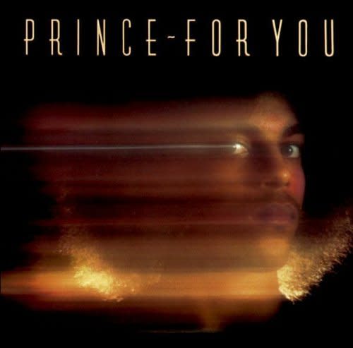
For You (1978)
Prince’s first album For You was released by Warner in 1978 and got stuck at #163 on Billboard’s Pop Chart. Later Prince said that For You didn’t reflect him as a person. It was too mechanical and recorded after too many sessions on very little sleep.
He said of the album, “I didn’t really feel like recording for eighty per cent of the record.”
An art director, Jeff Farmakes of The Ad Company, was hired for the cover, but Prince wasn’t comfortable with giving over creative control. He wanted photographer Joe Giannetti to shoot just his head in a darkroom with a candlelight behind his hair.
He was likely influenced by the prevalent disco style that dominated the radio. Think, The Bee Gees and anything from the Saturday Night Fever soundtrack.
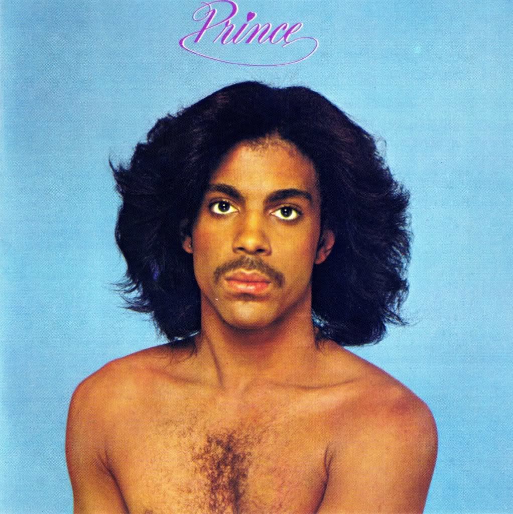
Prince (1979)
It’s no coincidence that Prince goes from shrouded in darkness to bright blue skies for his next album. Prince was recorded only a few weeks after Warner requested a follow-up to For You.
The clarity of his musical vision for the self-titled album led to its greater commercial success. Photographer Jurgen Reisch captured one of the most striking and honest images of Prince that’s ever been taken.
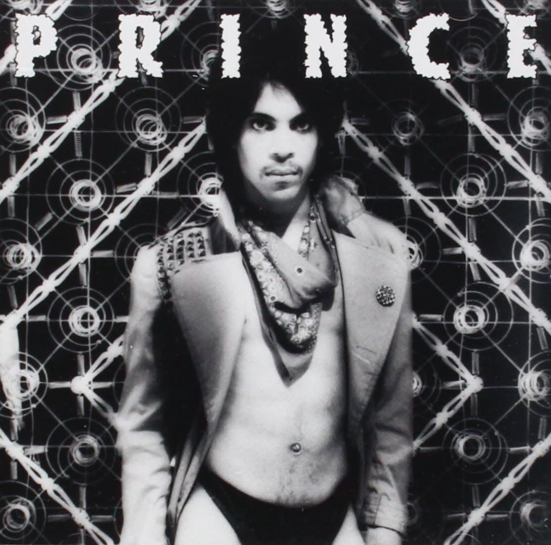
Dirty Mind (1980)
In the 1981 Rolling Stone review of Prince’s third album, Ken Tucker wrote: “Prince’s first two collections (For You, Prince) established him as a doe-eyed romantic…Nothing, therefore, could have prepared us for the liberating lewdness. of Dirty Mind.”
He goes onto describe the well-dressed yet scandalous outfit of Prince on the cover. Who else could pair a studded trench coat with a bandana and black bikini briefs?
Photographer Allen Beaulieu expertly balances the negative space of Prince’s torso with a busy, geometric background. It’s as if to say, “Don’t worry, just let your eyes go where they want to go.”
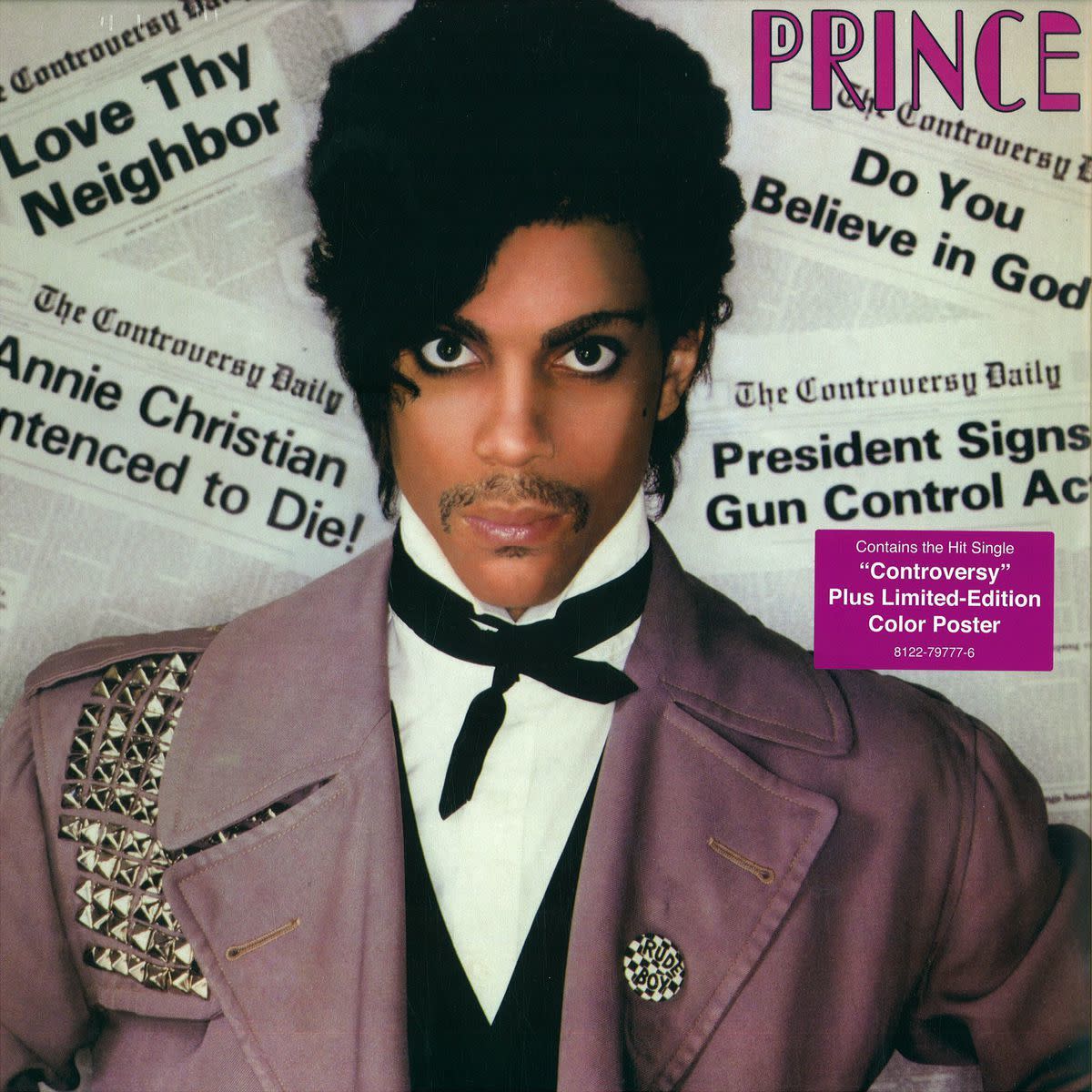
Controversy (1981)
This album cover was the second collaboration between Prince and Allen Beaulieu. At 28 years old, Beaulieu was hired as Prince’s personal photographer and they preferred an aesthetic that went past sexy and to the edge of soft-core pornography.
Controversy, however, is more cerebral than carnal. The headlines are explicit in a different way. There wasn’t much mystery when it came to Prince’s intentions with this album. It was a political take on timely issues including Abscam, an FBI sting operation from the early 80’s that went under investigation.
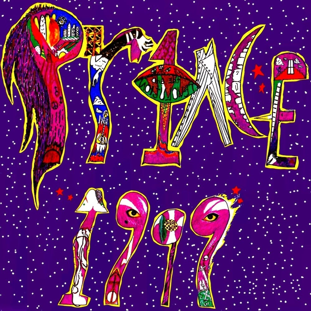
1999 (1982)
This was Prince’s breakthrough album on Billboard’s Top Ten. It also marks a sharp turn towards art-pop with this illustrative cover in pure 80’s psychedelic style. The artist is unknown, but many suspect that it’s Prince himself who drew the cover for 1999.
There are a few hidden messages in the drawing: it echoes the album cover for Controversy with eyes, a “Rude Boy” pin, jacket studs and a smile within the characters of “1999.” His backing band “The Revolution” is written backwards in the “1.”
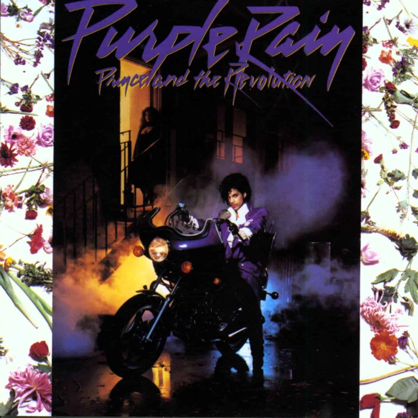
Purple Rain (1984)
With Purple Rain we reach full Prince. His iconic purple suit, high collared shirt and coiffed hair stand out against the street fog. Why is there so much fog? Why is there a floral border? Only art director Laura LiPuma and photographers Ed Thrasher and Stuart Douglas Watson know.
It’s clear that the message here is, “I’m going to do what I want. And you’re going to love it.” Prince uses his visual artistic sensibilities to prepare his audience for what they’ll experience with their ears.
Ed Thrasher, who passed away in 2006, was also responsible for the covers of Jimi Hendrix’s Are You Experienced?, Joni Mitchell’s Song to a Seagull and the Grateful Dead’s Anthem of the Sun among many, many others.
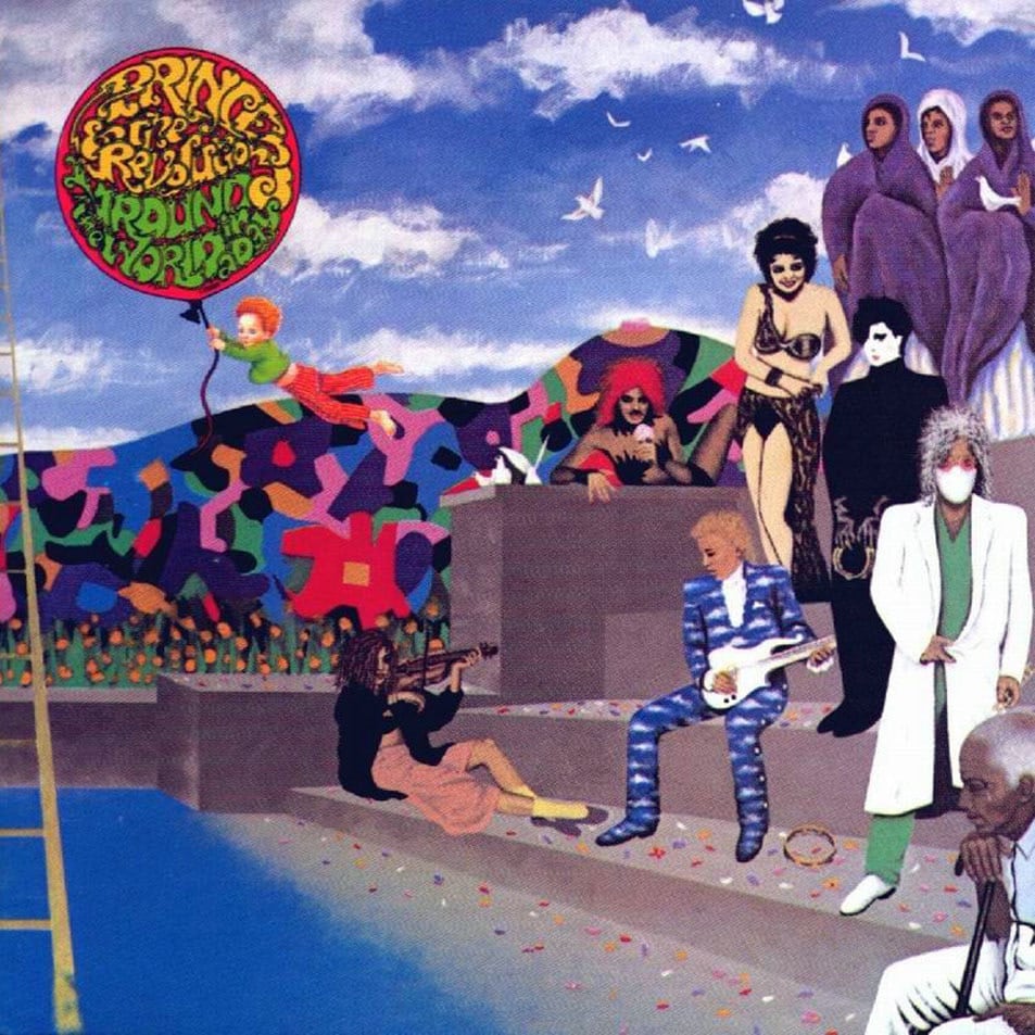
Around the World in a Day (1985)
The psychedelic illustration for Around the World in a Day’s album cover led many people to assume that he was influenced by The Beatles’ Sgt. Pepper’s Lonely Hearts Club Band (1967).
Instead, Prince said that he commissioned the drawing from illustrator Doug Henders because he thought people were tired of self-portraits.
He didn’t mind the term “psychedelic” though and stated that the late 60’s-early 70’s “was the only period in recent history that delivered songs and colors. Led Zeppelin, for example, would make you feel differently on each song.”
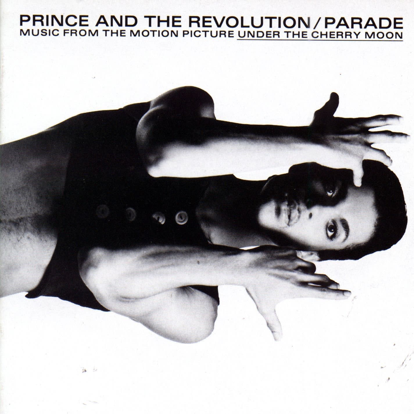
Parade (1986)
Parade is the soundtrack for Prince’s feature film titled Under the Cherry Moon. Photographer Jeff Katz brought back Prince’s face on the album cover with harsh hatchet lighting.
It also marks the third album in his collaboration with art director Laura LiPuma—a relationship that would end after 1987’s Sign’O’The Times.
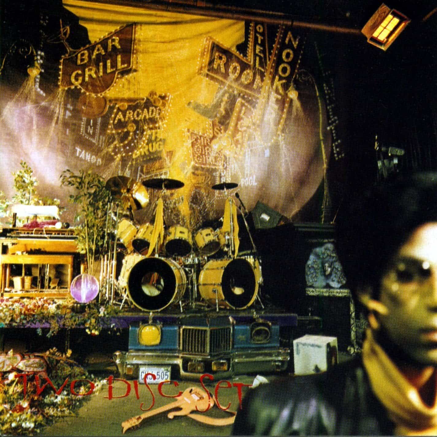
Sign ‘O’ The Times (1987)
This album cover is significant because it shows off Prince’s sense of humor and self-awareness. It’s a collage of the debris of a musical career and pokes fun at the idea that an artist can’t stay relevant forever.
This was 1987 and we know that Prince certainly didn’t abandon his career at this point, even though signs of conflict with Warner were coming to the surface. Instead, Prince innovated and reinvented and continued to make work in whatever way that he could.
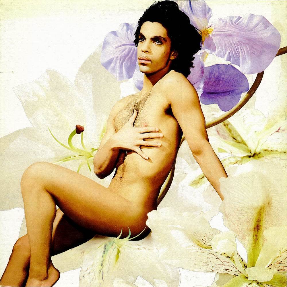
Lovesexy (1988)
Bring back those florals from Purple Rain, this album cover shot by photographer Jean Baptiste Mondino is a sultry collage. It mimics that Botticelli’s The Birth of Venus which caused enough controversy to stop some music stores from selling the album. Depending on the store, you could find Lovesexy in an opaque black plastic bag with his naked thighs out of sight.
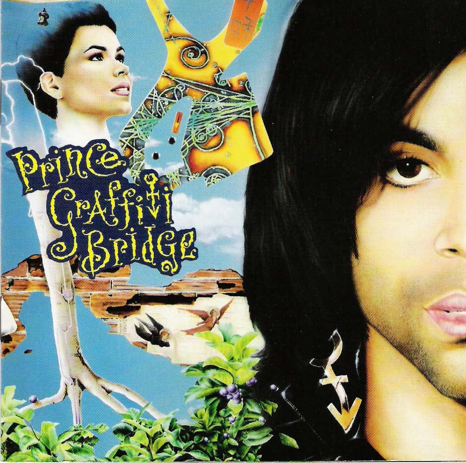
Graffiti Bridge (1990)
Prince’s love for collage continues on the album cover of Graffiti Bridge. It was a team effort from art director Tom Recchion, photographer Bob McNamara and illustrator Steve Parke. This mix-and-match style had a surrealist inspiration with further echoes of Controversy.
In fact, some of the songs on this album (which was a soundtrack for his second and last feature film), were originally conceived for Controversy.
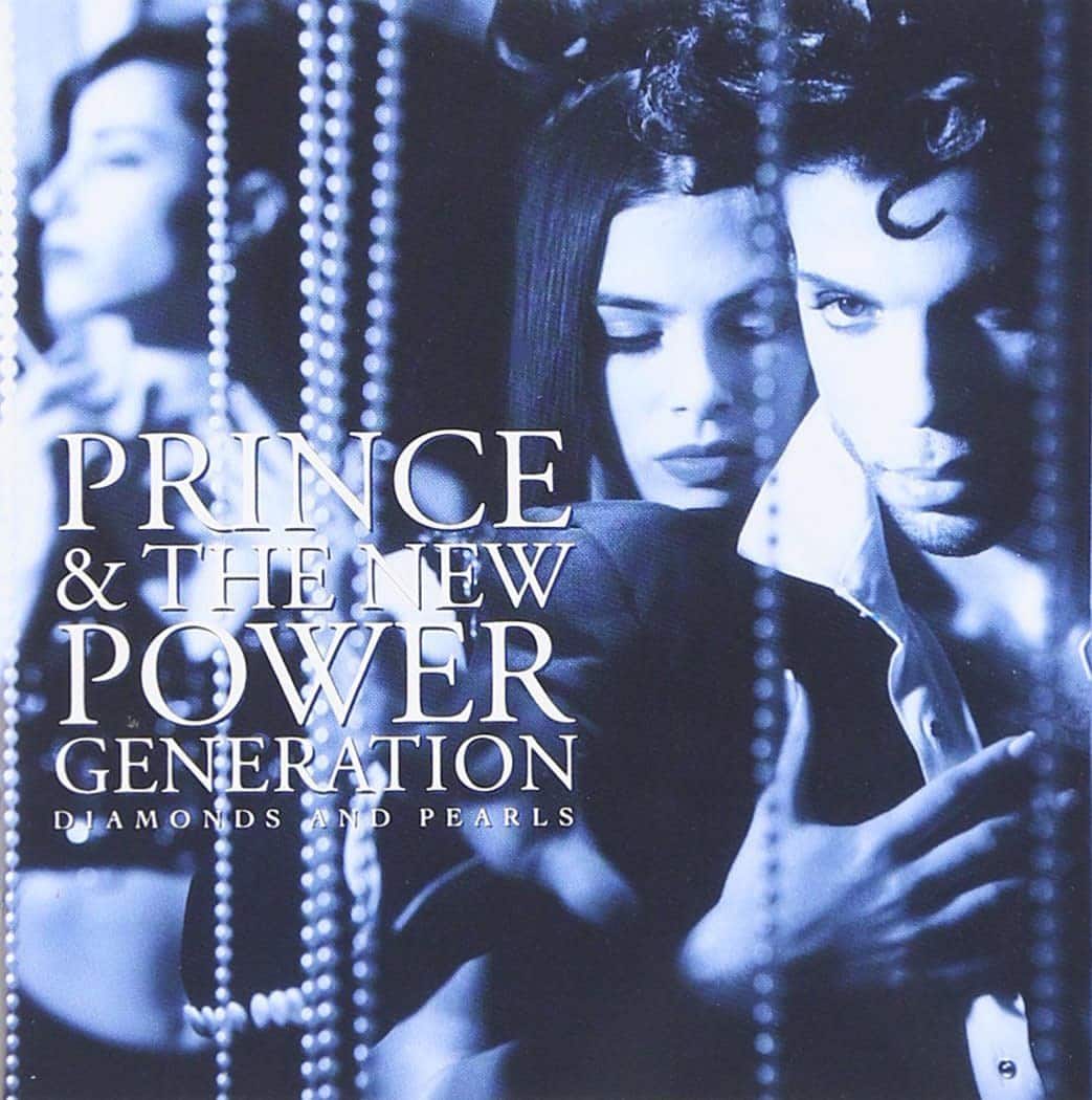
Diamonds And Pearls (1991)
Take a peek at the 90’s hip-hop style that pops up in Prince’s aesthetic for this album. Photographer Joel Larson went with a moody blue-hued image but kept Prince’s signature piercing stare.
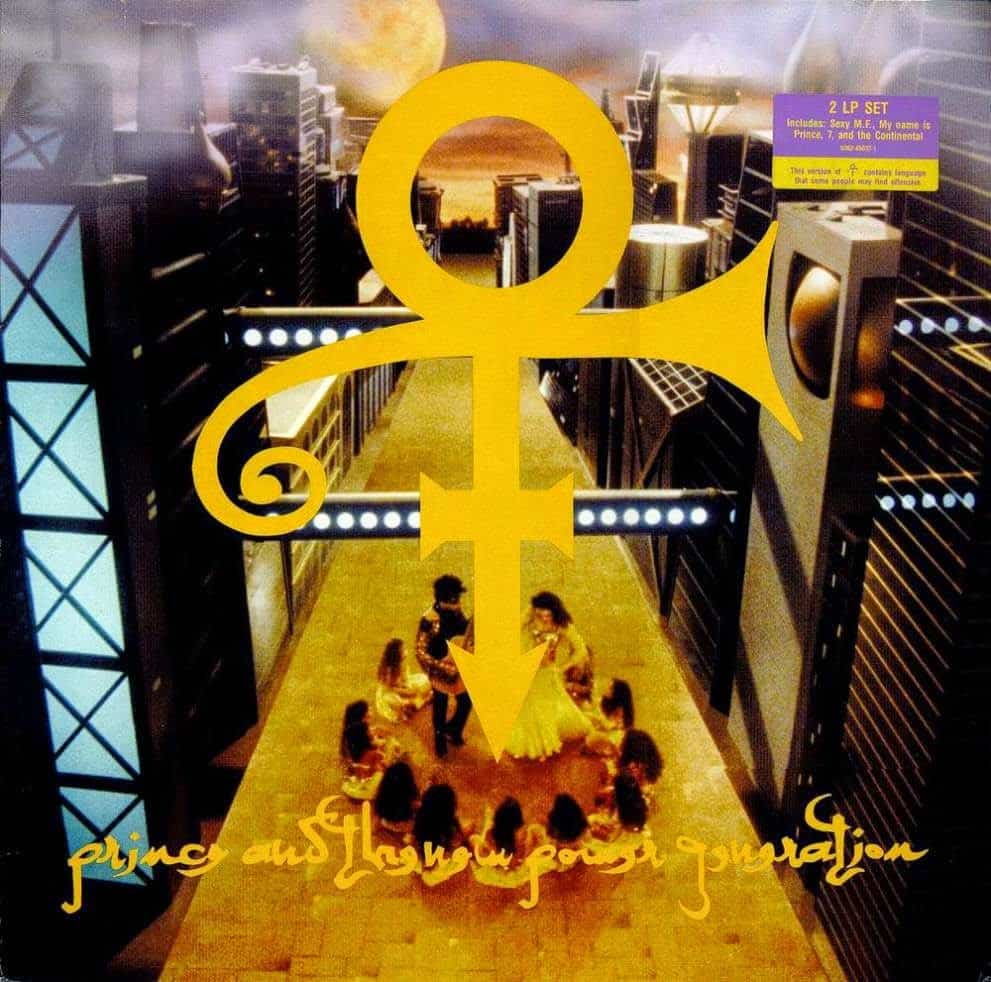
Love Symbol Album (1992)
The biggest power move is naming your album with an unpronounceable symbol. Commonly called Love Symbol, this futuristic hieroglyphic later became Prince’s name in 1993. It wasn’t until 2000 that he called himself “Prince” again.
The best part of this album? It contains interlude skits narrated by Kirstie Alley.
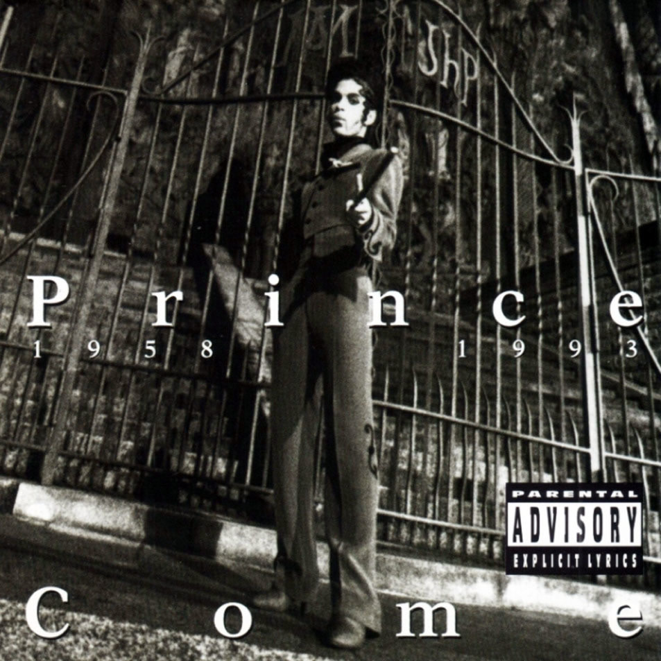
Come (1994)
Here’s where things truly get messy between Prince and his record label Warner. This gothic album cover alludes to Princes “death” and his intention was for The Gold Experience to be the rebirth of his artistic self at the Love Symbol.
Photography Terry Gydesen creates a daunting figure by shooting Prince from below, in front of a big iron gate. This is a version of Prince you don’t want to mess with. Not a lot of Love Symbol here.
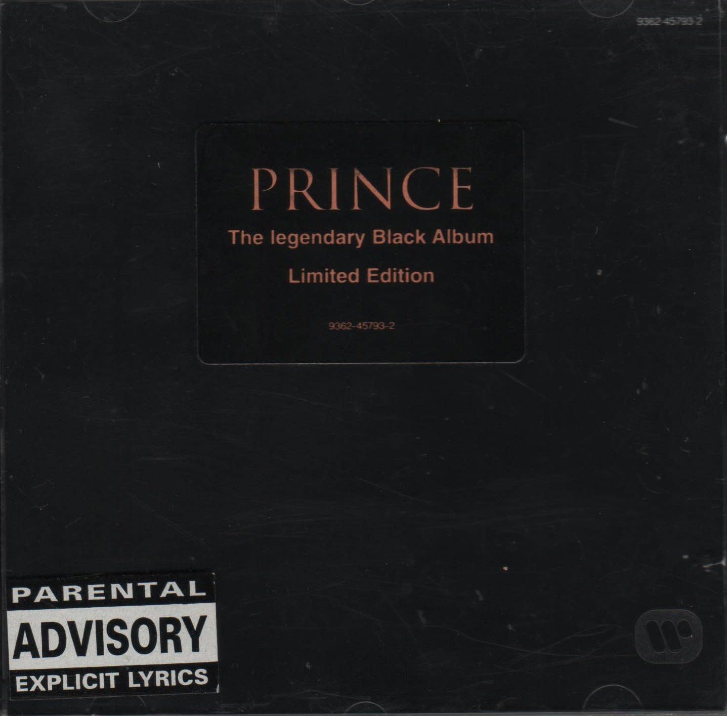
The Black Album (1994)
This album cover was completely black. The version you see above was altered for promotional release with stickers. It’s the most nihilistic version of Prince—no titles or even credits on the cover.
Before The Black Album was released to record stores, Prince had a bad ecstasy trip and recalled every copy. He was convinced that it was evil.
Perhaps because of this, it garnered underground market success despite Prince’s subtle apology woven into the music video for “Alphabet St.” where the words “Don’t buy The Black Album. I’m sorry” run vertically across the screen.
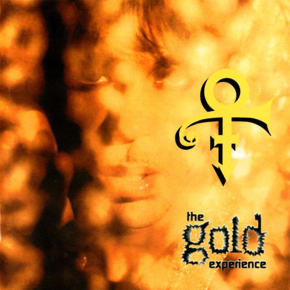
The Gold Experience (1995)
Is there anything more 90’s than the fonts on The Gold Experience cover? This album was entirely produced by Prince and “The Most Beautiful Girl in the World” hit #3 on the Billboard Hot 100.
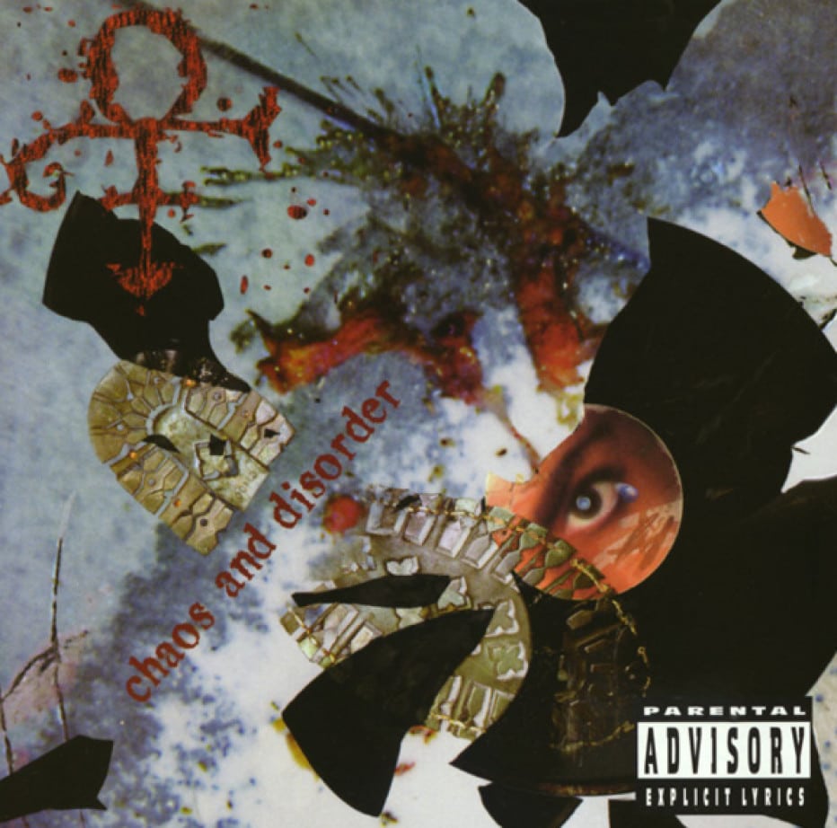
Chaos and Disorder (1996)
Back at it again with the collage mystical style, Prince worked with Steve Parke. They created the image in one afternoon using a computer and color copy machine.
This was the last album in Prince’s contract with Warner and it’s stacked with b-side songs. He added an extra stab with the sentence, “Originally intended for private use only, this compilation serves as the last original material recorded for Warner Brothers” in the linear notes. Remember linear notes?
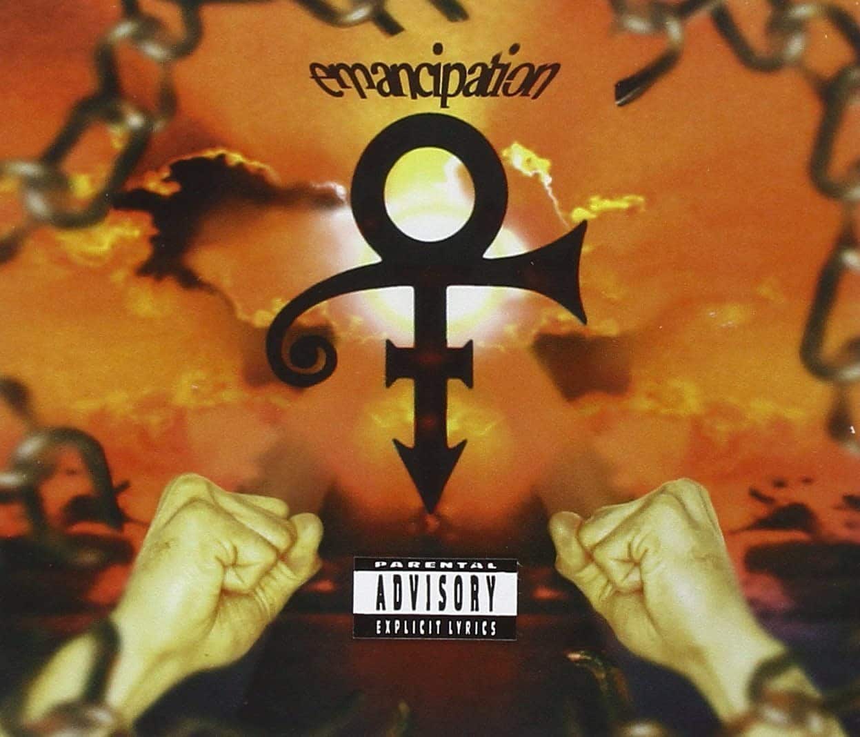
Emancipation (1996)
For Prince, gold is the color of freedom. Emancipation is exactly what it sounds like: the end of Prince’s contract with Warner. Steve Parke was again the art director for this album cover, created with photographs shot by Jeff Katz.

Crystal Ball (1998)
The mythical journey of Prince’s aesthetic continues with Crystal Ball. It’s also a reminder that the 90’s were a dark time for typography. Steve Parke really set the tone for Prince’s post-Warner style.
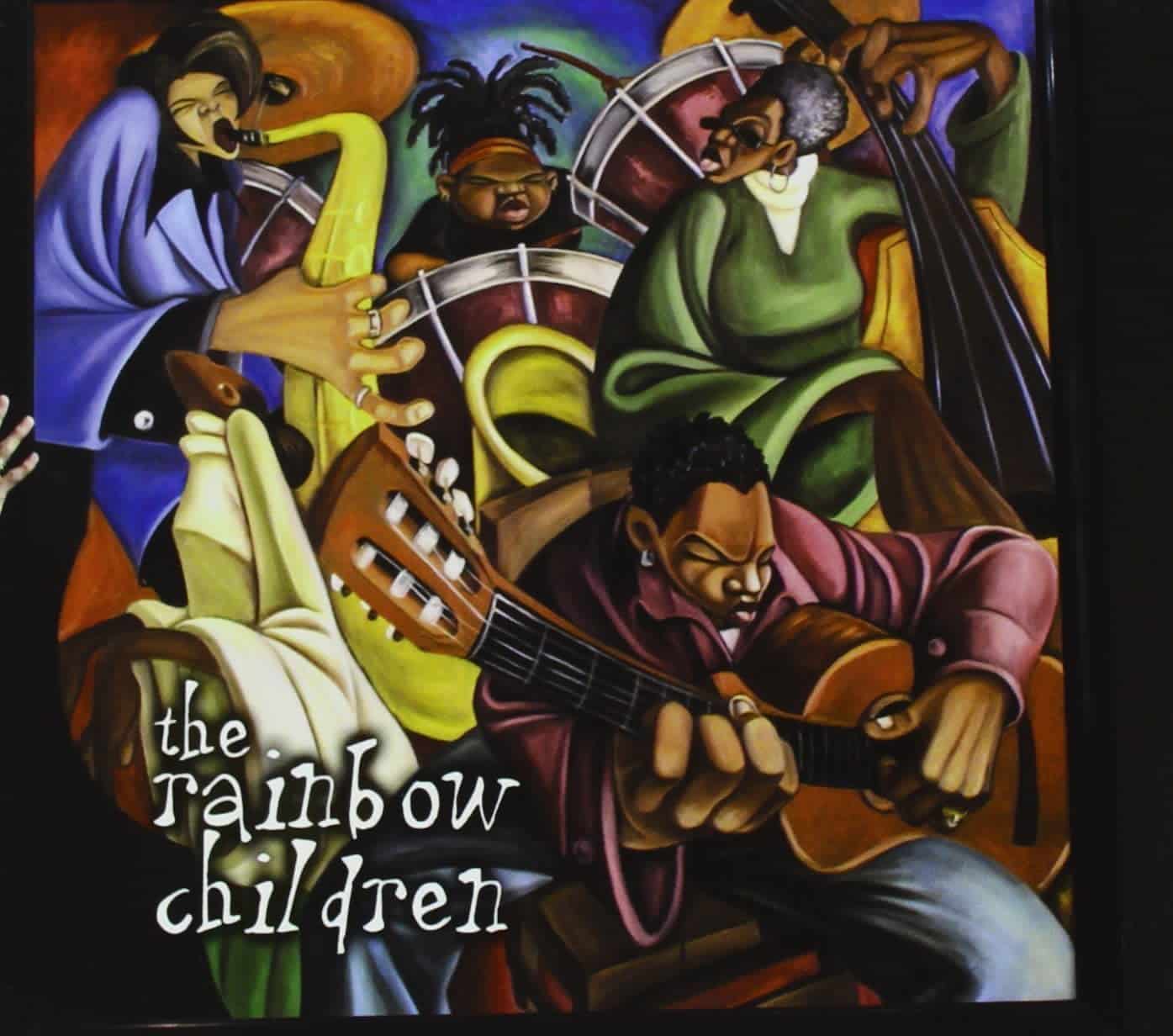
The Rainbow Children (2001)
Still doing his part to support illustrators, The Rainbow Children was created by Cbabi Bayoc. This religious, jazzy album (Prince had recently converted to become a Jehovah’s Witness) was a big gig for Bayoc.
The name “Cbabi Bayoc” is an acronym for “Creative Black Artist Battling Ignorance and Blessed African Youth of Creativity.” Just a few years before, you could find Bayoc at Six Flags Over St. Louis working as a caricature artist.

Xpectation (2003)
Looking like a screensaver nightmare, Xpectation was an online-only release on New Year’s Day. Fans could download it for free and enjoy all the songs that begin with the letter “x” including “Xemplify,” “Xpand” and “Xosphere.”
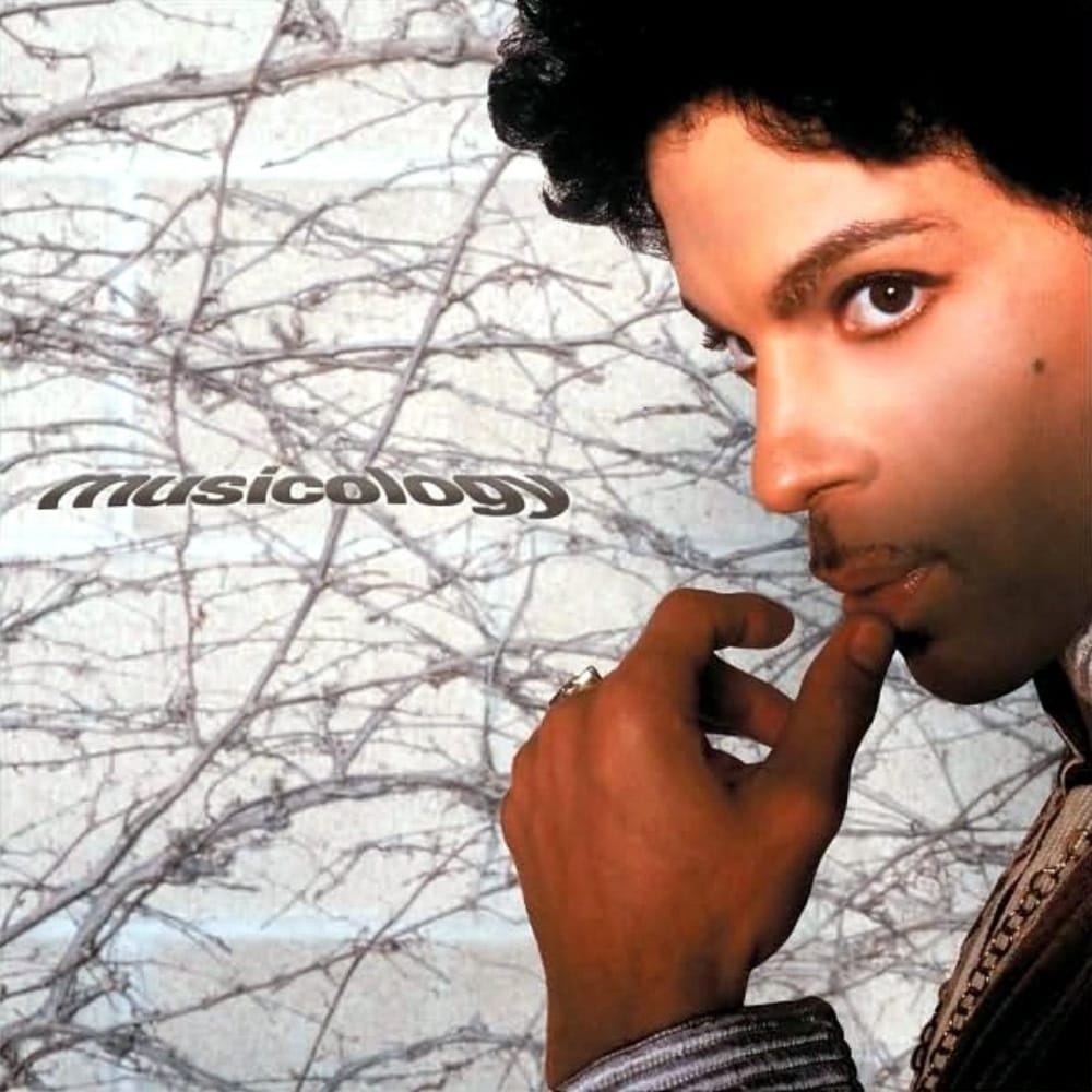
Musicology (2004)
Another Prince album, another single-eyed stare. Photographer Afshin Shahidi layered this pensive shot of Prince over grey branches. At this time, Shahidi was the artist’s photographer of choice. You can see in Prince’s style evolution different collaborators that pop up, stick around for a while, and then fade away.
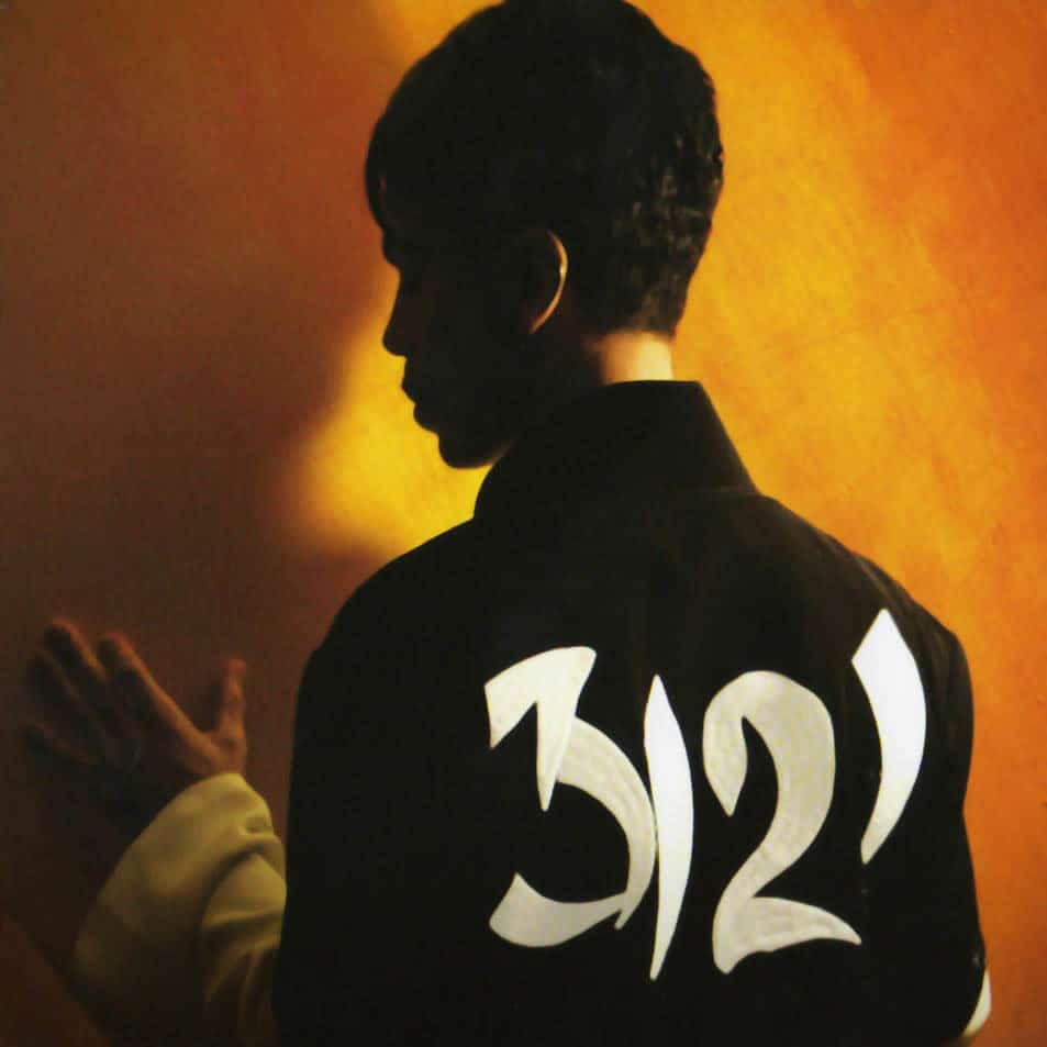
3121 (2006)
Spirituality is an ongoing theme for Prince’s album covers and his work. The meaning behind 3121 was never made explicitly clear but it’s suspected to refer to Psalm 31:21, “Praise be to the Lord, for he showed me the wonders of his love when I was in a city under siege.”
At the 2006 BET Awards, while performing a track from 3121, Prince said, “Where’s the real party at? Shake your tambourines! BET read Psalms; that’s where it is.”
He was also inspired by Charlie and the Chocolate Factory at the time of this album and hid purple tickets in copies. Recipients would be flown to his home for a private performance.
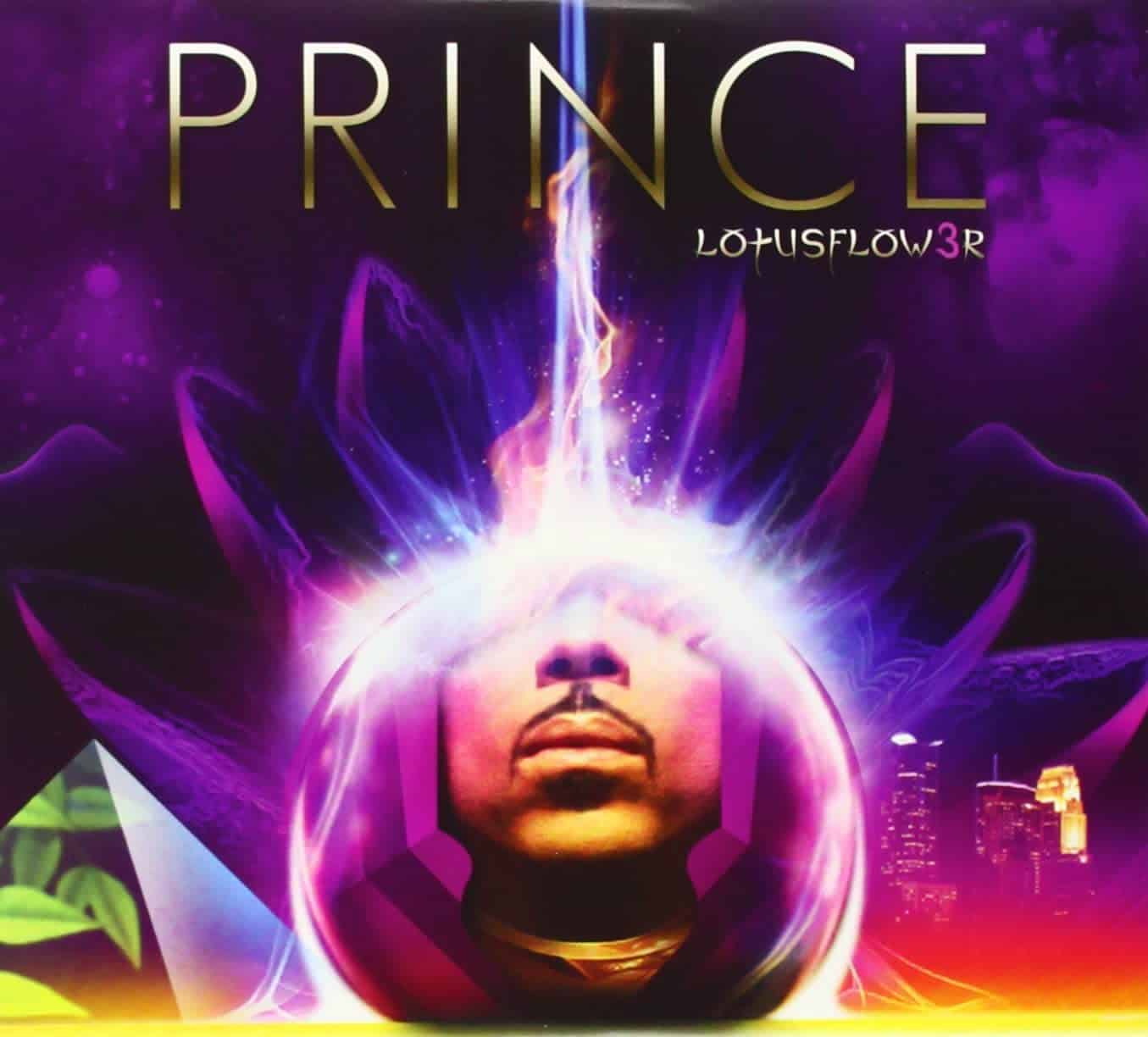
Lotusflow3r (2009)
This begins a streak of albums that replace letters with numbers. Technology hit Prince hard, and he hit back. Lotusflow3r was exclusively sold at Target, which makes the whole thing better somehow.

MPLSound (2009)
Crashing waves on an electric keyboard, disco ball jellyfish, speakers in the clouds, a swan with an aux cord head. There’s no listed designer so it’s safe to say that we’re deep in Prince’s imagination.
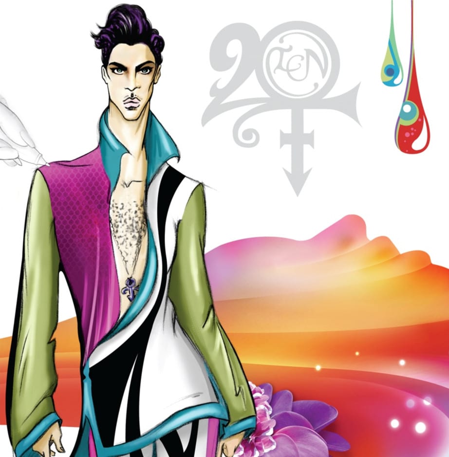
20Ten (2010)
For the first time, we’re seeing Anime influence on Prince’s aesthetic. It was designed by Debbie McGuan, who also designed his clothing at the time. Prince gives a shout-out to the creative team around him by including a sketched black and white hand in the corner that’s drawing his likeness. Very meta, Prince.
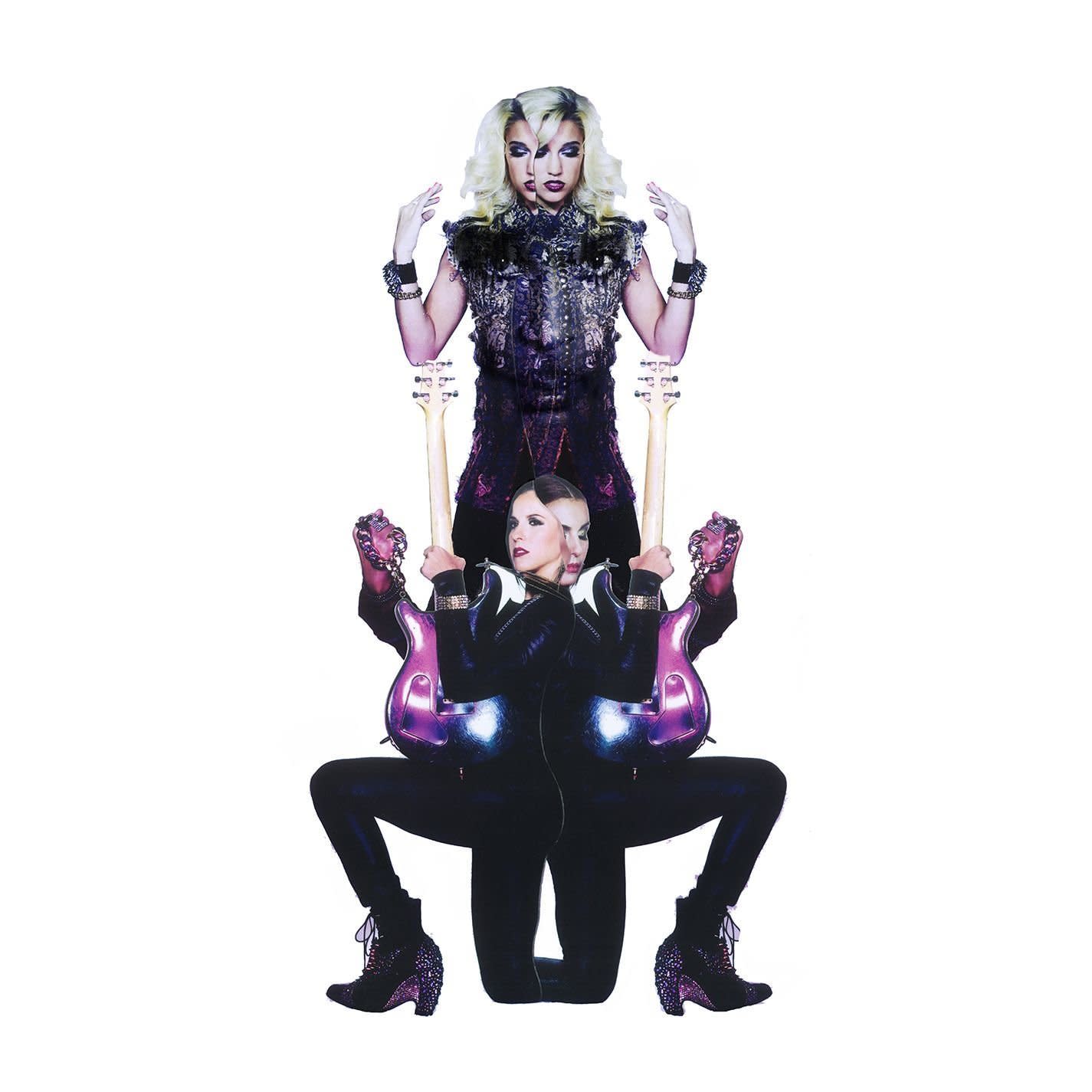
PlectrumElectrum (2014)
This evolution of Prince’s love for collage was created by artist Jesse Draxler and photographer Madison Dube. These frequent collaborators brought a modern magazine-like touch to Prince’s album cover. You can check out more of Dube’s Prince photos on Madison’s portfolio.
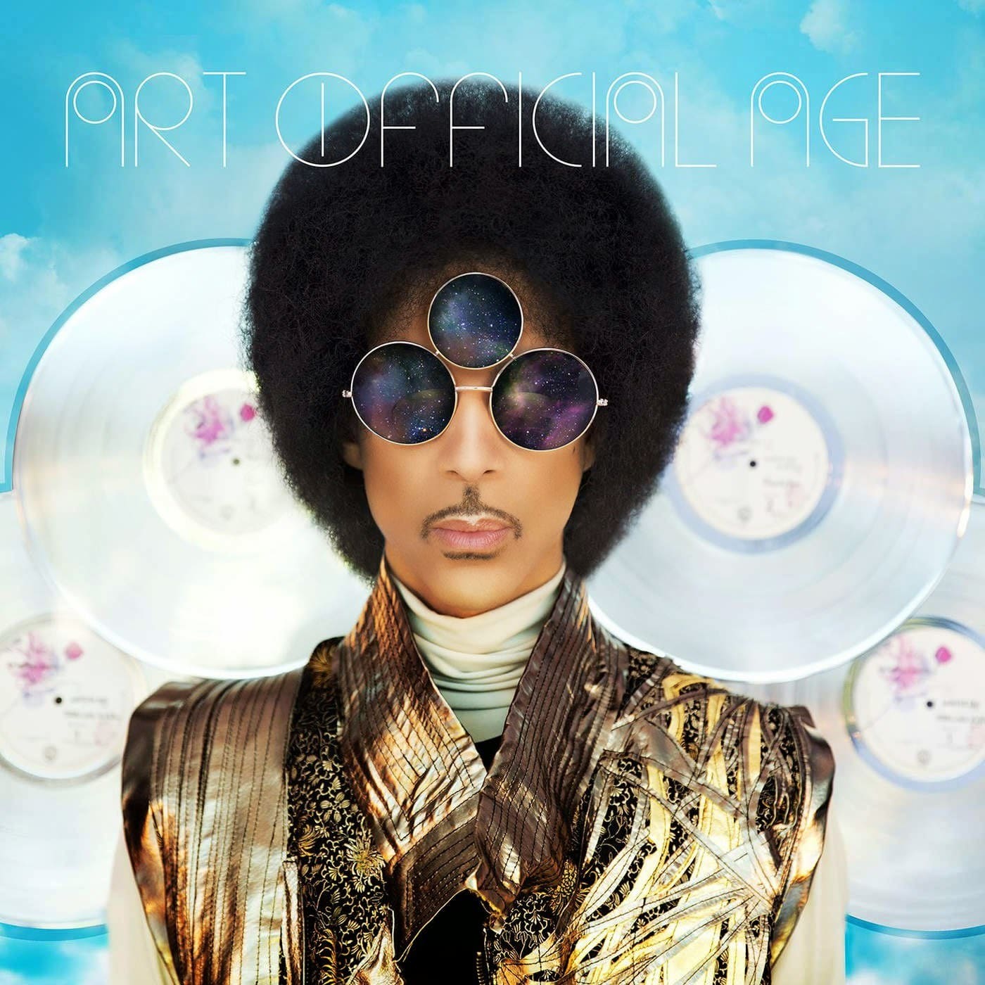
Art Official Age (2014)
Maya Washington is the creative genius behind Art Official Age’s album cover. It’s a further reincarnation of Prince with gold jacket, galaxy third-eye glasses and a smooth Photoshopped blurry face.
Washington gained notoriety for a project called “Shameless Maya” that tracked her “online self-discovery” as she shamelessly promoted herself every day for a year. Her YouTube channel as 688k subscribers so she seems to be achieving her goal.
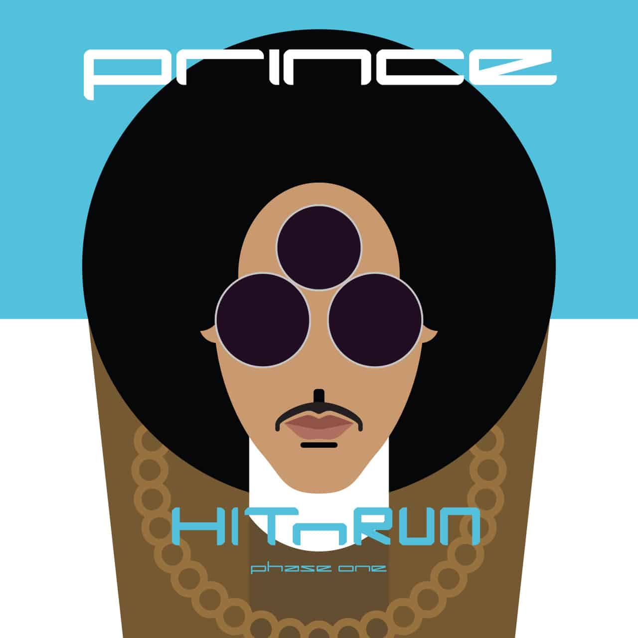
HITnRUN Phase One (2015)
Prince’s penultimate studio album showcases a throwback bubbly cartoon illustration version of the Art Official Age cover. However, this isn’t officially a “cover” because it was released exclusively online with Tidal. The reviews were mixed, but the promotional design is cute as hell.

HITnRUN Phase Two (2015/2016)
The second part of Prince’s final studio album is bittersweet. This is the last release by an artist who has given the world so much music (seriously, so much, we had to cut out even more albums that were instrumentals or soundtracks). We’ll remember Prince by his fondness for royal purple, intense stare, questionable font choices and love of collaged photography and illustration. RIP Prince.
Header image by Stuart Hogben.