The best logos are recognized instantly—Apple, Adobe, Instagram, Leica. They’re essential for big companies, but also effective for personal brands. It’s a snapshot first impression that communicates your unique aesthetic.
When you begin to customize your portfolio theme, don’t forget about your logo. Treat yourself like your first client and pay attention to the bigger picture that you’re establishing. This is about you and your creative brand.
A logo is the most concise expression of your brand’s personality. Creating a logo involves much more than writing your name and putting a circle around it. As a creative person, it should be a rewarding exercise to design something different. Your challenge is to create something that stands out and ties your portfolio together. A successful logo will tell your brand’s story without using any words and hopefully stand the test of time.
Here are nine tips for designing a portfolio logo that fits your creative brand:
1. Know Yourself
Before you start sketching out ideas, you should have a full understanding of your brand personality and its attributes. This is the first step in every logo design process. When the brand is part of your creative identity, it requires introspection. It’s very philosophical. You already know the answers, you just have to find them.
Sit down and write out the answers to the questions below. They should give you an indication about what your brand truly represents.
- What’s the purpose of my company/brand?
- What are my short-term goals?
- What are my long-term goals?
- What product or service do I offer?
- Who is my target audience?
- Who is my competition and how are they perceived?
- How does my company/brand differentiate from its competitors?
Through this exercise, other notes about your brand identity might come to mind. Add new questions to this list, if they’re appropriate. It should be a well-rounded survey that’s unique to your business.
When you’re happy with your answers, make sure you save this list. You never know when it will come in handy in the future. It will also be interesting to see if your answers to these questions change over time.
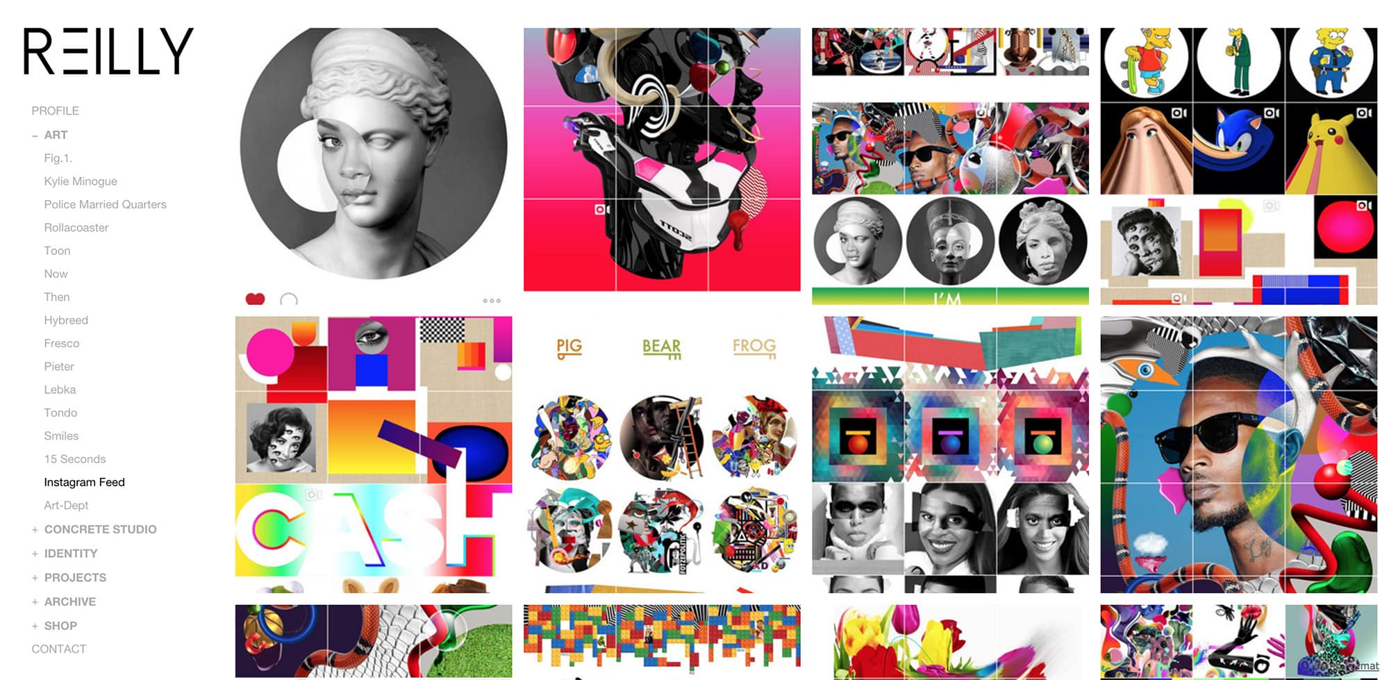
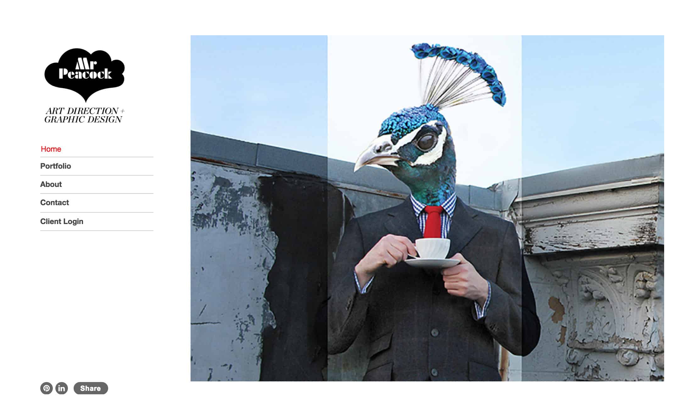
Hey Reilly Portfolio
2. Create a Mood Board
Even when you’re a creative person, the hardest part can be getting started. Don’t go in cold. Create a mood board of logos you like to help catch a vibe. When you choose images based on intuition, you’ll start to see common themes develop. These images, colors and textures will be the look and feel of your brand.
Collect images from visual platforms like Instagram, Pinterest or search keywords on Google Images. By browsing outside of your comfort zone, you can expand your creative thinking.
For many creative professionals, your portfolio work serves as a mood board. Narrow down your top ten favorite images and find commonalities between them. Are you more partial to bright colors? Pastels? Shadows? Flat? Layered? Take those naturally occurring elements into consideration when you’re creating your logo.

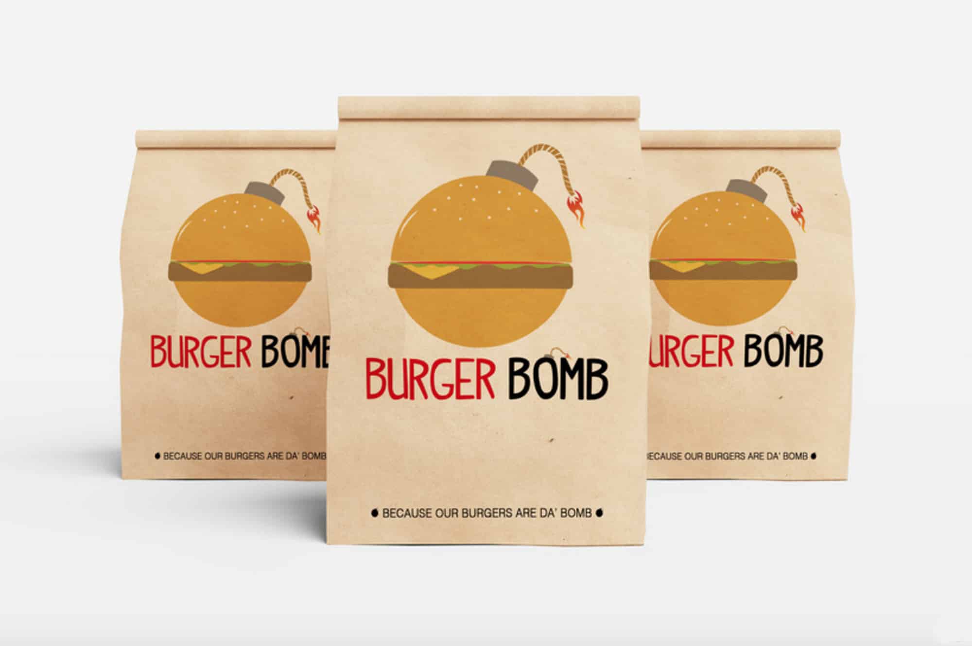
A truly original logo by Pâté
3. Avoid Cliches.
With your brand identity flushed out and inspirational images reviewed, it’s time to create the first iteration of your logo. Like any creative work, the first draft is exactly that, a draft. We all wish that our first product is the final product, but that’s rarely how things work. Don’t be afraid to create several different versions as you’re working towards the best logo for your online portfolio website.
Try making three very different versions of your logo. Let yourself get a bit wacky—don’t hold back. You might be surprised by the results. A good starting place is the “Three Little Bears” approach. Your first logo will be the “baby bear,” then “mama bear,” and then “papa bear.” This progression could be related to size, colors or concept.
Whatever you do, avoid the cliches. Your logo represents your creative brand and you don’t want to give clients the impression that you’re work isn’t original. If you’re seeing a lot of one type of logo in your creative field, maybe it’s time to switch it up.
Share your logo options with family and friends. Choose the people that can provide candid feedback. Remember that ultimately it’s your decision and you should pick a logo that you’re happy with.
4. Be Clever
For some creative brands, a pinch of intelligent humour makes the logo more memorable. Explore “visual double entendres” (two things in one) or depict a phrase or illustration like “two birds with one stone.”
Here’s an example of a double entendre by designer Von McKenzie:
Creative director and designer Jesse Clayton Conte has examples of subtly clever logo designs on his portfolio website. See how the logo below for Eastern Mountain Sports is shaped like a mountain? It’s smart without being cheesy.
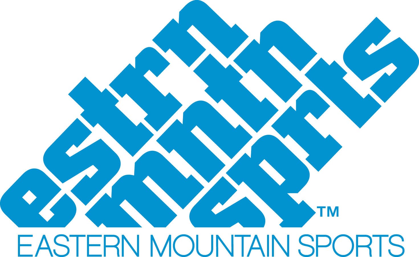
Jesse Clayton Conte Portfolio
If word play isn’t your thing, consider playing with negative space to create a visually clever effect. It will cause an “aha” moment for visitors to your website when they figure out the image. Here’s another example by Jesse Clayton Conte for Scott Sports.
Designing a clever logo will help ensure a lasting impression and might even make your audience crack a smile at your brilliance.
5. Dust Off Your Color Wheel
Keep in mind that colors convey meanings. The shades you choose can be an important factor in communicating your brand’s personality. Brush up on your color theory because it will come in handy when you’re determining the most optimal palette for your logo design.
In general, here are the emotional cues for colors:
- Red: power, passion, aggressive
- Orange: warmth, energy, excitement
- Yellow: happiness, optimism, sunshine
- Green: soothing, natural, wealthy
- Blue: clean, loyal, tranquil
- Purple: royal, creative, supernatural
- Pink: floral, feminine, affectionate
Using bright and bold colours in your logo design is a surefire way to turn heads.
If you have a wide array of products and services to offer, consider using multiple colours in a layered or blocked style. This communicates diversity and inclusivity without having to spell it out.
Your logo design should look good in a variety of colors, including greyscale. Having versatility at this level will help you achieve a timeless logo design that will be open to refinement over the years.
6. Custom Type is Key
Similar to the psychology behind color choice, fonts evoke a wide range of feelings. Typography plays a critical role in the design of your logo and can be as impactful as a graphic.
For example, if you’re a wedding photographer and want to portray your business as traditional and respectable, nothing says regal like a serif typeface in your portfolio logo design.
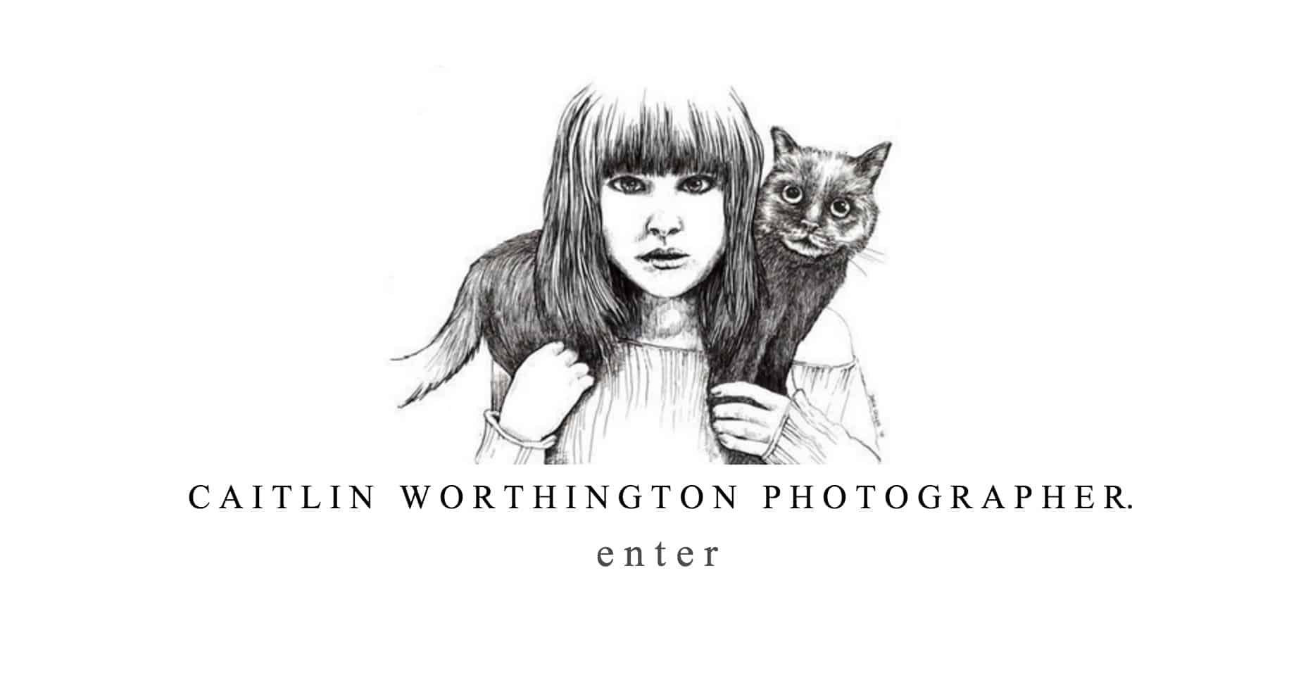
Here’s an example of elegant, serif typeface on Caitlin Worthington’s portfolio homepage:
Alternatively, if you’re a graphic designer and want something a bit more modern, you could work with a sans serif typeface.
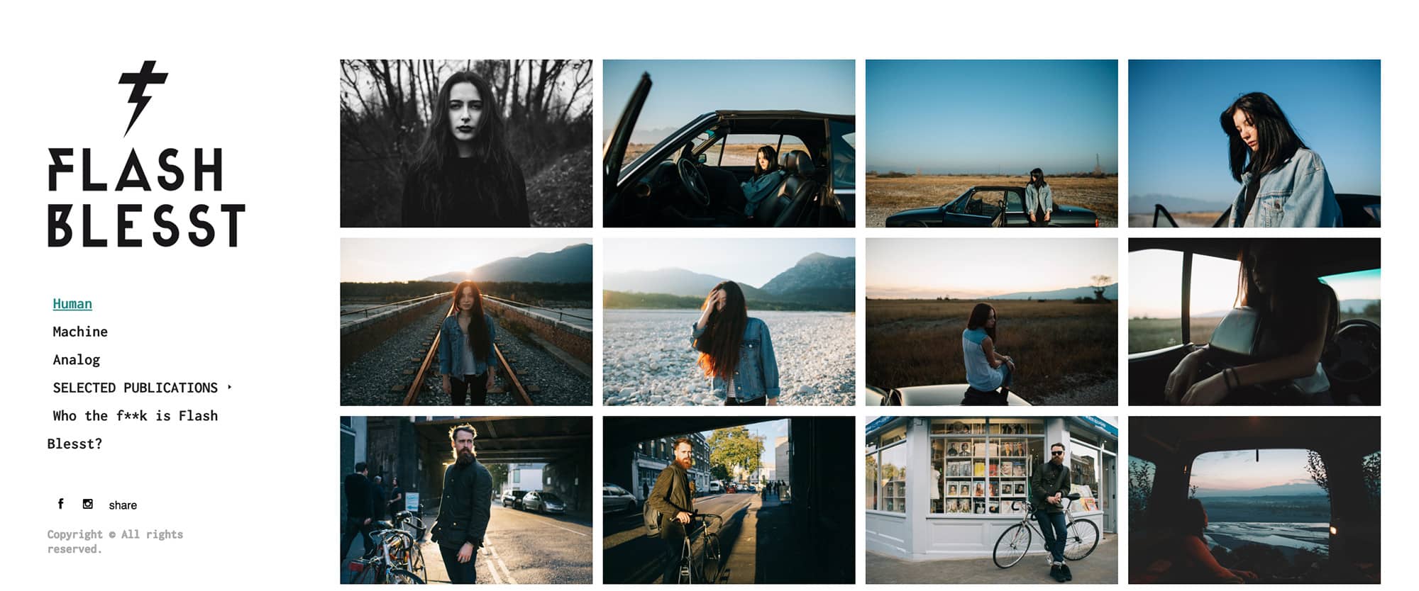
Check out Flash Blesst’s edgier portfolio logo below:
Regardless of which style fits your look, keep it easy and stick to one font. There’s nothing worse than a mishmash of typography.
For your portfolio, consider what your font is saying to you and whether it fits your design – this will avoid a visual disconnect to your logo.
To distinguish your portfolio from others, make sure your logo design has some custom lettering. Custom type ensures that your logo design will stay unique in the market and also ensures that no one will rip off your work.
All you need to do is make minor adaptations to existing typefaces. Add a curve where there was no curve before, or change the aspect ratio, you can even remove some elements from the font. This will make your text your own and better fit your brand and can even be another piece to add to your portfolio.
7. Keep it Simple
Simplicity allows for greater versatility.
A successful logo design delivers all the meaning in just a split second and your logo design for your portfolio should do the same. A well-crafted logo design can accommodate various uses and is easily recognizable on any platform.
Consider where your logo will be seen. Does it work on your website and your business cards? Does your logo design work on mobile screens? Make sure that it looks good in different sizes and mediums.
Melvin Galapon’s portfolio logo design is a throwback to the 8-bit era and perfect example of what a simple and versatile logo should look like:
Melvin Galaphon Portfolio
Keeping your logo design simple can further future-proof your image and add an air of sophistication to your portfolio.
8. Find the Balance
A balanced composition is one that feels right and is easy on the eyes. You’ll know it when you see it. While some of its elements might be focal points to attract your eye, the overall logo design should feel stable and aesthetically pleasing.
The human eye naturally creates order out of the things we see. Symmetry can explain how the mind structures and arranges visual data.
If your portfolio logo appears to have a balanced, harmonious quality to it, it will be pleasing to the viewer.
Take a look at Nadia Von Scotti’s portfolio logo below. Can you spot the symmetry?
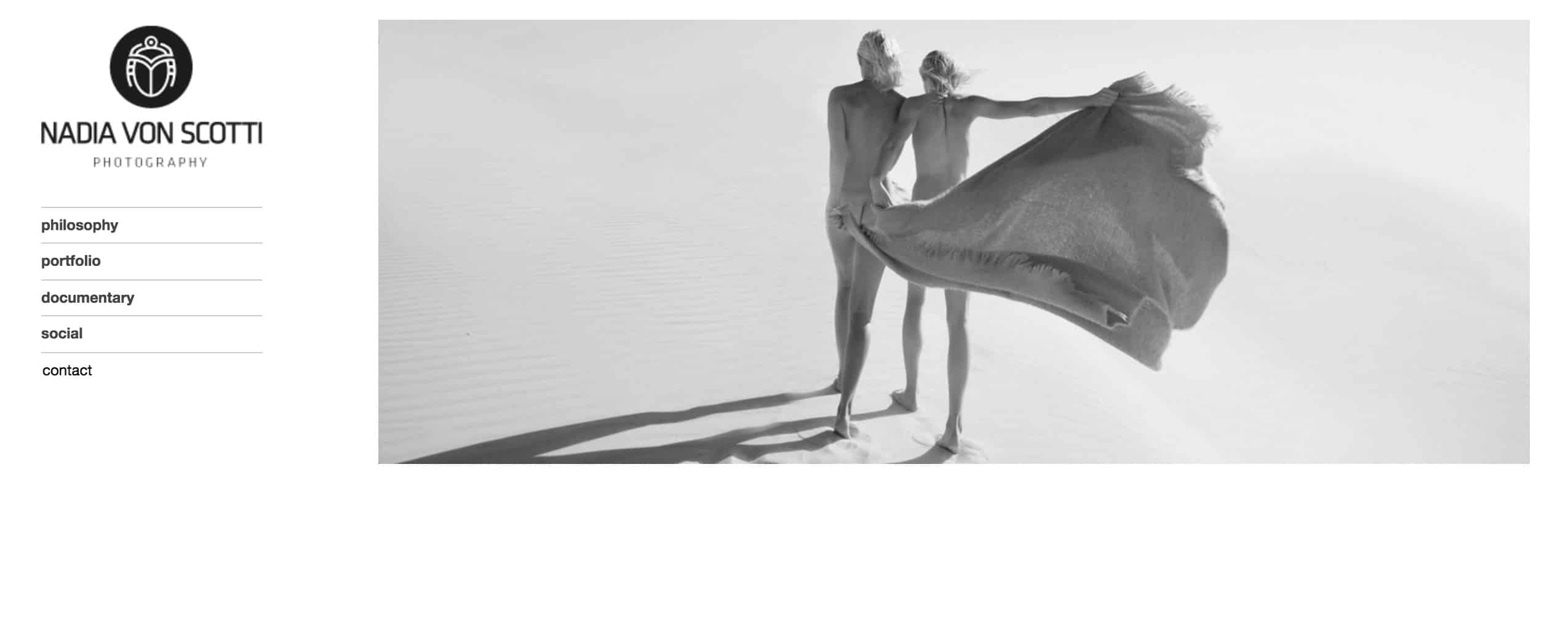
Nadia Von Scotti Portfolio
On the other hand, asymmetry can be unexpected and tends to communicate excitement and risk. This is an idea that Robert Hold’s portfolio logo design plays with:
Robert Hold Portfolio
Although the eye craves the natural order found in symmetry, the visual impact caused by asymmetry is also significant. Symmetry communicates consistency and integrity, whereas asymmetry carries elements of intrigue and individuality.
It’s like yin and yang, these seemingly contradictory forces are interconnected and interdependent, but it’s up to you to determine precisely how when developing your logo design.
9. Be Meaningful
Your logo design is a visual extension of your brand and when executed successfully, will consistently tell the story of your brand without using any words. That’s really powerful.
Every logo design should be riddled with meaning and symbolism, both obvious and hidden. This goes far beyond a simple pretty sketch. Give your audience layers of meaning to unravel and discover the deeper inspiration behind it.
By crafting a unique narrative, your logo design will be viewed as more than just artwork or a pattern of lines and text.