Creating a photography website might seem like something only established pros really need to do, but the reality is more like the opposite—a great online portfolio is crucial for any emerging photographer. Whether you’re a student, a freelancer, or any type of photographer looking to get serious about your work, having a well-curated website will help you get your work in front of the people who need to see it.
You don’t need to put in tons of time and effort learning HTML and CSS in order to build a photography website, either. There are lots of website builders available online that offer a wide range of customizable templates to help you build your own site without any coding knowledge. Some website builders also offer extra features like your own online store, a built-in blog, and proofing pages to let you privately share photos with clients.
“As an instructor, I feel it’s essential for my students to have a professional site that is not Facebook, Tumblr, or Instagram,” says Emily Najera, who is a visiting photography professor at Grand Valley State University. “While those sites are great resources for inspiration and networking, they are not the best platform for reviewing or showcasing bodies of work. A website shows thoughtful consideration of layout, similar to that of a book. It challenges my students to think about image progression and aesthetics.”
Having a large portfolio of work to share might also seem like a prerequisite for a website, but you can easily curate a memorable site that features as few as twenty images. A website that shares only a small selection of work is easy to browse through, and gives viewers a quick overview of who you are and what kind of photography you do. You can get creative with your website and use it as an online photo diary or a gallery for a single photo project; or you can go the super-simple route and just use your site as a place to host your CV, contact details, and a few of your best images.
Drawing on advice and examples from a range of photographers at different stages in their creative careers, this comprehensive guide will take you through every step of creating a strong photography website, from curating your work to writing a biography:
- Set some goals for your photography website
- Create your photography website layout
- Upload your photography
- Create a strong homepage
- Personalize your website with a bio
- Add your contact info
- Make your photography website discoverable
- Add your rates
- Sell your work on your website
- Do a full review
- Keep your site updated
- Get your work seen
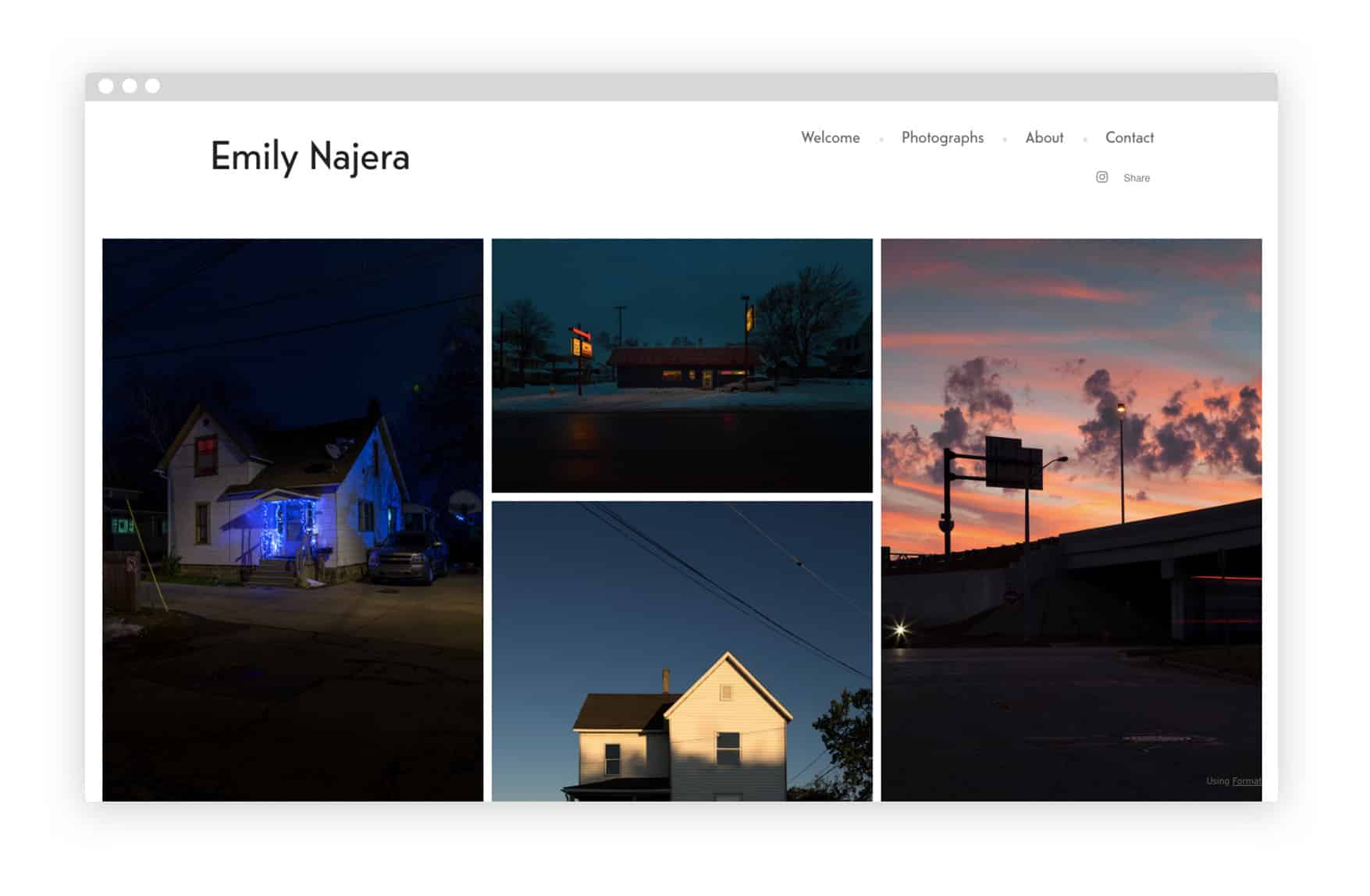
*[www.emilynajera.com](http://www.emilynajera.com)*
Set some goals for your photography website
The first step in building your photography website is deciding on a focus. Before you start putting together a selection of images, writing a statement, or even experimenting with layouts, take some time to sit down and think about these questions first.
Who is your intended audience? What sort of visitors are you trying to attract to your website? Is it potential clients? If so, are you hoping that these clients are brands, individuals, or publications?
What are your strengths as a photographer? Are you really great at portraits or street photography? Do you excel at shooting 35mm film or do you specialize in Photoshop edits?
What is the most important next step for your photography practice? Do you want to shoot more work to expand your portfolio? Do you want to start focusing on a different sort of photography—for example, are you an event photographer who wants to get more into documentary work?
Is there a certain aspect of your photography you want to improve on?
Is there one project, series, or shoot that stands out as your best work? Or even one image?
Once you have answers to these questions, you’ll find that selecting work to share and putting together a solid about page become easier. You’ll have a better understanding of what you want to achieve with your website and how it can help you represent yourself as a photographer.
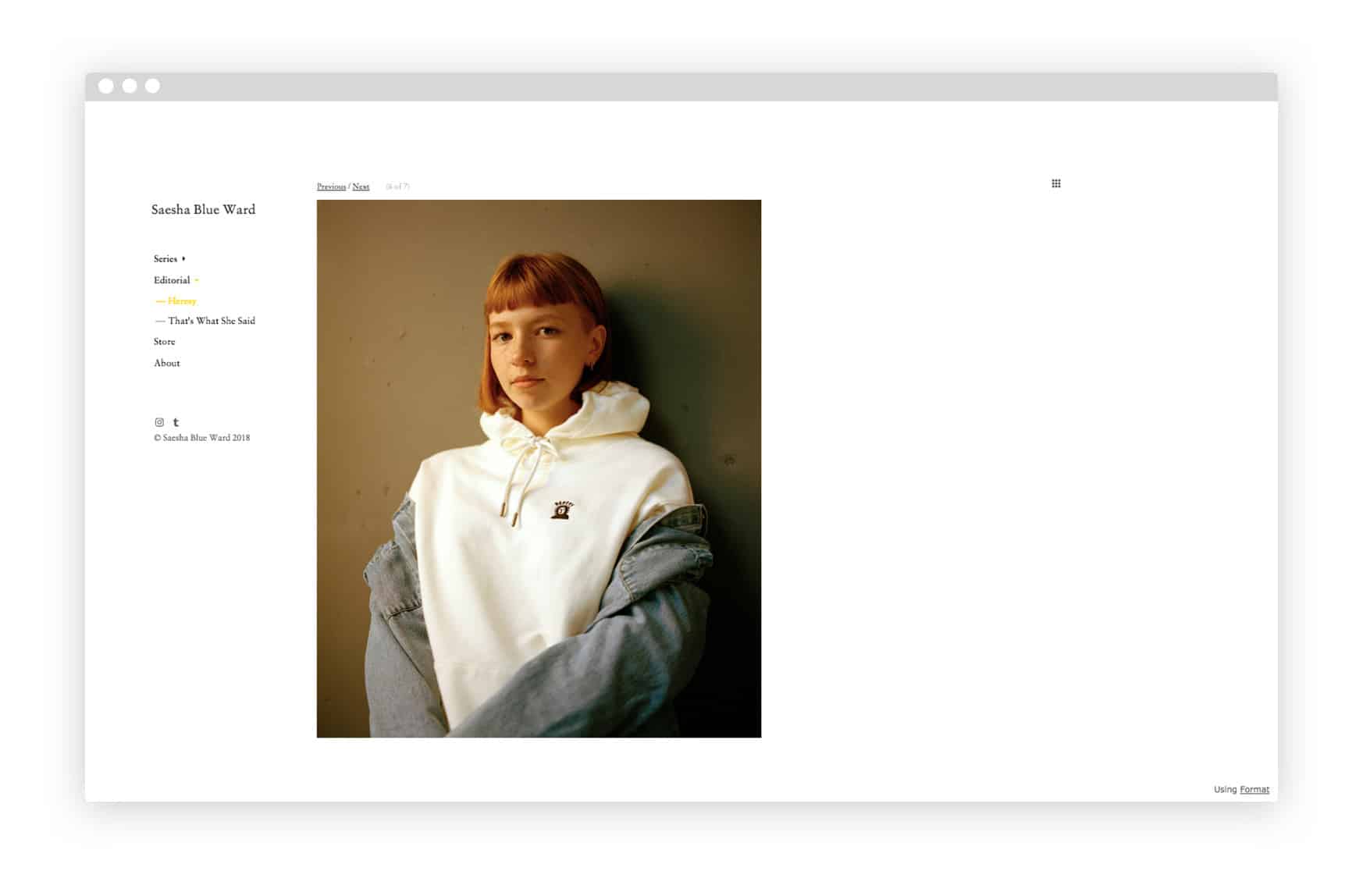
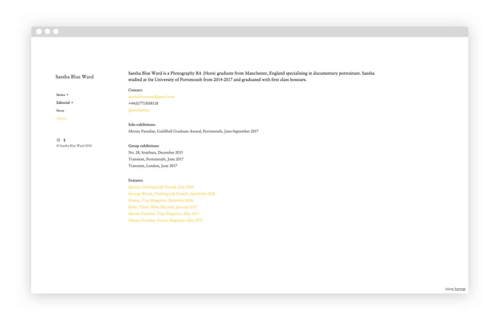
You might also find it useful to browse through the websites of other photographers for inspiration. For recent UK photography grad Saesha Blue Ward, this was an essential first step in building a strong online portfolio. “I spent a good few hours gathering inspiration from all of my favourite photographers’ websites, both professional and graduate, before designing my own. Experimentation is key to finding a style that suits you,” she says.
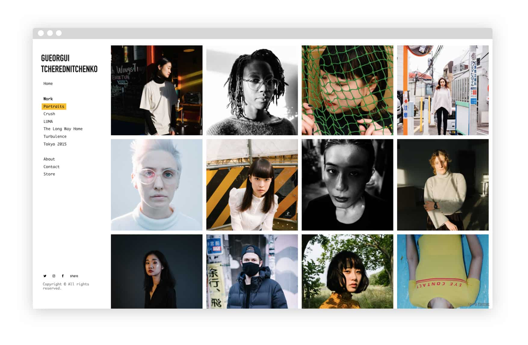
*[www.gueorgui.net](http://www.gueorgui.net)*
Create your photography website layout
Now take some time to think about how you want your website to look. You might want to sketch out possible layouts with pen and paper, especially if you are planning to create the site yourself using HTML. If you are using a website builder to create your online photography portfolio, you may find it easiest to start experimenting with the different templates and layout options available. There are lots of free website templates out there that can help you quickly build a professional-looking online portfolio without coding.
If you’re having a hard time choosing the best layout for your work, these are some simple website design questions to consider:
- Will the pages on your website scroll vertically or horizontally?
- Will your photos be displayed individually, or in a grid with multiple images?
- Where will your site menu be located: footer, header, left, or right side of the page?
- What font(s) will you use for your site?
- What color scheme best accents your work?
- How will you display your name in a way that stands out?
Just selecting a template you like can be a good start to getting things rolling. You can always switch up your website template for a new one if you don’t like the one you’ve tried, and just seeing your photos laid out in a neat grid or horizontal gallery can help you decide which layout works for you.
London-based photographer Gueorgui Tcherednitchenko created a memorable website using a grid-based layout that shows off a wide selection of his work. “As primarily a portrait photographer, the main challenge for me was deciding on how to present the first impression of my work, so the choice of a template was very important,” he says. “I decided on a template showing photos in a grid view by default, but offering a carousel style navigation once the user has clicked on an image. This gives the visitors an opportunity to get an overview of my work, and decide for themselves which images they’re interested in seeing up close.”
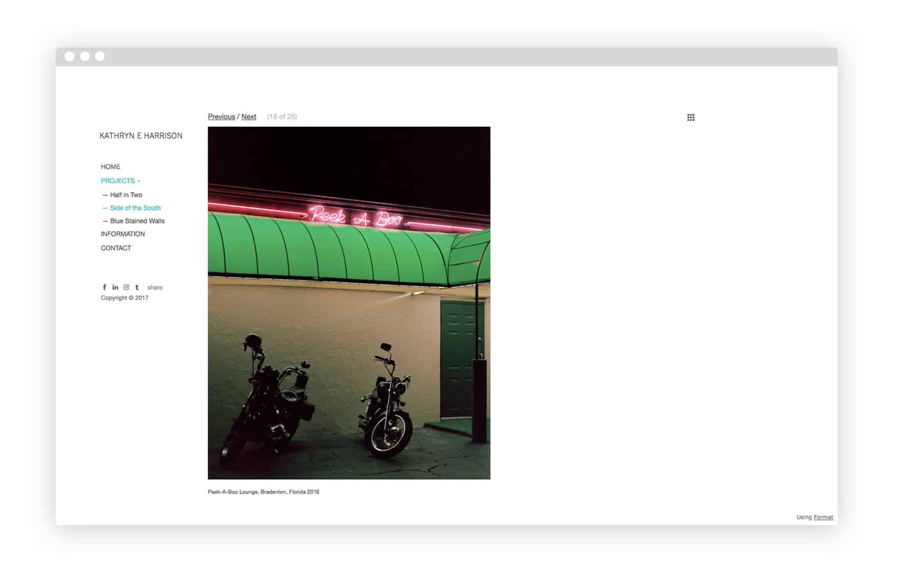
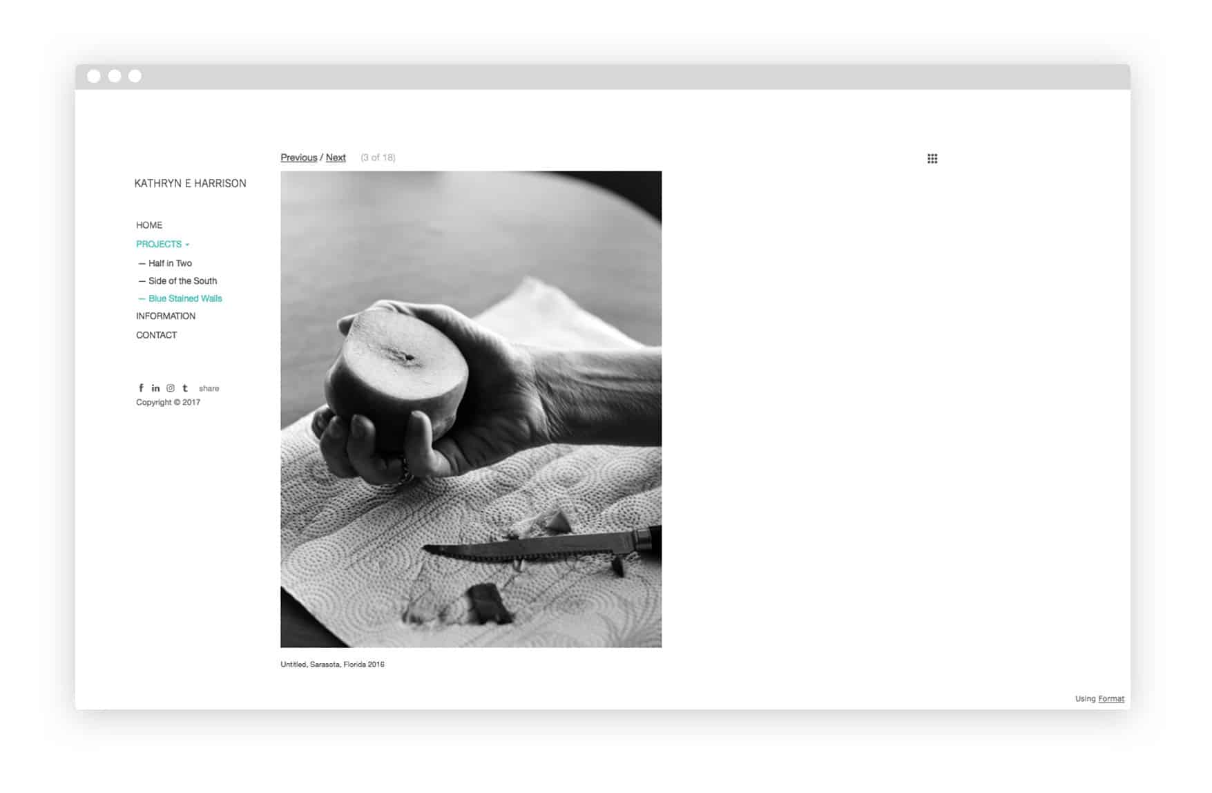
*[www.kathryneharrison.com](http://www.kathryneharrison.com)*
Documentary photographer Kathryn E. Harrison, who is currently an MFA candidate at Yale, chose a website template with one image per page because it reminded her of an analog viewing experience. “Format’s Offset theme has been the most effective for my work because of how organized and user-friendly it is,” she says. “With this theme I can focus the viewer’s attention on one image at a time, similar to viewing a book. This theme keeps my social media icons upfront, which is crucial for sharing my work and keeping followers updated.”
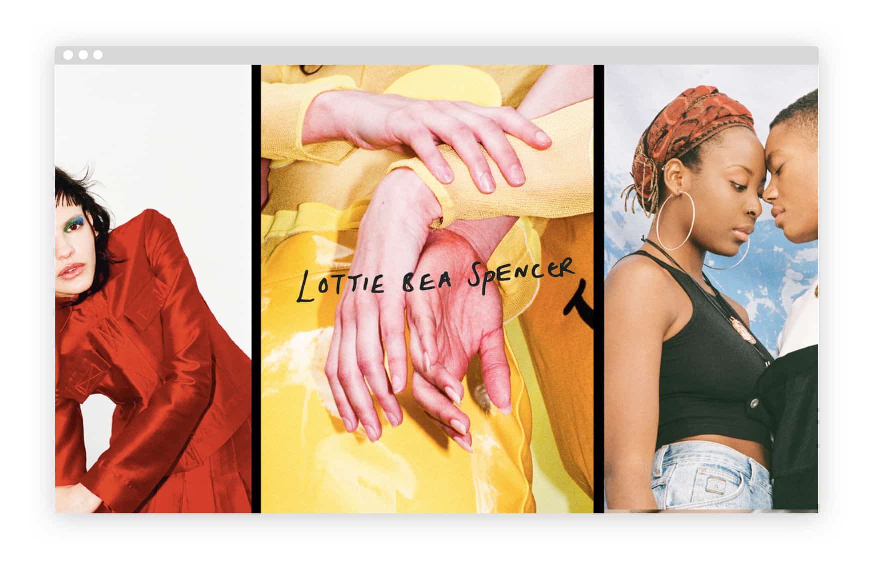
UK fashion photographer Lottie Bea Spencer, who’s shot for clients like Nike and Dazed, created a website with a fun, collage-inspired layout that matches the creative aesthetic of her work. “I wanted to create a website which felt playful and reflective of the images I make,” she says. “Format’s existing themes are a great place to start as everything is already there set up for you.”
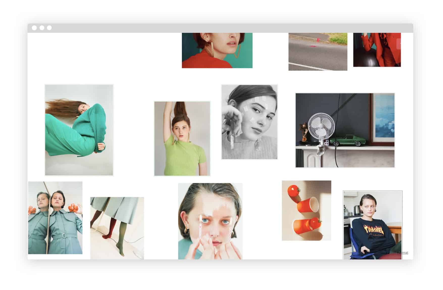
*[www.lottiebeaspencer.co.uk](http://www.lottiebeaspencer.co.uk/)*
Upload your photography
It can be tempting to fill up your photography website with a huge archive of your work. But your best images will stand out better if you don’t select too many of them. You want viewers to see and remember your strongest work; you don’t want them to be overwhelmed by pages and pages of images. Some of the best online portfolios include only one or two galleries of images.
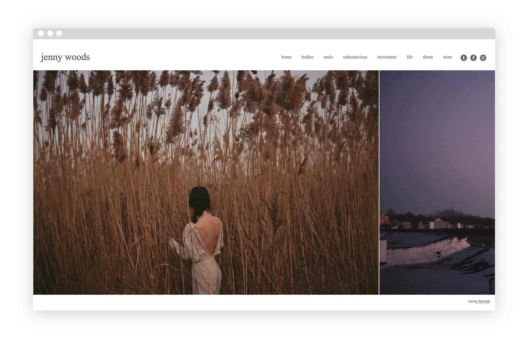
Fine art photographer Jenny Woods divides the images on her website into a series of galleries with titles like “bodies” and “movement,” which reflect the dreamy, abstract nature of her photos. “I think it’s important to find overall themes within your work—there might be only one or very many—and to separate those themes into galleries,” says the New York-based photographer. “But I also think it’s important to keep it clean and simple. Don’t have too many pages, because then you just end up frustrating yourself and failing at grabbing the attention of the viewer. I personally feel art is viewed better large, which is why I chose the website theme that I did. I love that the entire page is taken up with my photographs, so you can really get lost in them.”
*[www.bunnyjennyphoto.com](http://www.bunnyjennyphoto.com/)*
You might find it easiest to curate the galleries for your online portfolio on your computer before uploading them to your website. Here are a few ideas for how to categorize your work. (If you do additional creative work that isn’t photography, you may want to keep it on a different section of your website.)
- Subject matter (e.g. portraits, landscapes, travel, fashion)
- Type of work (e.g. personal, commercial, editorial, documentary)
- Clients (e.g. by client name or by type of client)
- Medium (e.g. 35mm, 120mm, digital, video)
- Location (this may be useful if you are a travel or documentary photographer)
- Series (this may be useful if you primarily do personal or fine art photography)
When you upload a gallery of images to your site, also consider whether or not you want to include captions on your photos, or add a written statement about the work at the start or end of the gallery. Adding even just a little information can go a long way to holding the attention of your viewers, and can also add a lot to their understanding of your work. Even if the gallery is a simple photo diary, you may want to add captions which explain where the images were taken, or a brief statement about what kind of camera you used. If you’re uploading a series that has previously been published, you may want to share this information and add a link to the publication.
*[www.kathryneharrison.com](http://www.kathryneharrison.com/)*
What if you’re really stuck on how to categorize your work? Creating a website can be the push you need to curate photos you’ve already taken. It’s a helpful task for students or any emerging photographers who need to work on defining their practice. Professor Emily Najera actually assigns building a website as a project for her advanced digital photography students. “Students who do not have a cohesive large body of work should start by looking for similarities in their photographs,” she recommends. “There usually is some type of repetition, whether it’s time of day, location, color, or composition. Once they identify how their images are related, they can begin to assemble a portfolio.” This advice applies to anyone who’s looking to create a portfolio but doesn’t have a large image archive to draw from.
Curating your own work can be tough. Give yourself time to really consider every image individually as well as the way images fit together. Would you share this image on Instagram? Would you print it out and frame it and hang it on your bedroom wall? Would you submit it to a publication or contest? If this image was created for a client, do you think they would be 100% satisfied?
*[www.saeshablueward.co.uk](http://www.saeshablueward.co.uk/)*
“When it comes to online portfolios, the simpler the better,” Saesha Blue Ward says. The Manchester-based photographer has a simple, pared-down website that includes just five galleries. “Your style and identity as a photographer comes from your images, mainly, and the theory and process behind them. So it’s important not to overcrowd your website with an invasive design and heavy fonts.”
If you find it hard to narrow down your strongest images, you might try selecting twenty images for a gallery, and then going through the gallery and removing ten of them. Ideally, you should be confident that every individual image on your portfolio is a good representation of your ability as a photographer, and that no matter which page a visitor to your site lands on, it will show your work in the best light.
Create a strong homepage
As it’s likely to be the first page visitors see, your homepage is the most important page on your website. You can create a lasting impression by making a title page which visitors have to click through, or by selecting one of your best images for the homepage. You might also consider setting up your homepage to direct to a gallery of recent work or one of your best projects. Or, you could use your homepage to show a brief overview of five to ten standout images that provide a quick look at the kind of work you do.
Think carefully about how your homepage will look to someone who has no idea who you are and has never seen your photography before. Lottie Bea Spencer created a captivating homepage by collaging three of her strongest images together. She then added her name as a clickable logo which takes the visitor through to her actual site. “I tried to make my logo more personal, so I hand-wrote my name and edited it in Photoshop,” says Spencer. The handwritten logo appears at the top of every page on her website, adding a sense of visual continuity.
*[www.lottiebeaspencer.co.uk](http://www.lottiebeaspencer.co.uk/)*
Photographer Gueorgui Tcherednitchenko tested out different homepage layouts before finding the one that worked best for him. “My old website opened with one single picture, and the visitor would be able to scroll through a gallery of portraits by clicking on the image to advance to the next one. I felt like this put a lot of ‘pressure’ on this first image. According to analytics, not that many users actually clicked through—and almost no one made it to the end of the gallery.” The grid layout that Tcherednitchenko ended up choosing offers a faster look at his portfolio. “Another thing in the favour of a grid view is that it works well on both desktop and mobile,” he says.
Personalize your website with a bio
Now you’ve curated one or two galleries for your website, it’s time to create an about page with a biography on it, and perhaps a brief CV or artist statement. Including a headshot is always a nice way to add a personal touch to your about page. You may want to add links to published work here, or create a separate page titled “Publications” or something similar.
“My best advice for writing a biography is to keep it short and to be honest,” says photography professor Emily Najera. “Read it aloud before you post it. Someone else reading it out loud is even better. Try to eliminate repetition and be as clear as possible. After reading a strong bio, you should have a sense of the photographer, their style, and the focus of their work. I prefer biographies that are personal and individual rather than a growing list of accomplishments.” When in doubt, keep your bio simple, and aim for a casual and friendly tone. Najera’s own about page includes a photo of herself, a description of her artistic practice, and a brief CV that lists her teaching credits.
“Writing a bio is definitely one of the hardest parts to making a great website,” says photographer Jenny Woods. “I chose to keep it simple and as ‘me’ as possible. You don’t need to dive deep into your life story. Just write the basics, like where you’re from and what got you into photography.”
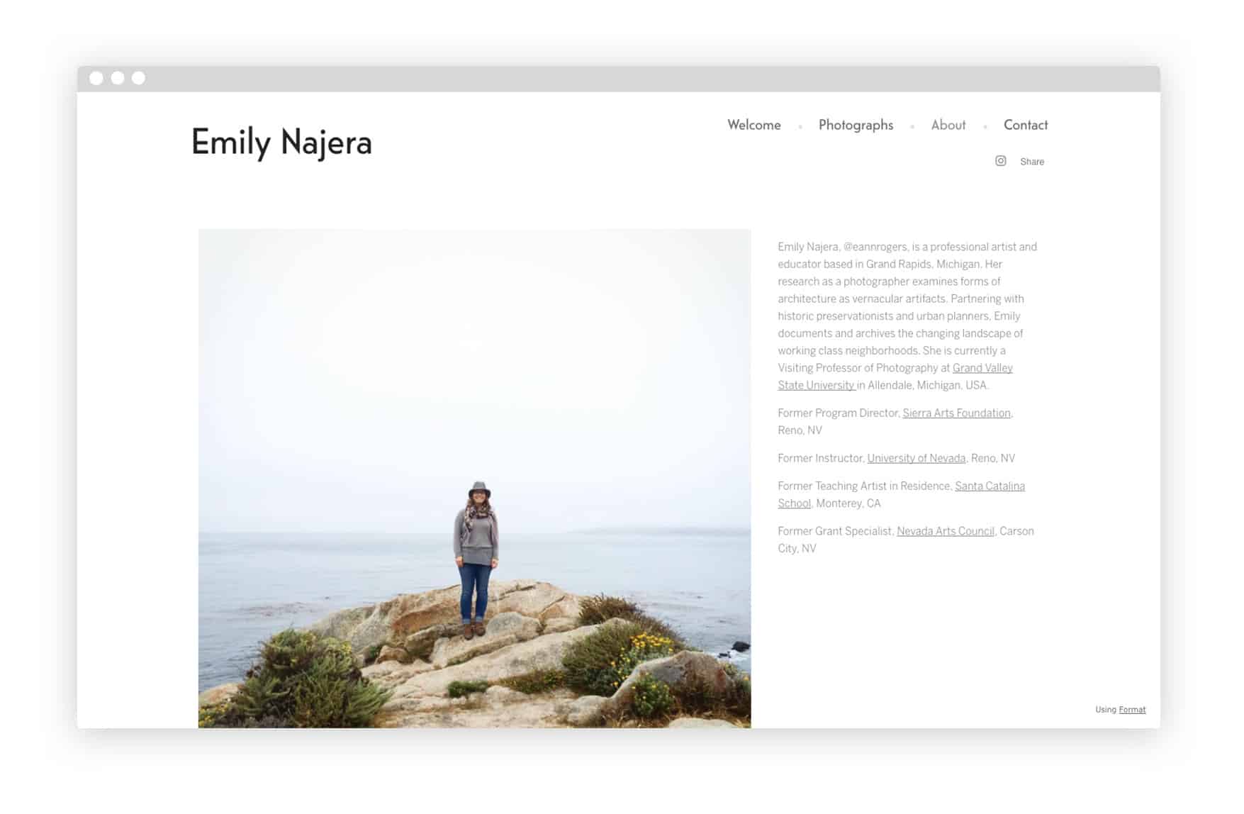
*[www.emilynajera.com](http://www.emilynajera.com/about)*
Add your contact info
Make sure your contact details feature prominently on your site, whether on your about page or on a separate contact page.
Make it clear to visitors what kind of work you do and what opportunities you’re looking for. If you’re looking for a certain type of clients, commissions, or publications, say so! Clearly state what kind of work you are available for, where you are located, and how you can be contacted.
Add links to your social media accounts, if you have accounts that you use for your photography. Don’t add any accounts that you wouldn’t readily share with clients. If your Instagram is more focused on your personal life and you don’t share your photo work on it, you don’t need to link it here. If finding clients is a priority for you as you create your website, you may want to consider creating professionally-oriented Facebook, Twitter, and/or Instagram accounts for your photography business. Adding a LinkedIn link can be helpful if you want to be able to share your professional CV with clients.
Photographer Saesha Blue Ward keeps her contact details clear and easy to find by placing them right under her brief bio on her about page. She’s also made her email address into a clickable link, which is an easy way to prompt people to get in touch. You can do this with your own email by inserting “mailto:” in front of your address (e.g., “mailto:example@gmail.com”).
*[www.saeshablueward.co.uk](http://www.saeshablueward.co.uk/contact)*
Make your photography website discoverable
Make sure the title and description of your site are set up how you’d like them. Many website builders will allow you to edit these aspects of your site from their backend. This is what will show up when people find your website in Google searches or share it on social media, so you want to make sure this info is all correct and easy to read. It’s also a good idea to make sure the open graph image of your site looks the way you want. This is the image that will show up when people share your site on social media, so it’s important to choose one that represents your work well.
Adding keywords to your site to make it indexable by Google is a good idea for photographers hoping to get discovered online. You may want to use keywords that would help potential clients find you, such as “wedding photographer London,” if you’re a wedding photographer based in London. Many website builders will let you add these keywords yourself when you are setting up your site.
Add your rates
Not every photographer needs a pricing page on their website. If you aren’t specifically looking to get paying clients from your site, you don’t need to include your rates. But if you’re a photographer who specializes in weddings, engagements, or portraits, for example, it’s a good idea to have your site include purchase details for these services. You may even want to add an option to book and pay for sessions through your site.
How you list your rates is up to you, and depends on the way you want to do business as a photographer. You may prefer to negotiate rates directly with clients depending on what they’re asking for, or you may find it useful to offer an estimate of how much your services cost. Listing your rates can help you get more targeted business from clients who already know that they can afford your services.
If finding clients is a priority for your photography website, it’s good to consider not only adding your rates, but also including any other information that clients might need. For example, creating specific galleries titled “Engagements” and “Weddings” to showcase your expertise shooting for past clients will help prospective clients get a feel for the kind of work you do. If you’ve shot lots of engagements and weddings, but you stick them all together in the same gallery and just title it “Photos,” visitors to your website will have to scroll through your work to know what you specialize in.
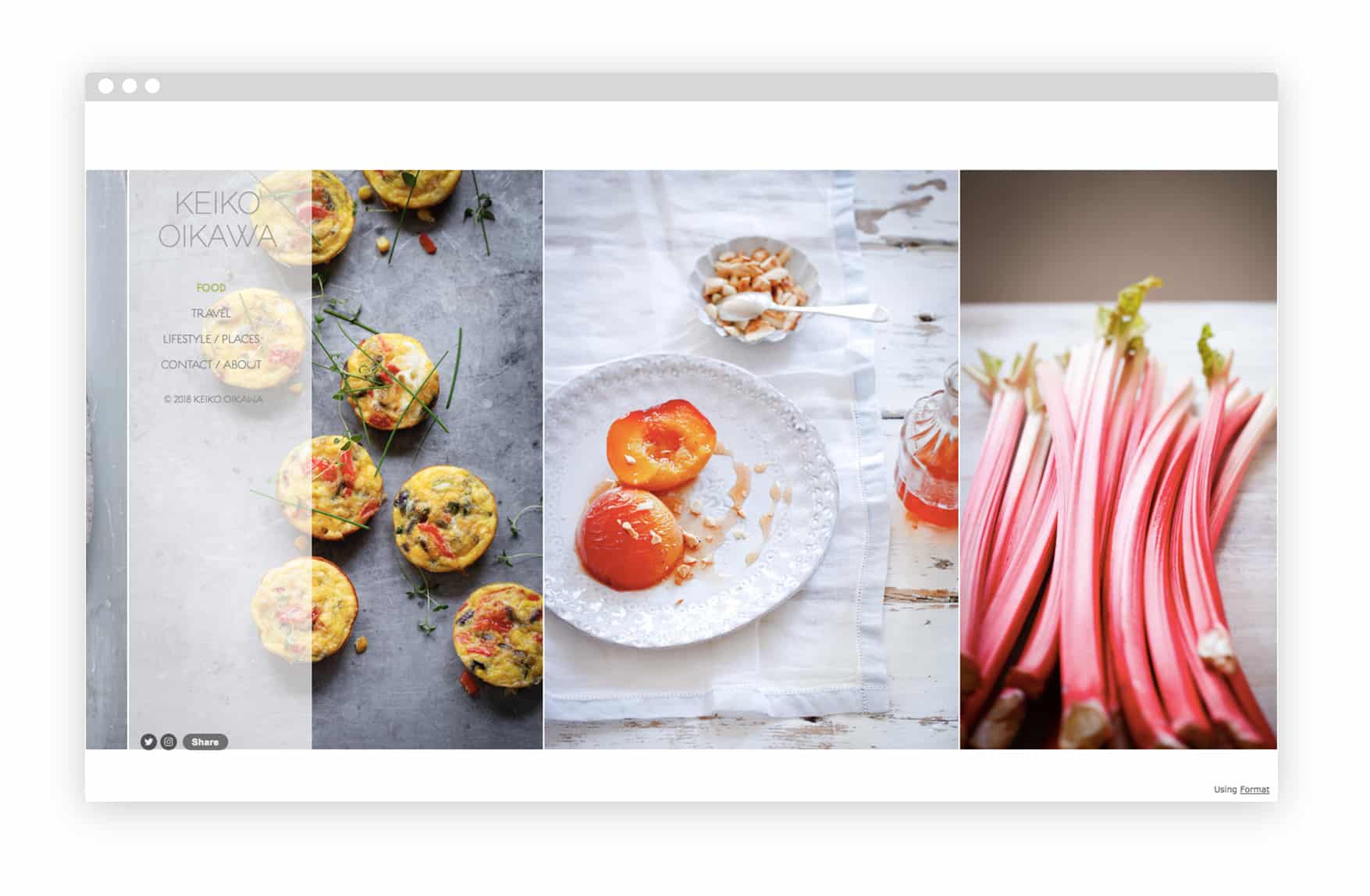
Photographer Keiko Oikawa, who’s shot and styled food for everyone from Nigella Lawson to Marks & Spencer, had her clients in mind when she created her website. Oikawa chose to divide her online portfolio into separate galleries for food, lifestyle, and travel shots, so that clients would instantly get a feel for her photography. “I shoot mainly food, but food is also about different cultures and places,” she says. “It makes sense for me to choose these subjects, but show them separately so that clients can find relevant information.”
*[www.keikooikawa.com](http://www.keikooikawa.com/)*
Sell your work on your website
If you’ve ever considered selling prints of your photos, now’s the time to try it out. Adding a sentence like, “Send me an email if you’re interested in buying prints of my photos” is an easy way to let visitors to your site know that your work is available for sale.
Adding an online store to your website is an even more effective way to get your work out there. Many website builders offer the option of adding a store page to your site, sometimes at no additional cost to you. You may want to check to see whether or not your website platform will take a percentage of revenue from your sales before setting up your store.
You don’t necessarily need to print any photos before setting up an online store—you can always just select a few images you’d like to sell, and add those to your store, with a description of the print sizing and quality that will be available. If someone places an order, you can then make the print for them on demand.
If you already have products you want to sell, like photo books or zines that you’ve printed, Lightroom presets, or any other photo-related item, you can add these to your store. “I always include my absolute favorite photos in my store,” says photographer Jenny Woods. “I try to take a step back from my body of work and ask myself what I would want hung up on my walls.”
Make sure to clearly describe what you’re offering for sale, and state where you are able to ship to and how much shipping will cost. If you’re selling framed prints or photo books, including clear product images and sizing information will help customers get a feel for what’s on offer. In his online store, photographer Gueorgui Tcherednitchenko offers a detailed description of the photo book he’s selling, including images that show the book’s size and give a preview of its contents.
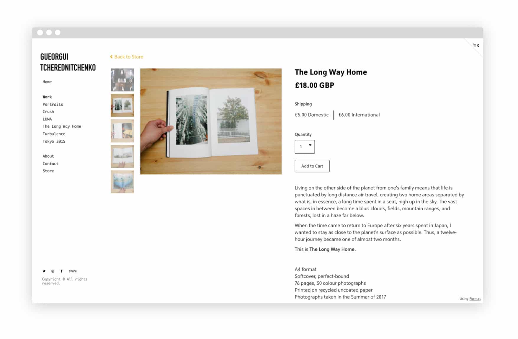
*[www.gueorgui.net](http://www.gueorgui.net/buy-the-long-way-home)*
Do a full review
Make sure your photography website is optimized for viewing on all devices, including phones and tablets. Most website builders optimize their themes for mobile viewing, but it’s still a good idea to check how your finished site will appear on your phone. More than half of web traffic is now taking place on mobile; it’s likely that many visitors to your site will be viewing it on a small screen.
Pay attention not only to formatting basics, but also the way your menu appears, how easy the whole site is to navigate on a phone, and also how your images feel on mobile. Full-screen images which look stunning on a monitor may be overwhelmingly large on a phone. A creative grid layout that you’ve customized for desktop browser viewing might look completely different on a small screen. Take some time to browse through your own website on your phone and ensure that it feels just as easy to navigate, and looks just as good, as your desktop site does.
Next, proofread the text on your entire site. It’s always a good idea to get someone else to do this, too, as it can be easy to overlook your own typos. Check that your spelling and grammar is correct and consistent across every page with text on it, from your website menu to any photo captions you might have. There’s nothing worse than crafting a perfect statement to go along with a photo series, and then publishing it with a glaring typo in the title. Make sure all the text on your online portfolio is just as carefully curated as your photography.
Finally, check your whole photography website for any formatting errors and inconsistencies in design. For example, have you decided to italicize your captions? Make sure each one is italicized. These details may seem minor, but ensuring that the formatting is perfectly consistent across your whole site will also ensure it has a professional and polished feel.
Test any links you’ve included in your photography website, whether they’re links to published work or your social media profiles, to ensure that they are all entered correctly and leading where they should.
Have some people you trust take a look at your finalized site before sharing it with the world. If you’re a student, you might ask classmates and instructors to look over your site. Otherwise, consider showing it to friends, other photographers, and mentors. Ask for honest and critical feedback. Obviously you don’t have to make the changes that other people suggest. But at the same time, it’s important to be mindful of the fact that your online portfolio is ultimately intended for other people, not for you. If everyone who looks at your site finds your artist statement confusing, it may be a good call to revise it. If three of your photographer friends all say that one of your image galleries feels way too long, consider cutting a few images from it.
Photographer Keiko Oikawa recognizes the importance of being choosy when you finalize your website. Although her own photography portfolio is quite extensive, reflecting the quantity of work she’s done for a wide variety of clients, she’s picky about which images make the final cut. “It’s important to be objective,” Oikawa says. “Although I may have personal favourites, those images may not make it to the homepage. I think it’s important to have a clear message on what you would like to convey as a portfolio site.” Keep this in mind as you take a final look at your website.
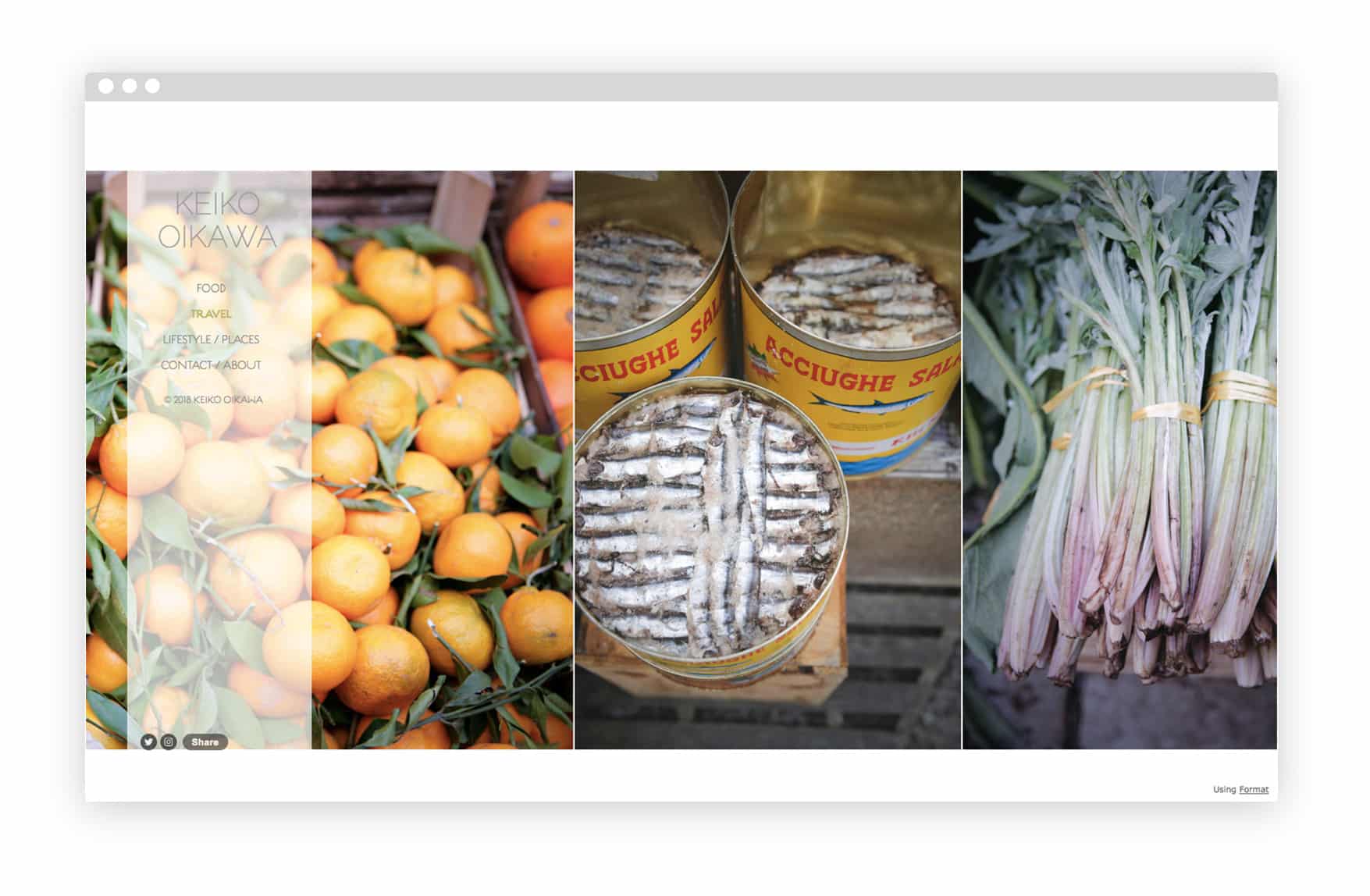
*[www.keikooikawa.com](http://www.keikooikawa.com/travel)*
Keep your site updated
Update your photography website at least once a month to make sure that your newest work is posted, your CV and contact info are up to date, and everything is running smoothly and looks good. Adding your latest projects and publication details to your website helps ensure that anyone who comes across it has the latest information about your photography practice.
Get your work seen
Once your photography website is finished, it’s time to put it out there. Consider putting out the word about your site by sharing it on social media or sending an email to some of your professional contacts. If you’re actively looking for new work opportunities, this is a great way to get your photography on everyone’s radar. If you use LinkedIn, make sure to add a link to your website on your profile.
Now is also a great time to start submitting your photography and making new connections. You might try emailing photo editors with a brief introduction to your work and a link to any new projects you’ve shared on your online portfolio. This list of places to submit your creative work is a good starting point if you’re looking for publications to contact.
Finally, if you use Format to build your website, get in touch to share it with us! We’re always looking for new work to showcase on Format Magazine and on our Instagram.