


Right now, someone is looking at your portfolio on their phone. Maybe it’s an art director in the back of a cab, scrolling through candidates for a shoot. Maybe it’s a gallery owner checking out your work between meetings. Or a potential client lying in bed at midnight, tapping through creative portfolios to find the right fit for their project.
Here’s the uncomfortable truth: over 60% of all web traffic now comes from mobile devices. For creative portfolios shared via social media, email, or messaging, that number is likely even higher. And if your portfolio wasn’t designed with that phone-first moment in mind, you might be losing opportunities before anyone even sees your best work.
The good news? Making your portfolio look stunning on mobile doesn’t require a complete redesign. It requires understanding what breaks, what matters, and where to focus your effort.
Why Mobile Matters More for Portfolios
Most advice about mobile-friendly websites focuses on e-commerce conversion rates and corporate landing pages. But creative portfolios have a different set of stakes entirely.
Your images ARE the product. When a client or curator visits your site, they’re making a visual judgment in seconds. On a desktop, your carefully curated gallery spreads across a wide canvas with room to breathe. On a phone? That same gallery might render as a wall of postage-stamp thumbnails, or worse, a single endless scroll of massive images that take ten seconds each to load.
The people reviewing your portfolio on mobile aren’t casually browsing. They’re making decisions. An art director shortlisting photographers. A brand manager comparing designers. A festival programmer reviewing filmmaker reels. These are high-intent visitors, and the experience you deliver on their phone directly shapes whether they reach out or move on.
Consider where portfolio links get shared most often: Instagram DMs, LinkedIn messages, email threads, text conversations. Every one of those contexts opens on a phone. Your portfolio’s mobile experience isn’t a secondary concern. For many visitors, it’s the only experience.
Where Generic Mobile Advice Falls Short
If you search for “how to make a website mobile friendly,” you’ll find no shortage of generic tips: compress your images, use a responsive template, make your buttons bigger, avoid pop-ups. All valid. But none of it addresses what makes a creative portfolio actually work on a small screen.
Portfolios are unique because:
- Images carry the entire narrative. A photography portfolio doesn’t have product descriptions or blog posts to fall back on. If the images don’t display well, there’s nothing else holding the visitor’s attention.
- Visual hierarchy is the design. The way you arrange, size, and sequence your work tells a story. That story can fall apart completely on a 6-inch screen.
- File sizes are inherently large. High-quality creative work demands high-resolution images. Balancing visual quality with load speed is a challenge that generic websites rarely face at this scale.
- First impressions happen fast. Visitors don’t read your about page first on mobile. They register the first image, the loading speed, and the overall feel in about three seconds.
Understanding these differences is what separates a portfolio that works on mobile from one that merely loads.

How to Make Your Portfolio Look Stunning on Mobile
Here are the changes that actually move the needle for creative portfolios on small screens. None of them require coding. All of them require paying attention.
Start With Your Analytics, Not Your Assumptions
Before changing anything, check how much of your traffic is actually coming from mobile devices. If you’re using Google Analytics, look at the device breakdown for the last 90 days. If 50-70% of your visitors are on phones (and they very likely are), that tells you exactly where to prioritize.
Also look at your bounce rate by device. If mobile visitors are leaving faster than desktop visitors, your site is underperforming on smaller screens. That gap between mobile and desktop bounce rate is your clearest signal that something needs to change.
Choose Themes Designed for Visual Work
Not all responsive themes handle image-heavy portfolios gracefully. A theme built for a blog or a business site will technically resize on mobile, but it won’t present your photographs, paintings, or design work the way they deserve to be seen.
Look for themes specifically designed for creative portfolios. The best ones handle responsive image scaling, gallery grid adaptation, and full-screen presentations without requiring you to manually adjust each element. Format’s profession-specific themes, for instance, are built to center on visuals and adapt to mobile viewports out of the box.
When evaluating themes, pull them up on your phone first. If the demo doesn’t look great on mobile, the theme won’t magically improve with your content in it.
Your work deserves a theme that looks gallery-ready on every screen. Inizia la tua prova gratuita and see how Format’s profession-specific themes adapt to mobile out of the box.
Optimize Images Without Sacrificing Quality
This is where portfolios face their most difficult trade-off. You want your work to look sharp and detailed. But large, uncompressed images can make your mobile site painfully slow. Google and other speed authorities recommend a maximum mobile load time of about three seconds. After that, visitor retention drops dramatically.
A few practical steps:
- Use modern image formats. WebP and AVIF deliver dramatically smaller file sizes at equivalent visual quality compared to JPEG or PNG. Many portfolio platforms now compress images to WebP automatically.
- Lazy loading. Use a portfolio platform that has lazy loading, and enable the setting if it is not a standard setting. Instead of forcing every image on a page to load at once, lazy loading serves images as visitors scroll to them. This makes the initial page load much faster, especially for gallery pages with dozens of images.
- Resize for context. Your original 6000px-wide file doesn’t need to load on a 390px-wide phone screen. Serving appropriately sized images for each device is one of the biggest speed wins available.
The goal isn’t to make your images smaller. It’s to make them load smarter.
Rethink Your Gallery Layout for Small Screens
A three-column grid that looks beautiful on a 27-inch monitor can turn into a confusing mosaic on a phone. The best mobile portfolio layouts embrace simplicity:
- Single-column or two-column grids give each image room to breathe on a small screen.
- Swipe-friendly galleries feel natural on touch devices and let visitors move through your work at their own pace.
- Full-bleed images (edge-to-edge on the screen) can be powerful on mobile, turning a phone into a private viewing experience.
- Fewer images per project page. On desktop, 30 images in a gallery might feel curated. On mobile, it feels like an endurance test. Choose your strongest 10 to 15 and let them carry the story.
If your portfolio platform gives you control over how galleries display on mobile versus desktop, use it. The desktop version and the mobile version don’t need to be identical. They need to be intentional.
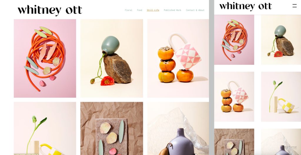
Above: Whitney Ott’s still life & product photography portfolio. Left: desktop view, Right: mobile view.
Simplify Your Navigation
On mobile, every tap is a commitment. If visitors have to dig through nested menus to find your portrait work or your contact page, they’ll leave.
Keep your mobile navigation to the essentials:
- Portafoglio (or your key project categories)
- Circa
- Contatto
A clean hamburger menu works well for portfolios. Avoid dropdown submenus that require precise tapping on a small screen. And make sure your contact information is never more than two taps away from any page. When someone decides they want to work with you, the path from that thought to sending a message should be instant.
Make Text Readable and Minimal
On a portfolio site, your images do the heavy lifting. But the text you do include needs to work on mobile:
- Use a minimum of 16px for body text. Anything smaller forces visitors to pinch and zoom, and once they start zooming, the experience feels broken.
- Keep project descriptions short. Two to three sentences per project is usually enough on mobile. Save detailed case studies for dedicated project pages.
- Ensure strong contrast. Light gray text on a white background might look subtle and refined on a desktop monitor, but it becomes invisible in outdoor sunlight on a phone screen.
If you find yourself writing long paragraphs on your portfolio, consider whether your images should be telling that part of the story instead.
Test Like a Visitor, Not a Creator
This is the step most creatives skip, and it’s the most important one.
Open your portfolio on your phone. Not just a quick glance. Spend five full minutes actually using it:
- Can you find a specific project within 10 seconds?
- Do images load quickly, or is there a visible delay?
- Can you read all the text without zooming?
- Does the gallery feel natural to scroll or swipe through?
- Is it easy to get to your contact page or email?
Then hand your phone to someone who has never seen your site and ask them the same questions. Their experience is much closer to what a potential client will feel than yours ever will be. You know where everything is. They don’t.
Test on both iOS and Android if possible. What looks perfect on an iPhone might have layout quirks on a Samsung Galaxy browser, and vice versa. You can also run your site through Google’s PageSpeed Insights for a technical health check on mobile load times.
Your Quick Mobile Portfolio Checklist
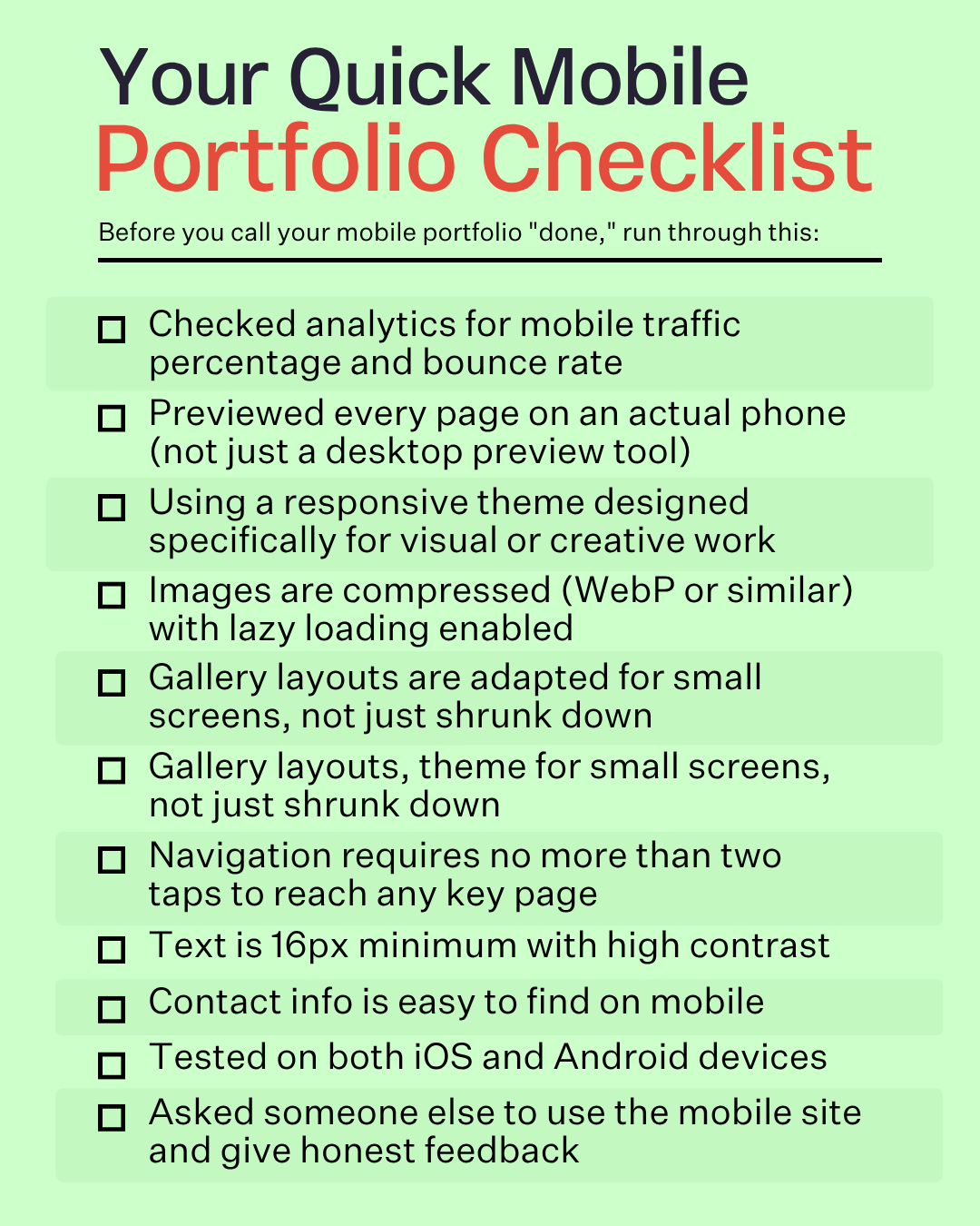
Before you call your mobile portfolio “done,” run through this:
- Checked analytics for mobile traffic percentage and bounce rate
- Previewed every page on an actual phone (not just a desktop preview tool)
- Using a responsive theme designed specifically for visual or creative work
- Images are compressed (WebP or similar) with lazy loading enabled
- Gallery layouts are adapted for small screens, not just shrunk down
- Navigation requires no more than two taps to reach any key page
- Text is 16px minimum with high contrast
- Contact info is easy to find on mobile
- Tested on both iOS and Android devices
- Asked someone else to use the mobile site and give honest feedback
What a Mobile-Ready Portfolio Does for Your Career
Making your portfolio work beautifully on mobile isn’t just a technical improvement. It changes how people experience your work at the moment that matters most.
A fast, well-designed mobile portfolio means:
Stronger first impressions. When an art director opens your link on their phone, they see your work the way it deserves to be seen. Not pixelated. Not slow. Not confusing.
Lower bounce rates. Visitors who can navigate easily and watch images load quickly are far more likely to stay, browse deeper, and reach out.
Better search visibility. Google uses mobile-first indexing, meaning it evaluates the mobile version of your site when determining search rankings. A mobile-friendly portfolio doesn’t just look better. It performs better in search results. For more on building a portfolio that works for you, take a look at these tips for designing your online portfolio.
More inquiries. When the path from “this work is impressive” to “let me contact this person” is frictionless on mobile, more people make the leap.
Your portfolio is your visual calling card. It’s how you validate your practice to people who have never met you. Making sure it looks stunning on the device where most of those first encounters happen isn’t optional anymore. It’s simply the professional standard.
If you’re starting from scratch or thinking about refreshing your setup, exploring portfolio examples from working creatives can help you see what a polished mobile experience looks like in practice.
Your visual calling card should shine on every device. Build your portfolio free with Format and show up as the professional you are, everywhere your link gets opened.