
Creatives, Adobe Illustrator, Vector, Illustration, Composition
Coming up with ideas and having an efficient work process is key to being a successful creative. There is no time to sit and wait for inspiration, and even when you do have an idea it's often hard to juggle multiple projects at once. I will be giving tips on what to do if you find yourself stuck in the creative process in a series called Stuck Illustrator Rescue Tips.
Stuck Illustrator Rescue Tip 2: Composition
In my graphic design based illustration style, composition is the most important ingredient after the concept. Once I’ve decided how I am going to visualise an idea, it’s all about looking for the best composition possible.
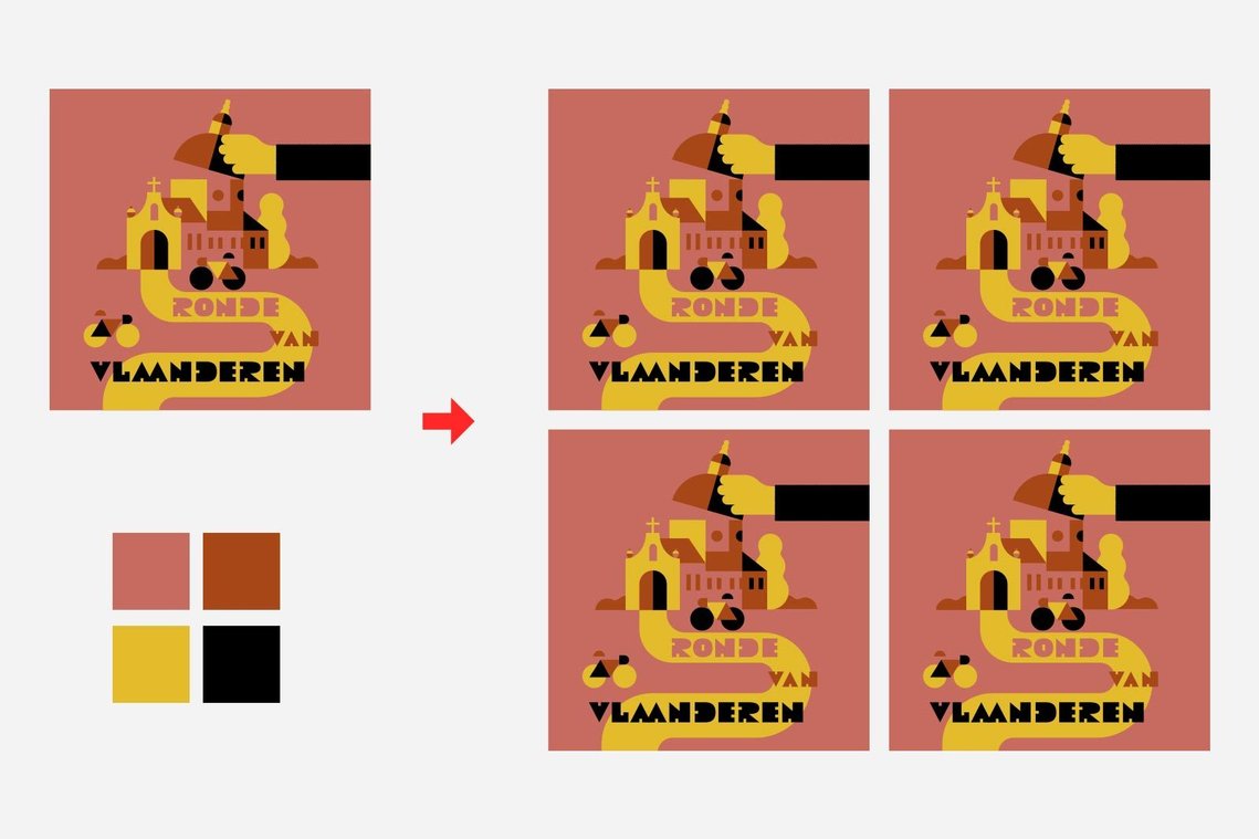
Usually defining the composition is part of the sketch process, so I will be working on the concept and the composition simultaneously. But other times, the sketch is a very loose doodle and most of the composition happens digitally. I spend a lot of time moving shapes around, because with a restricted colour palette I can’t allow for too many of the same colour shapes to touch. On the other hand, breaking this rule sometimes creates interesting results. One of the main things I look for in my compositions is the contrast between big and small objects and a consistency in stroke widths. A composition gets more interesting when you combine smaller and bigger objects, but I don’t like it when this contrast gets too big. Same goes for lines in my artwork. I make it a rule that all the strokes within one illustration have the same width, sometimes adding a second stroke weight when needed. Working with a restricted colour palette puts emphasis on the composition. One way to check where the weak spots in my composition are, is by doing quick colour separations. With a four colour palette, it's not too much extra work and you'll quickly find where you need to touch up your composition and it helps to objectively look at the contrast of the used elements and overall rhythm of your composition.
Here's how to do it in Adobe Illustrator:
Duplicate your artwork and expand all type and strokes to outlines, this makes colour selection easier. Duplicate again according to the number of colours you're using. Group each separate duplication. Double click to open the group and select all. Now subtract one colour from your selection by using the magic wand tool holding the Alt key (for subtract). Make your selection white. You now have separated the first colour. Repeat for the other colours and bring down the Magic Wand tolerance if your colours are too close for the magic wand to select it seperately.
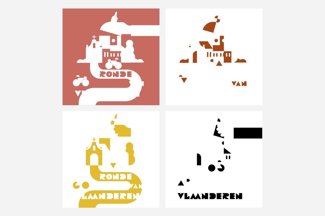
I can now objectively look at what's happening in my composition taking it one colour at the time. What I am looking for is anything that's off, one area that's busier that the others, one colour that'stoo dominant, isolated bits and shapes that are too small. What I want is an overall composition that has a certain rhythm to it.
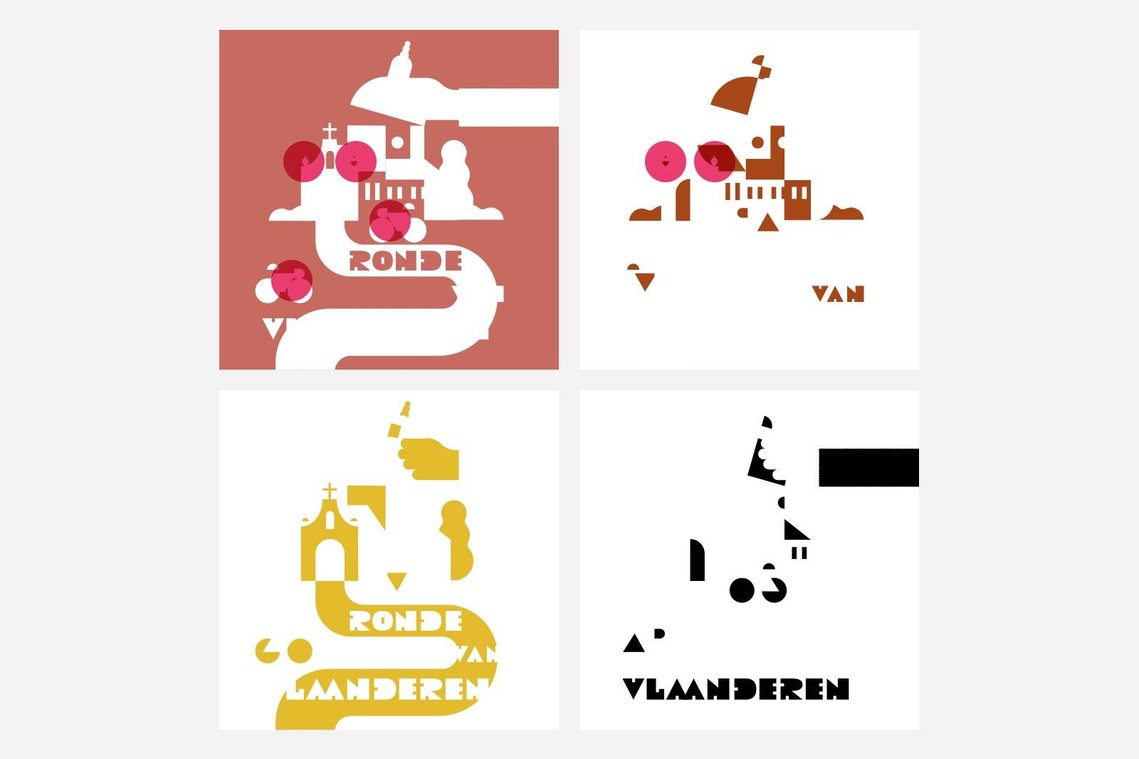
In this case the little ornaments on the wall in the chapel look too small and I think it will help the composition to make those objects a little bit bigger. I also don't like the negative shape on the bicycles, it is too thin a triangle to fit nicely with the rest of the composition so I will be touching that up as well.
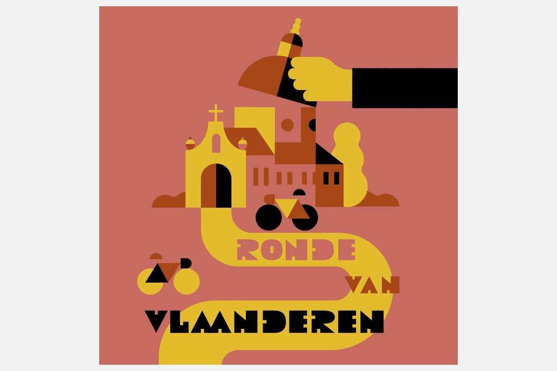
Using this trick allows me to distance myself from the artwork I've been staring at for hours and look at it with fresh eyes. In the same way you can mirror or rotate your artwork to see where your composition could improve. Hope this helps! Let me know what you do to achieve the best composition in your illustrations.
Wijtze Valkema is a commercial illustrator who believes in creating upbeat illustrations in a grey world. Connect with him at wijtze@gmail.com or on Twitter @wjitze