Filip Koludrović Doesn’t Want You to See Everything at Once
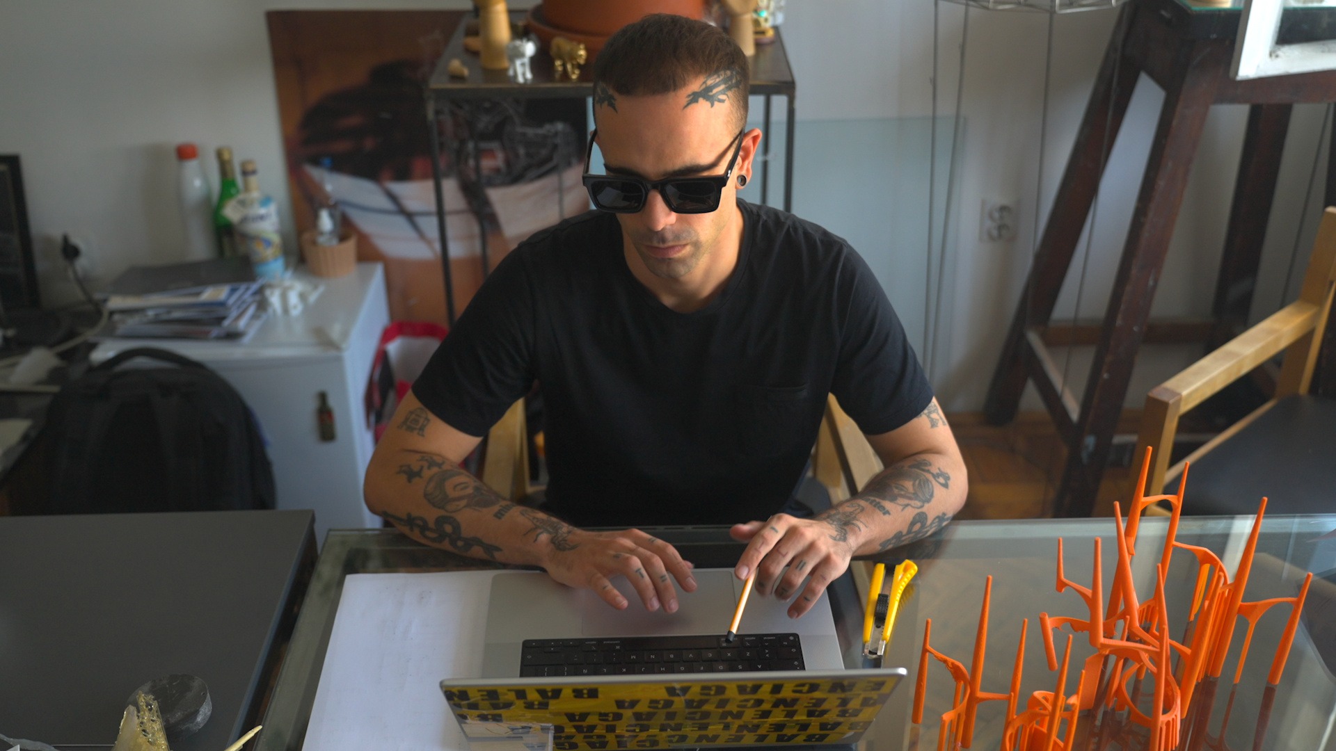
Filip Koludrović has shot for Vogue, Numéro and the Wall Street Journal, and he launched Vogue Adria as its founding creative director. But the work he cares about most holds something back. We sat down with the Croatian fashion photographer to talk about the AI photobook that never admits it’s AI, his move from camera to scanner, and the Flex Block redesign that turned his Format portfolio into a place to explore rather than a page to skim.
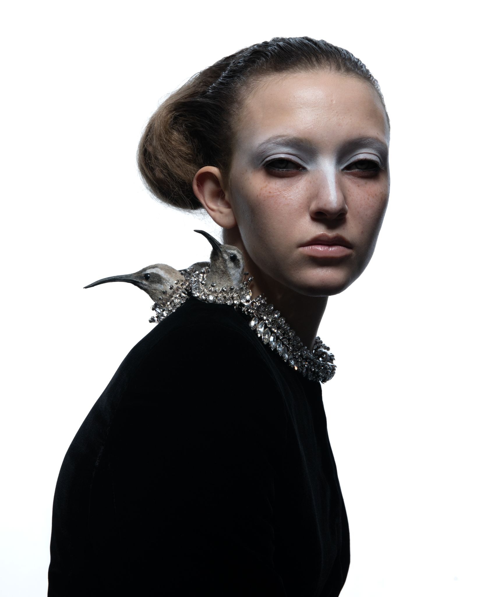
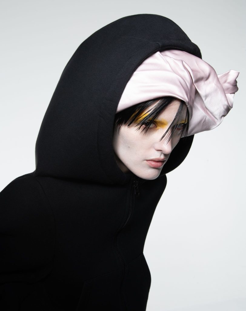
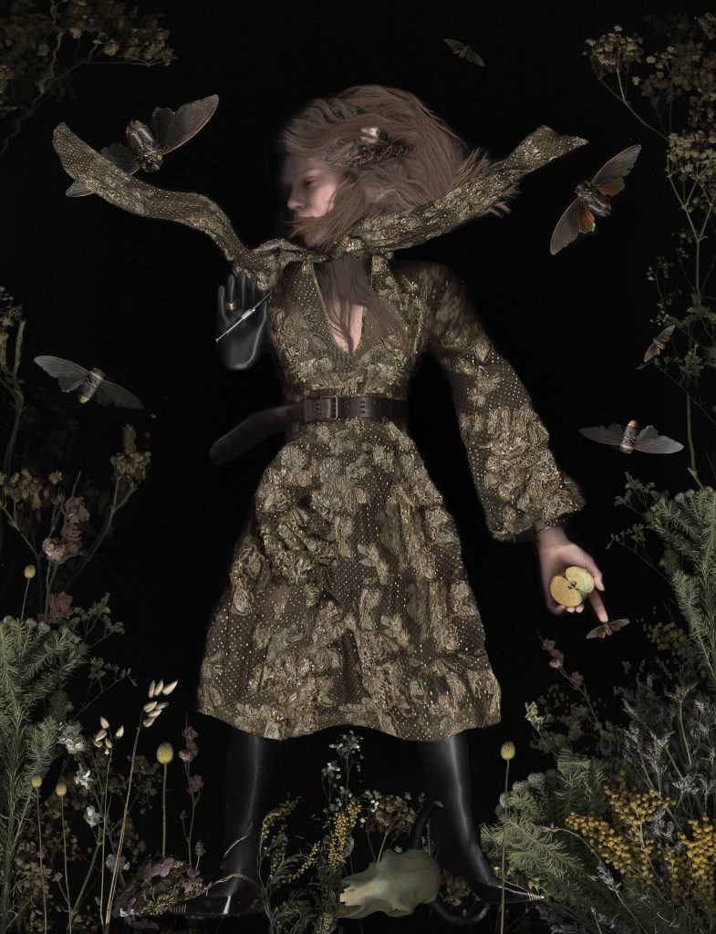
Filip Koludrovic for Schiaparelli
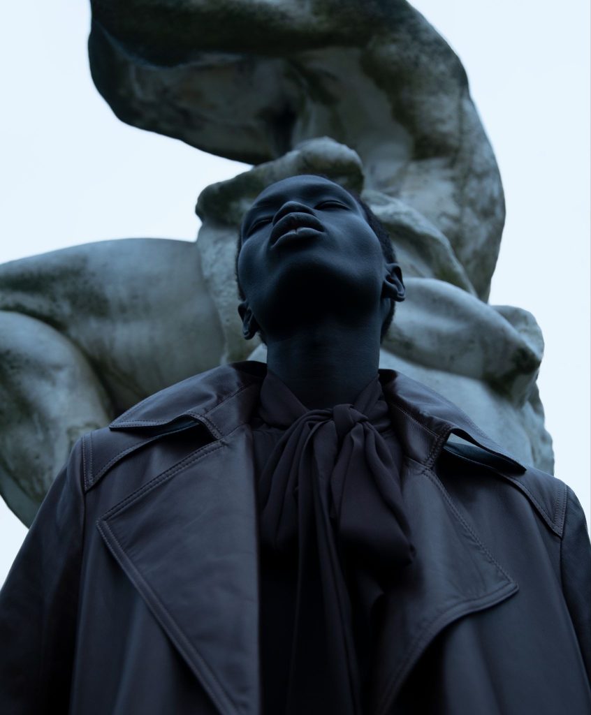
There’s a version of Filip Koludrović’s career that reads like a checklist. He’s shot for WSJ, Vogue, Numéro, and GQ, and he’s photographed projects for Chanel, Hermès, Gucci, Céline, and Givenchy. The British Fashion Council nominated him as a “Next Generation Creative” in 2022. As founding creative director of Vogue Adria, he shot the magazine’s debut cover, model Nataša Vojnović in an archival Alber Elbaz piece. That version is accurate. It’s also the least interesting way to describe him.
Talk to Koludrović for five minutes and a different picture emerges. He thinks in fragments and rituals, and he scans dead pigeons and museum coins with the same reverence he brings to a Schiaparelli couture shoot. He also believes a portfolio, like a good magazine spread, should make you work a little to see everything. “The more we make it specific, the more it makes you want to explore,” he says of his design philosophy. “I think it’s more interesting rather than you get too much available for you immediately.”
That instinct toward mystery over disclosure runs through everything Koludrović makes, from his black-and-white portraiture to the strange, self-published AI photobook he built in 2023 to the redesign of his own portfolio, which just relaunched on Format.
From Croatia’s North Coast to Vogue Adria
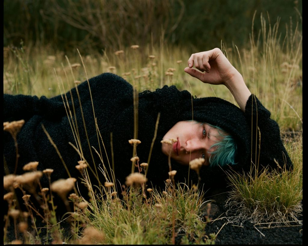
Koludrović grew up on Croatia’s northern coast, near the Italian border, with an analog camera that never left his side. He bought his first digital camera at sixteen and gravitated immediately toward black and white. He enrolled at the Faculty of Architecture before photography pulled him away entirely, a detour that shows up in his work as a persistent interest in structure, negative space, and the geometry underneath an image.
That structural eye is part of what’s made him equally in demand behind the lens and behind the concept. He’s photographed for some of fashion’s most recognizable mastheads, and he joined the founding team of Vogue Adria as creative director. The newest regional edition of Vogue, it covers Bosnia and Herzegovina, Croatia, Montenegro, Serbia, and Slovenia. It’s a rare dual credential, being both the photographer e the person shaping how an entire magazine looks and feels, issue to issue. “You had to do a lot of things by yourself, so you were very hands on,” he says of the role. “You had to come up with all of the shoots yourself, and sometimes even the
scenography, sometimes hair, sometimes all these things. It was really interesting to unlock this world where you can play with these things and connect people, photographers and set
designers and everyone, and bring them together into one conversation under one team.”
One of his favorite examples of that dual instinct at work is a story for Numéro built around the seven deadly sins, each one cast through a fashion house. Gluttony went to Versace. Greed, “because it’s very golden,” went to Balenciaga. It’s the kind of concept that only works if the person holding the camera is also the person deciding what the whole story means.

Una guida per migliorare le vostre abilità fotografiche
Migliorate la vostra fotografia con la nostra guida gratuita. Ottenete l'accesso esclusivo a suggerimenti, trucchi e strumenti privilegiati per perfezionare il vostro mestiere, costruire il vostro portfolio online e far crescere la vostra attività.
Ricevi il meglio della rivista Format nella tua casella di posta elettronica.
I Have Never Been to America: An AI Photobook That Never Says It’s AI
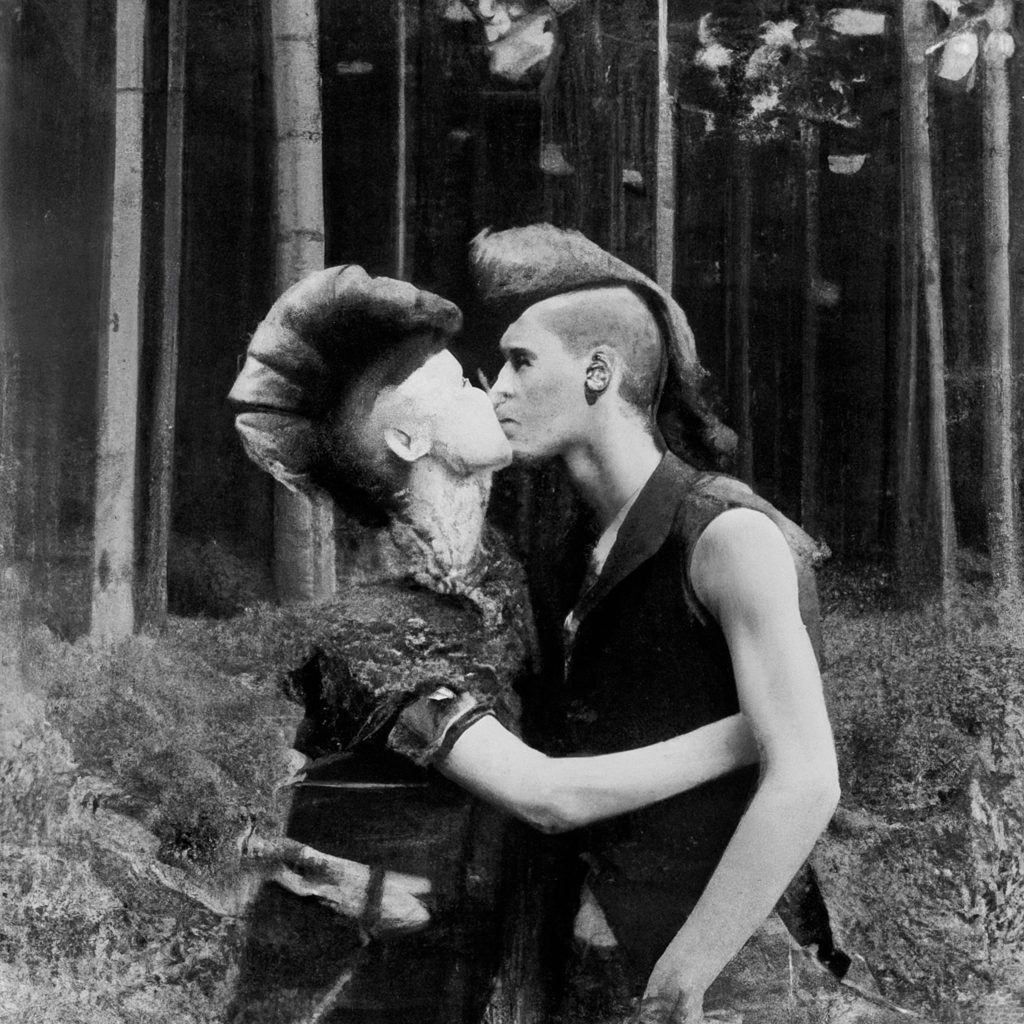
In 2023, Koludrović self-published I Have Never Been to America, a photobook built entirely from AI-generated imagery, made before AI tools could reliably render a human hand. He had never set foot in the United States. Instead, he built a fictional 18-year-old’s three-month diary of a trip that never happened, working purely from the version of America he’d absorbed secondhand through screens.
The book is structured like a bible, bound in the kind of canvas used for the ones left in hotel rooms, with an American green card printed into the cover in place of gilded scripture. Every image was prompted as “analog,” so the early photographs read as real film. Koludrović wrote the first chapter himself; the final chapter was left entirely to AI. In between, he lifted language wholesale from idealized descriptions of American civic life, “everybody deserves a lawyer, everybody is equal before the law,” and let the book curdle that promise into its opposite: addiction, police violence, a country’s gap between what it says about itself and what it is.
“This book doesn’t say at any point that it’s AI,” he says. “If you get this book without the context, you will not know what it’s about.” V Magazine called it a work that pioneered a new field in literature.
Scanography: Photography Without a Camera
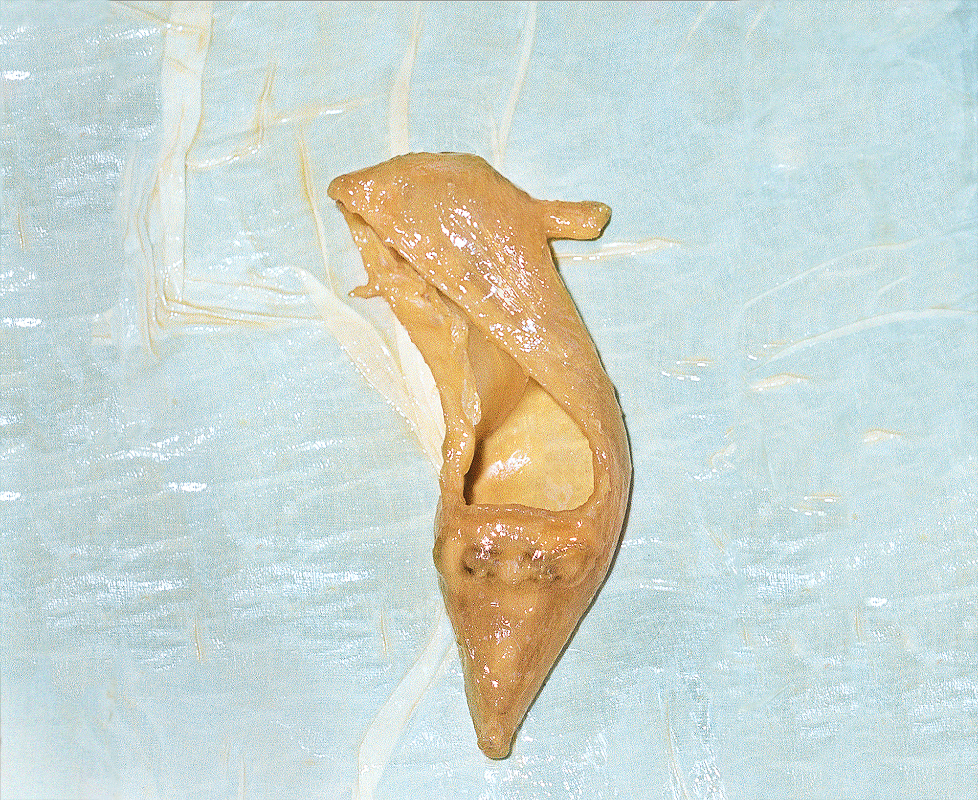
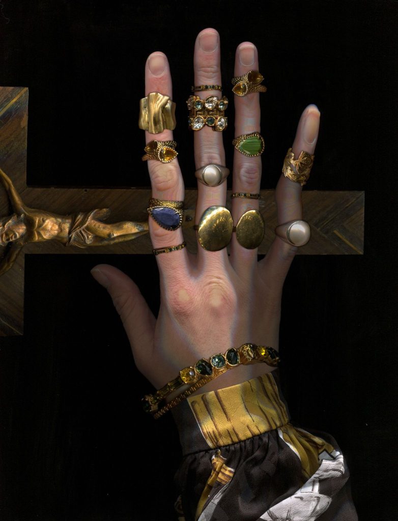
Koludrović’s newest body of work trades the camera for a scanner, and it’s less a departure than a continuation of the same obsession with detail hiding in plain sight. He’s been scanning religious artifacts, museum pieces, and full-body portraits at extraordinarily high resolution, flattening his subjects into something closer to specimen than photograph. One image, built from dozens of individually scanned garments and figures, can be explored at a scale that turns a single frame into something closer to a wall-sized painting: the kind of image you could walk toward the way you’d approach a canvas in a museum, discovering new detail the closer you get.
The project is developing into an exhibition, though Koludrović is intentionally keeping most of it under wraps for now. “I don’t want to show too much,” he says, “in a way that it stays a little bit mysterious.”
Inside the Redesign: A Flex Block Portfolio Built for Discovery
Koludrović’s Format site just went through a full redesign built on Flex Block, and the new version says as much about how he thinks as any single photograph does.
Format has been with him from the start, well before this redesign. “What mostly attracted me to using Format in the first place was just this freedom of not being burdened by this mathematical part, which is doing the HTML coding and really needing to know everything that comes with designing something that really speaks of you,” he says. “It was great for me to just jump directly into something that’s visual, that’s designing, that’s really being hands-on with design.”
What Flex Block added, he says, was room to keep going. “For years I was kind of stuck in something that I was using and I was pretty happy with it, but then I didn’t even think that maybe there is more possibilities. It was like having a little sandbox, some kind of paper in front of you and your photographs are there, and you can just resize them and move them and juggle them as they go. It really unlocked some new features that now I feel it feels even more like my website.”
The Homepage Is an Artwork, Not a Menu
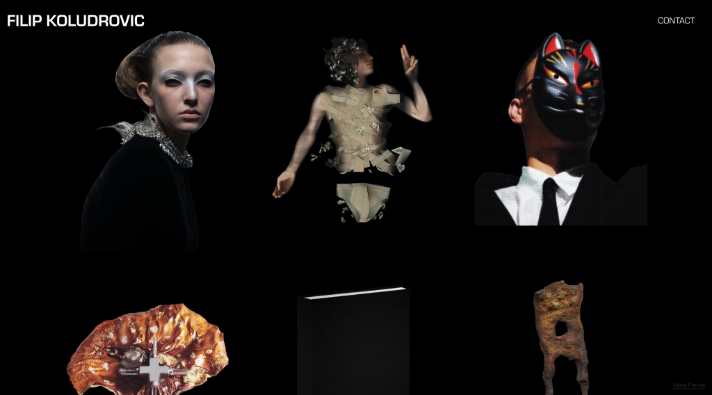
Instead of a conventional nav bar, visitors land on a rotating, star-shaped piece with five icons set into it: Photography, Scanography, Creative Direction, Book, and Personal, each one a small custom mark rather than a text label. “I love this idea that there is some very strong kind of graphic star,” Koludrović says, “and I like that inside of the star there is some kind of a universe, because I like that it’s very empty. There is absolutely nothing on it. I feel like it’s some kind of a portal, or a passageway that allows you to enter into somebody’s universe.” Nothing announces itself as a menu. It reads first as a piece of visual work, something to look at, and only on closer inspection reveals itself as a way in. There’s no name on the page until you’re already inside; Koludrović deliberately stripped his own byline from the landing screen. The logic: if you typed the URL, you already know whose site this is. Arriving somewhere unlabeled and a little abstract invites you to engage with it rather than scan it, to discover what it does instead of being handed a map on arrival.
Icons That Behave Like Objects
Koludrović describes them less as navigation than as things you’d find in a room: “Maybe there is this little drawers that you can enter, or maybe there are some kind of items on the table, and each item on the table that you touch leads you to a different branch of the creativity that you have. So it can be something that is more physical, something that is a moving image, a still image. I like this idea that you enter, then maybe like a video game, you come to this table, this menu, and you can be curious and discover what each of these items would mean.”
A Custom Layout for Every Section
The Book page runs as a slideshow instead of a grid, staged to look like the book is resting on a lit worktable rather than floating in a browser window. The Scanography section is built to let images run oversized and largely alone, because the entire point of the work is scale: a single scanned piece should be able to fill the screen the way it would fill a gallery wall. His Personal page, still in progress, is being built as a loose, tabletop-style collage, some images tiny, some huge, some overlapping, a deliberate contrast to the discipline of his commercial work.
Precision Down to the Crop
Koludrović was specific about wanting his section icons cropped sharp against their background, with no shadow or gap between the image and its frame, a small, easy-to-miss decision that says a lot about how exacting he is about presentation, even in a five-pixel icon nobody will study for more than a second.
Typography With an Editorial Eye
He gravitated toward Eurostile Black and Simplicita Pro, the same bold, structural, minimal-but-strong type families he used for cover lines during his time at Vogue Adria. “My work is very graphic,” he explains. “If it’s a color, it’s one or two colors. I think something like this would not swallow it. It wouldn’t be too aggressive.”
The result is a portfolio that behaves less like a résumé and more like the work itself: considered, a little withholding, and built to reward a second visit. “I want us to create a website that’s interesting to visit,” he says, “and then come back and see it again.”
In His Words: Why he Recommends Format
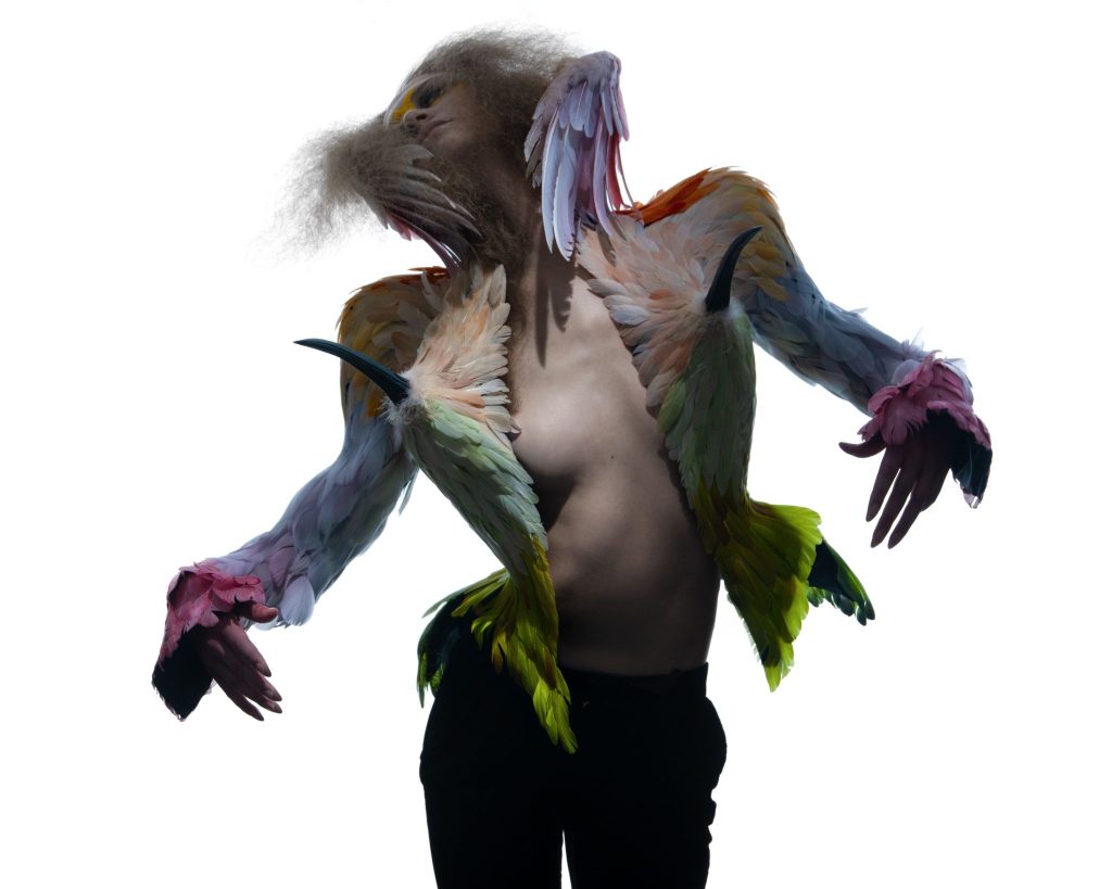
“Honestly, I’ve been recommending Format for a few years now already. Whenever I did some kind of portfolio checks at different photography festivals, or we were doing these projects for universities and students would come to me for portfolio reviews, whoever asked me what is the best way to set up a website as a young professional, I was always just telling them Format. It was something I was using long before this collaboration, and it’s just something I authentically believed was great for me, easy to use, and a great way to represent yourself as a visual person.” — Filip Koludrović
What’s Next: New York
Koludrović is moving to Manhattan, on the border of Chinatown and Soho, alone, in an apartment he calls, happily, “not a shoebox.” It’s a fitting next chapter for someone whose entire visual language is built around the pleasure of discovery: he’s arriving with more curiosity than plan. “I just want to be there and see as much as I can,” he says. “I don’t want to plan too much. I want to get there and see where it’s going to take me.” He already has people to land among, friends and collaborators scattered across the city’s creative world, stylists, set designers, architects, game designers, and describes the move less as a destination than an opening. “I’m so happy,” he says. It’s the same instinct that shapes his homepage, his portfolio, his whole body of work: don’t show everything at once. Let the next thing stay a little bit unknown, and go find out what it is.
Costruite il vostro portafoglio con Format
Il costruttore di portfolio online #1 è stato valutato da artisti e creatori.
Costruite il vostro portafoglio con Format
Il costruttore di portfolio online #1 è stato valutato da artisti e creatori.