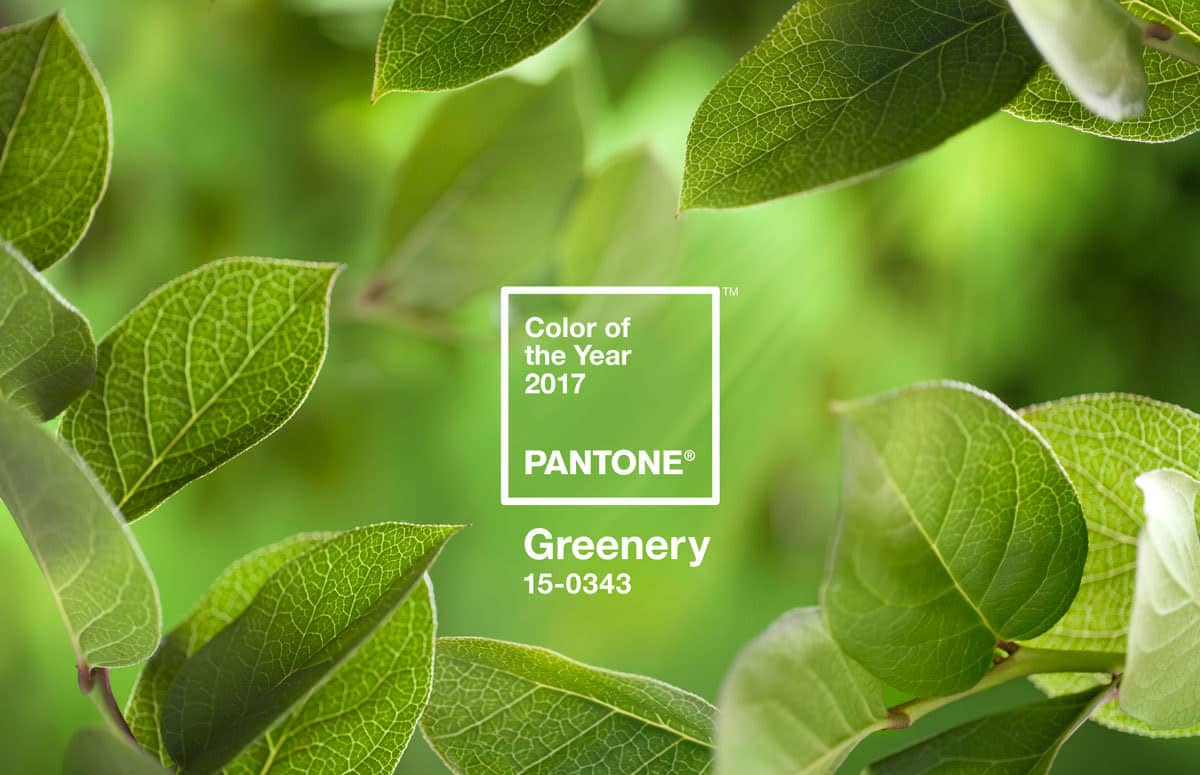
Pantone has just anunciado their color of the year for 2017. It’s called “greenery,” and it’s “symbolic of new beginnings,” according to the Pantone Color Insitute.
In 2016, Pantone chose two colors: rose quartz and serenity, citing increased gender equality and fluidity as their inspiration. This year’s choice also seems to have a political influence. Color Institute Director Leatrice Eiseman says greenery offers “the reassurance we yearn for amid a tumultuous social and political environment.”
In the United States, the political climate is definitely fraught with widespread Black Lives Matter protests and the controversial election of Donald Trump. Over in Europe, the ongoing refugee crisis and the turmoil of Brexit contribute to social turbulence. The time seems very nigh for a “life-affirming shade,” as Pantone puts it.
In another light, the color is referencing the green living trend—which certainly isn’t new, but continued to grow this year. With environmental concerns increasing, and many people seeking refuge from the constant demands of their smartphones, the idea of returning to nature is becoming increasingly appealing.
Is greenery really that natural, though? Co.Design’s blog calls greenery an “artificial-seeming yellow-green.” We agree that there is something a bit artificial about the shade. On its own, it’s reminiscent of fake houseplants, artificial turf, and tennis courts. But how are artists and photographers using the color?
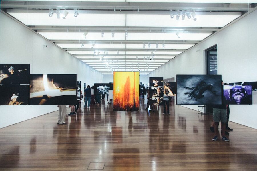
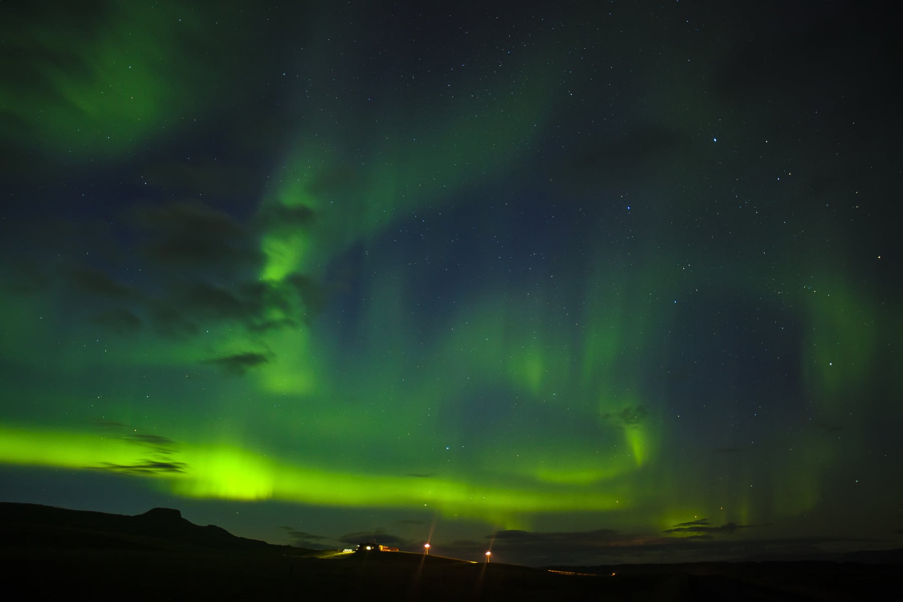
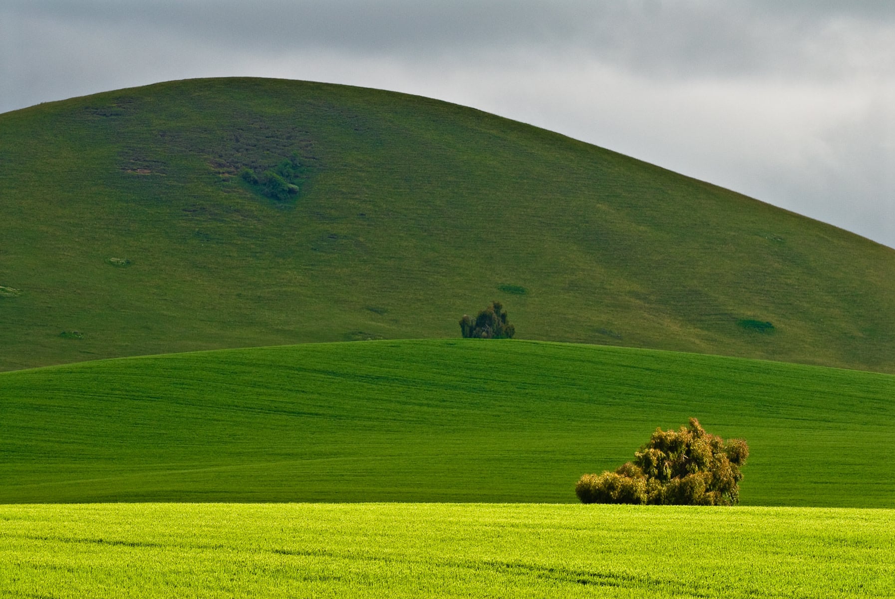
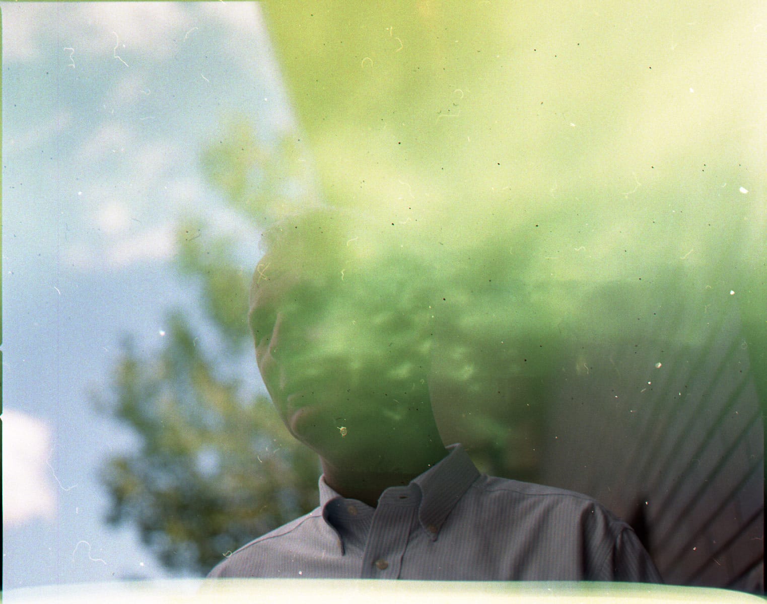
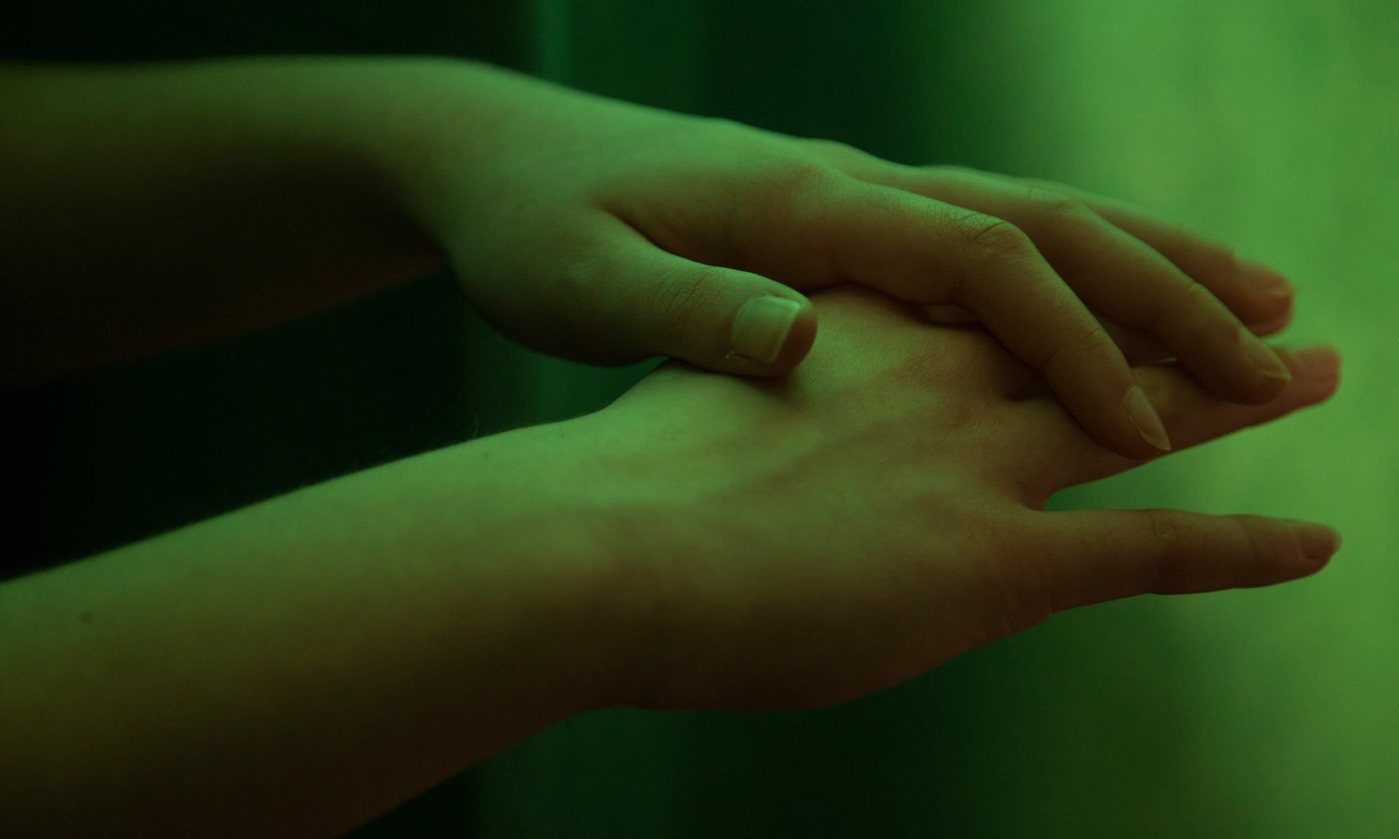
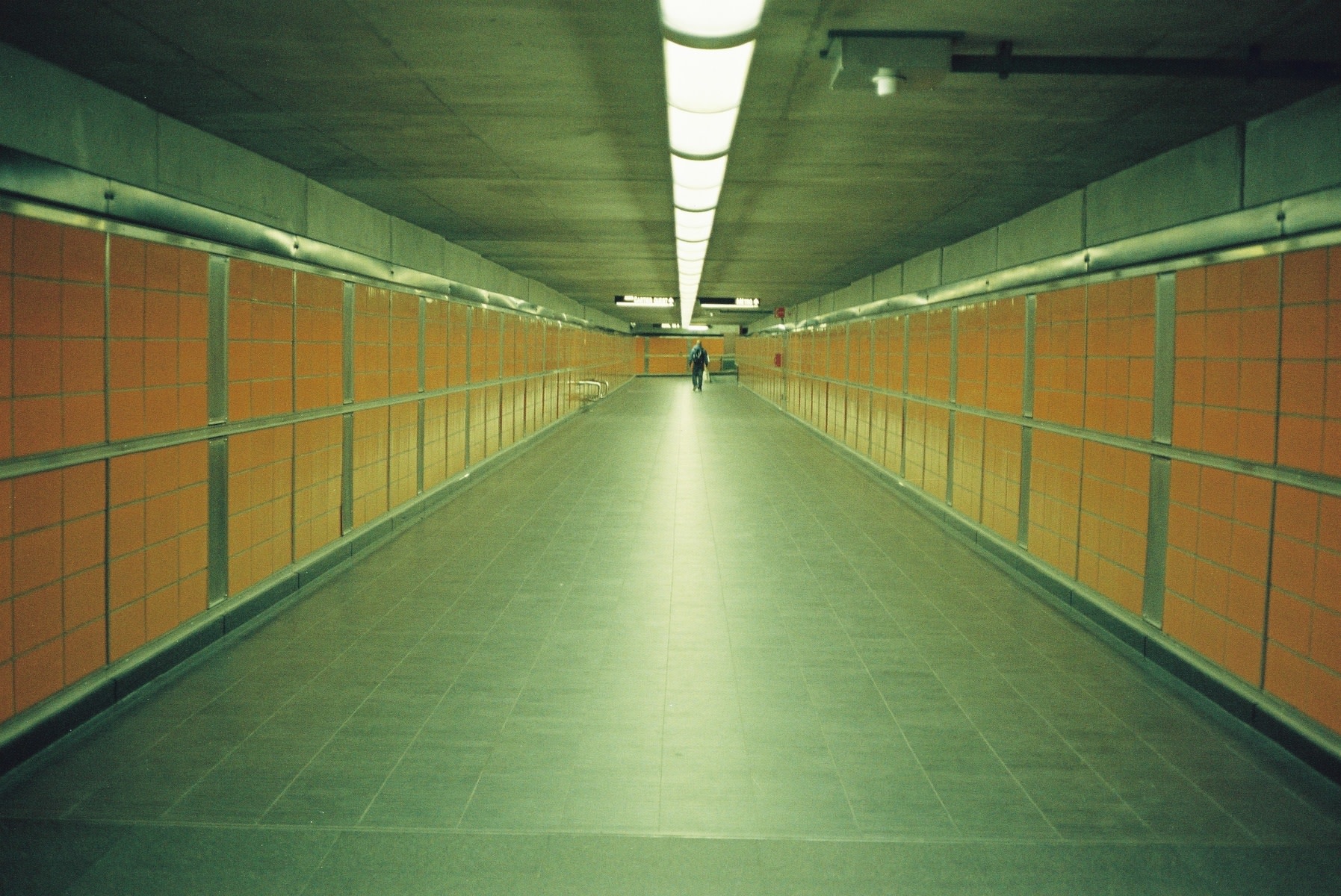
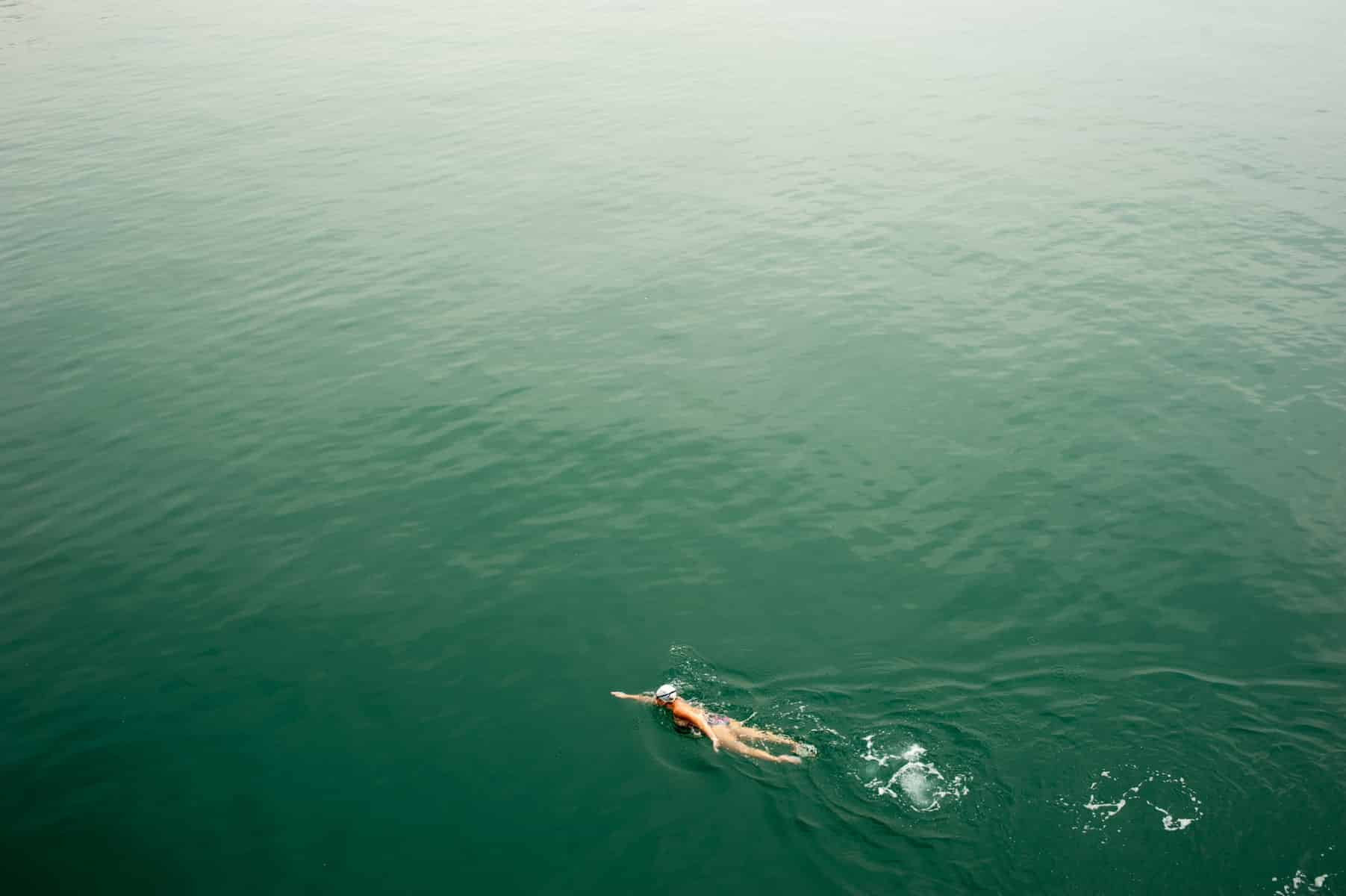
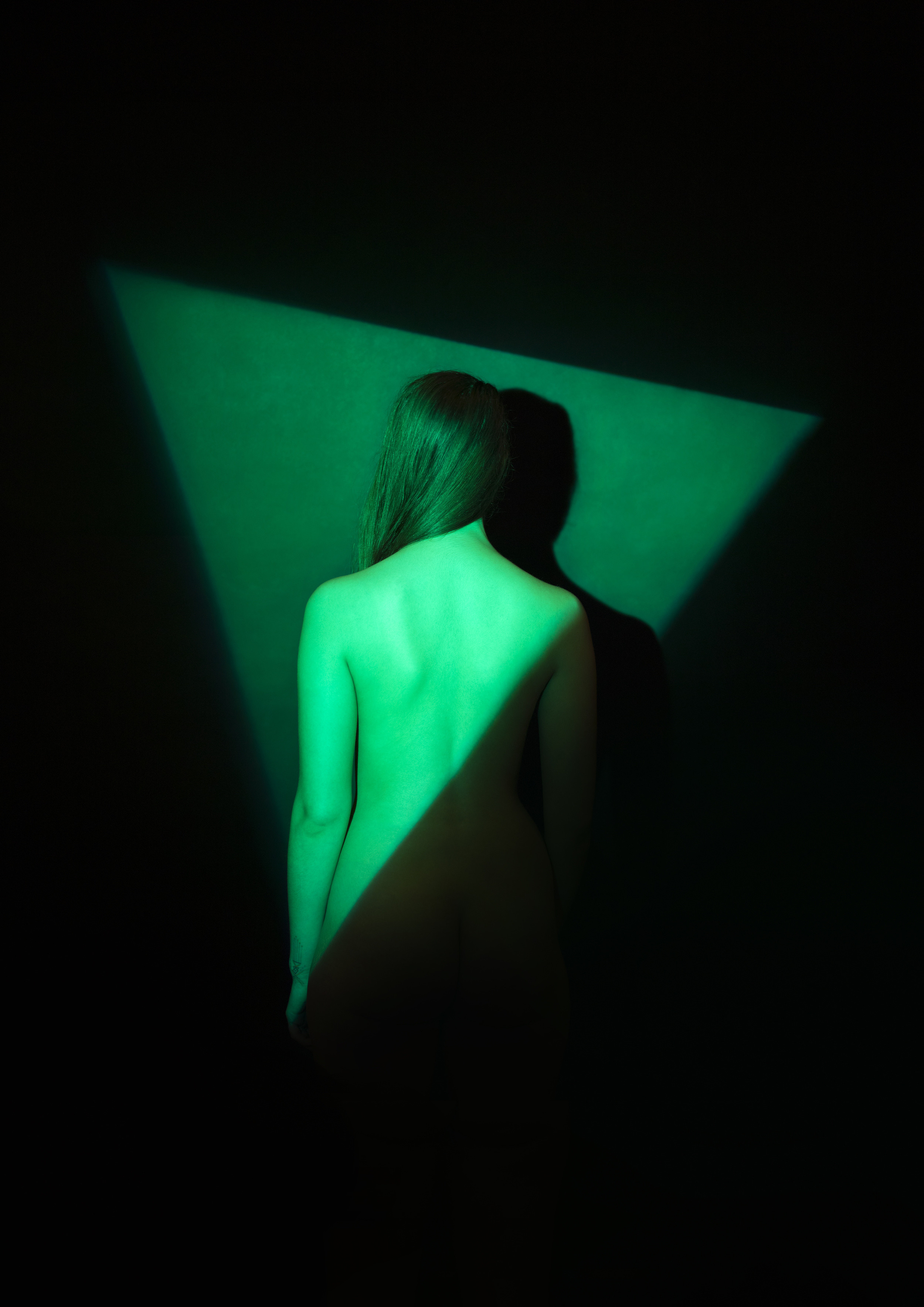
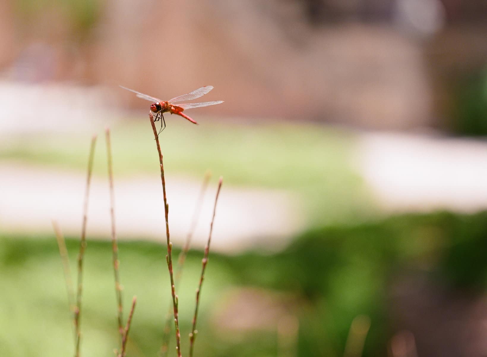
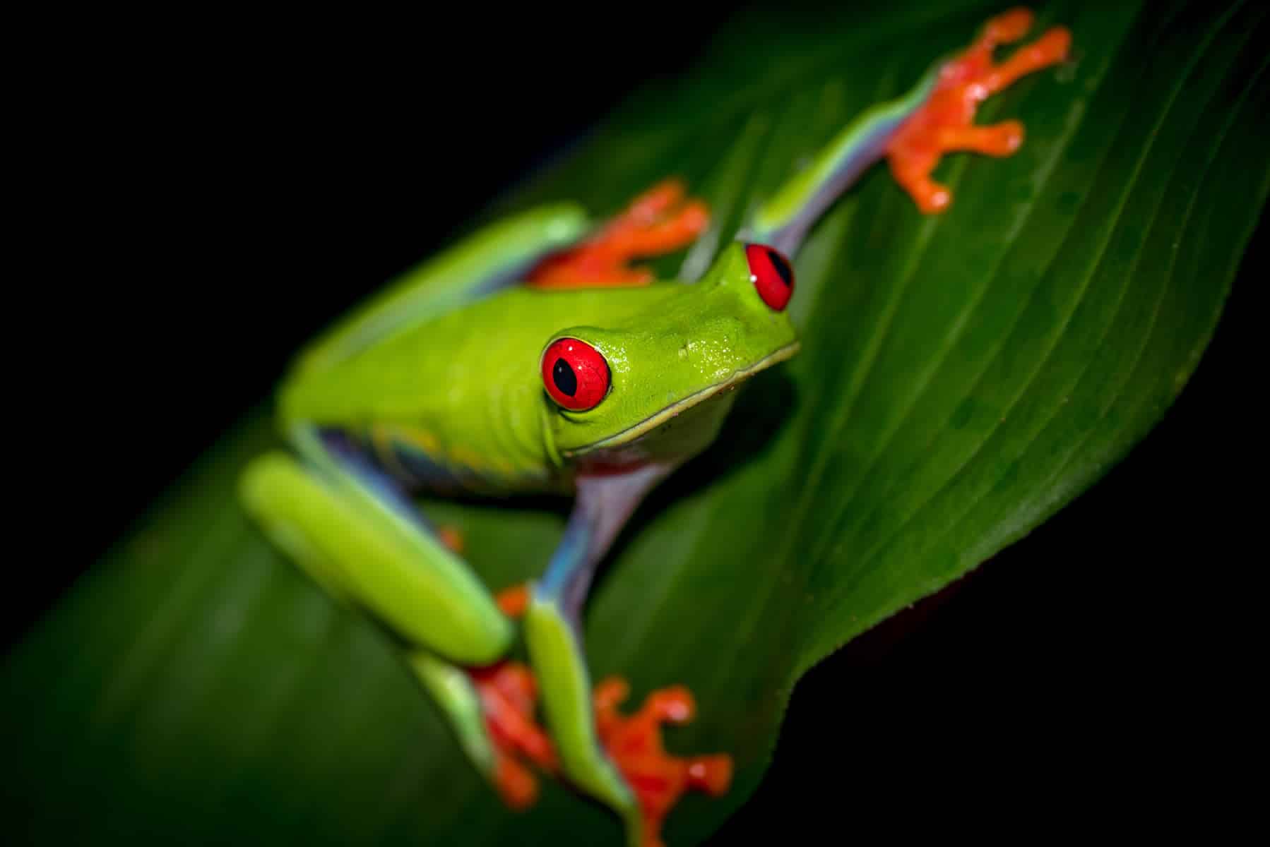
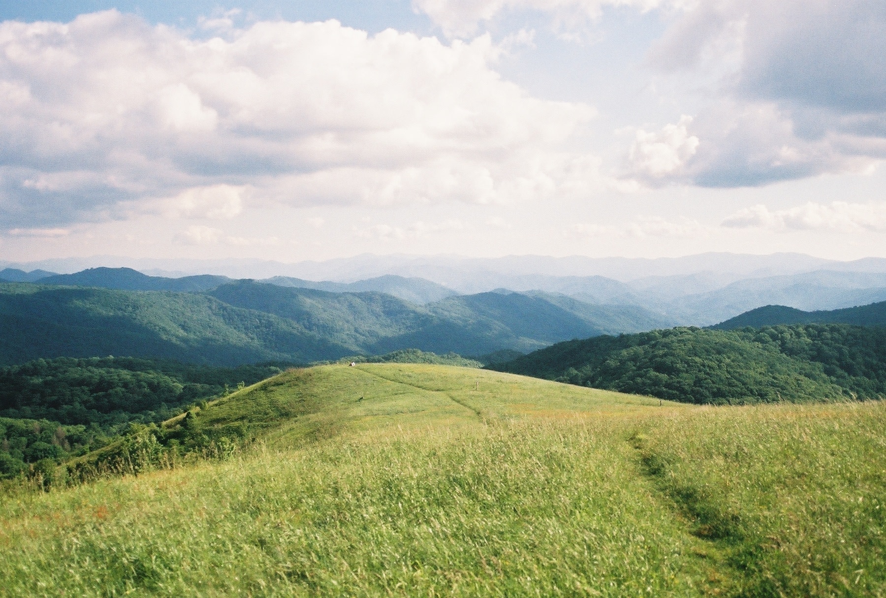
We took greenery and color-matched it to images in Formatar portfólios. The results showed that the hue is more natural than we originally thought—but it’s found in those corners of nature that are so vibrant they don’t feel real: Day-Glo tree frogs, the Northern Lights, impossibly verdant hills in places where it rains every day. It’s an intense, extreme color, more than a calming one. Maybe that says something about the kind of year 2017 will be?
More color roundups:
Fotos da cor mais bonita do mundo
Fotografias da cor mais feia do mundo
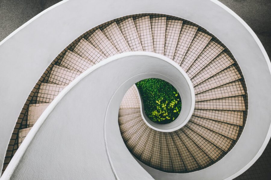
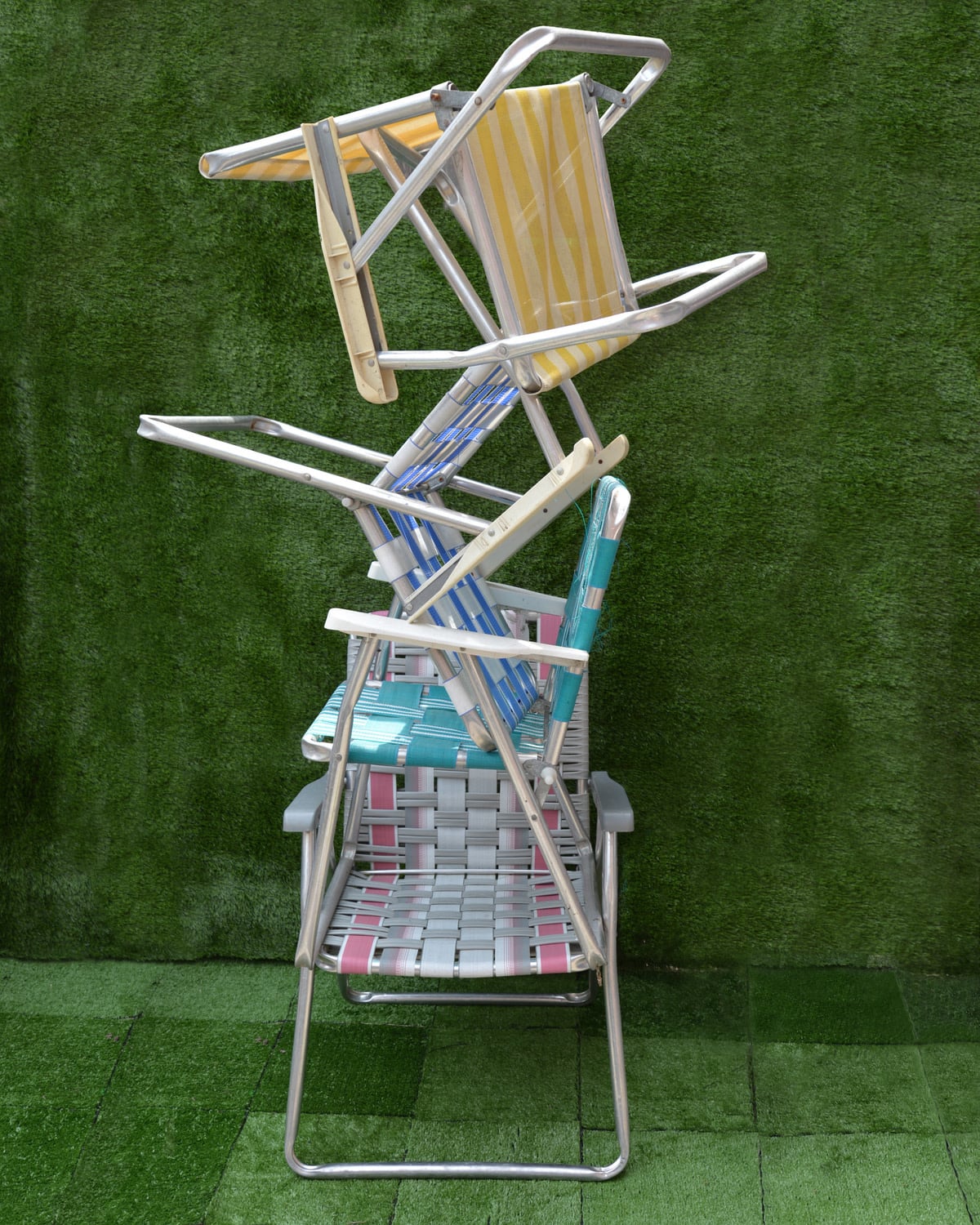
Jerry Rileyportfólio da
Rebecca Leachportfólio da
Christa Michelleportfólio da
Mary Parker’s portfolio
Naoise Dunne’s portfolio
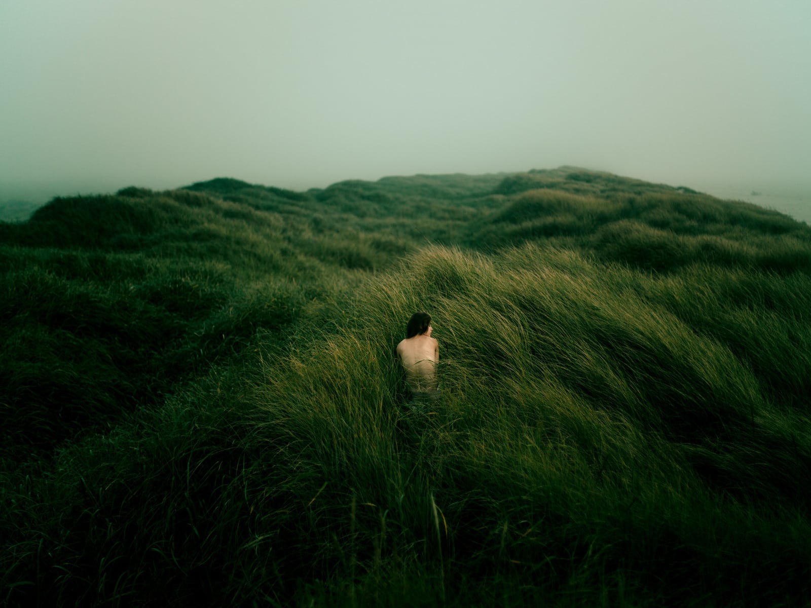
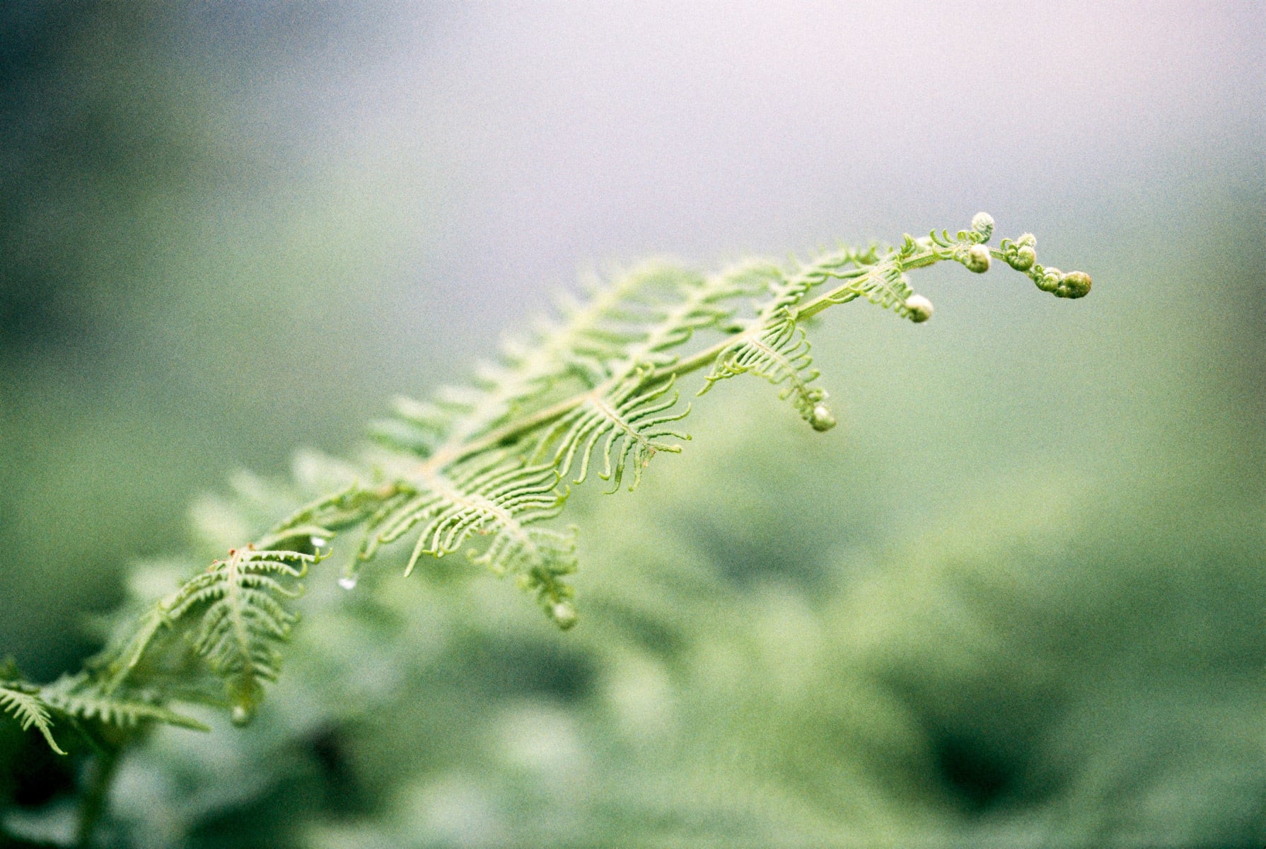
David Uzochukwuportfólio da
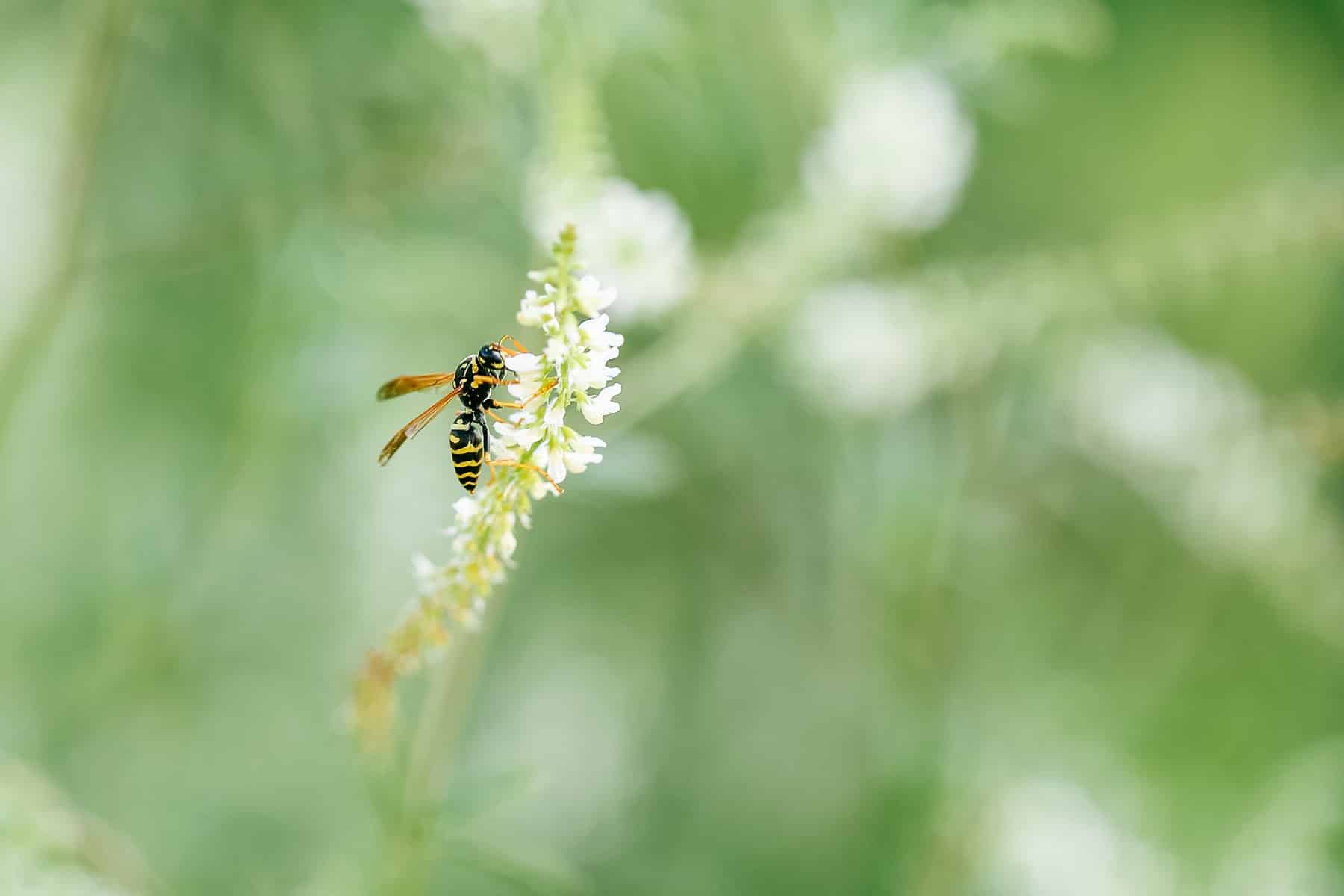
Amarpreet Kaurportfólio da
Sandra Harperportfólio da
Jessica Liaportfólio da

Alie Krohnportfólio da
Klara Foremanportfólio da
Sara Donaldsonportfólio da
Ben Davis' portfólio
Yasmin Murphyportfólio da
Theo Williamportfólio da