


Your portfolio is the one project where you are the client, the creative director, and the audience. You choose every font, every image placement, every pixel of white space. So why does it still feel like it was designed by someone else?
For most creatives, the answer is simple: templates. You pick one that looks close enough, swap in your images, adjust the colors, and call it done. The result is functional. It is professional. And it looks like ten thousand other portfolios sitting in ten thousand other browser tabs.
This is not an argument against templates. Templates are a brilliant starting point. But a starting point is not a destination. The real question is: what happens after you choose the template?
That is where layout becomes personal. And it is where a tool most Format members do not even know they have, called Flex Block, changes the entire equation.
Why Most Portfolios Look the Same (And Why It Matters)
When you build from a template without customizing the layout, you are inheriting someone else’s design decisions. Their spacing. Their hierarchy. Their idea of how a project page should breathe.
The problem is not that templates are bad. The problem is that layout communicates. It sends signals about how you think, how you pace your work, and how you want clients to experience it. A photographer who shoots slow, contemplative editorial work needs a layout that breathes differently than a motion designer building kinetic brand identities. A fashion photographer needs a sense of editorial urgency. A sculptor needs scale.
When every portfolio defaults to the same grid, the same spacing, the same rhythm, those signals disappear. Clients cannot feel the difference between your creative perspective and anyone else’s. And in a saturated market, where referrals and “insider” credibility drive purchasing decisions, that difference is everything.
Portfolio Layout Ideas That Actually Feel Personal
The portfolio layouts that stand out are not the ones with the most complex code or the most dramatic animations. They are the ones where the design decisions clearly come from the work itself. Here are five layout approaches worth considering, each suited to different types of creative practice.
The Editorial Spread
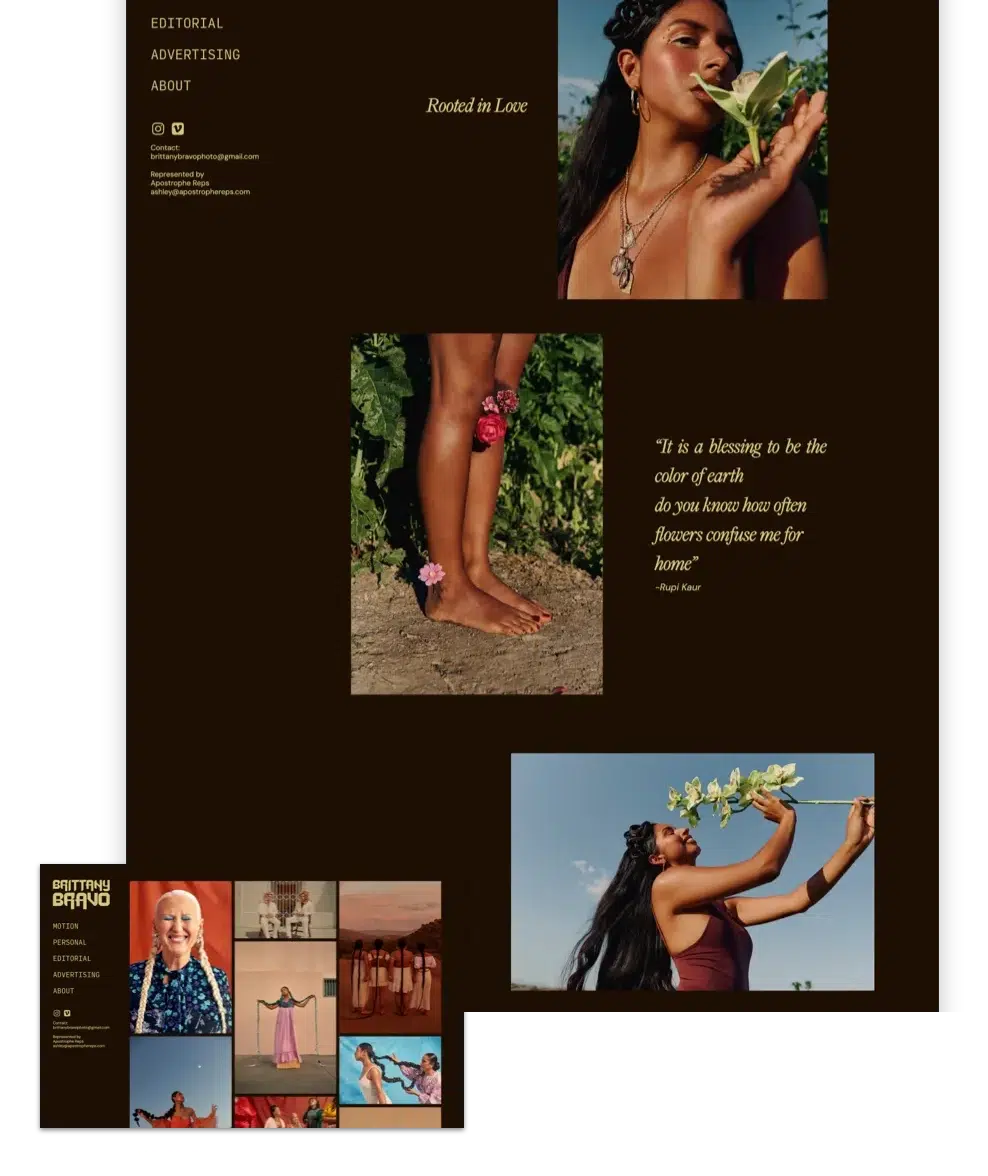
Think magazine layout. Overlapping images, layered text, bold typography, and intentional white space that guides the eye. This approach works beautifully for photographers, art directors, and fashion creatives who want their portfolio to feel like a curated publication rather than a simple image gallery.
The key is asymmetry with purpose. Stagger your images at different scales. Let text overlap an image edge. Use a background color shift to define sections. An editorial layout tells clients you understand visual storytelling, not just image-making.
This is the approach photographer Brittany Bravo used when she designed her Format portfolio. As she described it: “I wanted the page to feel like a magazine spread. It allows my clients to be imaginative and see the potential of my work and how it translates well into editorial spaces.”
The Cinematic Scroll
Full-bleed imagery, minimal text, dramatic vertical pacing. You let the work absorb the entire viewport, then use scroll depth to control the reveal. This layout is ideal for filmmakers, landscape photographers, and visual artists whose work depends on immersion.
The trick is restraint. One image per section. Brief credits or context tucked into the margins. The layout becomes an experience rather than a catalog, and clients feel the scale of your work before they read a single word about it.
The Curated Grid (With Intentional Variation)
The standard portfolio grid, rows of equally sized thumbnails, is the most common layout online. It is efficient, but it treats every project as interchangeable. A stronger version introduces intentional variation: one hero image at full width, two smaller images side by side beneath it, a text block breaking the pattern.
This works especially well for designers and illustrators who have a large body of work and want to signal which projects matter most. The variation creates hierarchy without requiring the viewer to click deeper.
The Art-Directed Project Page
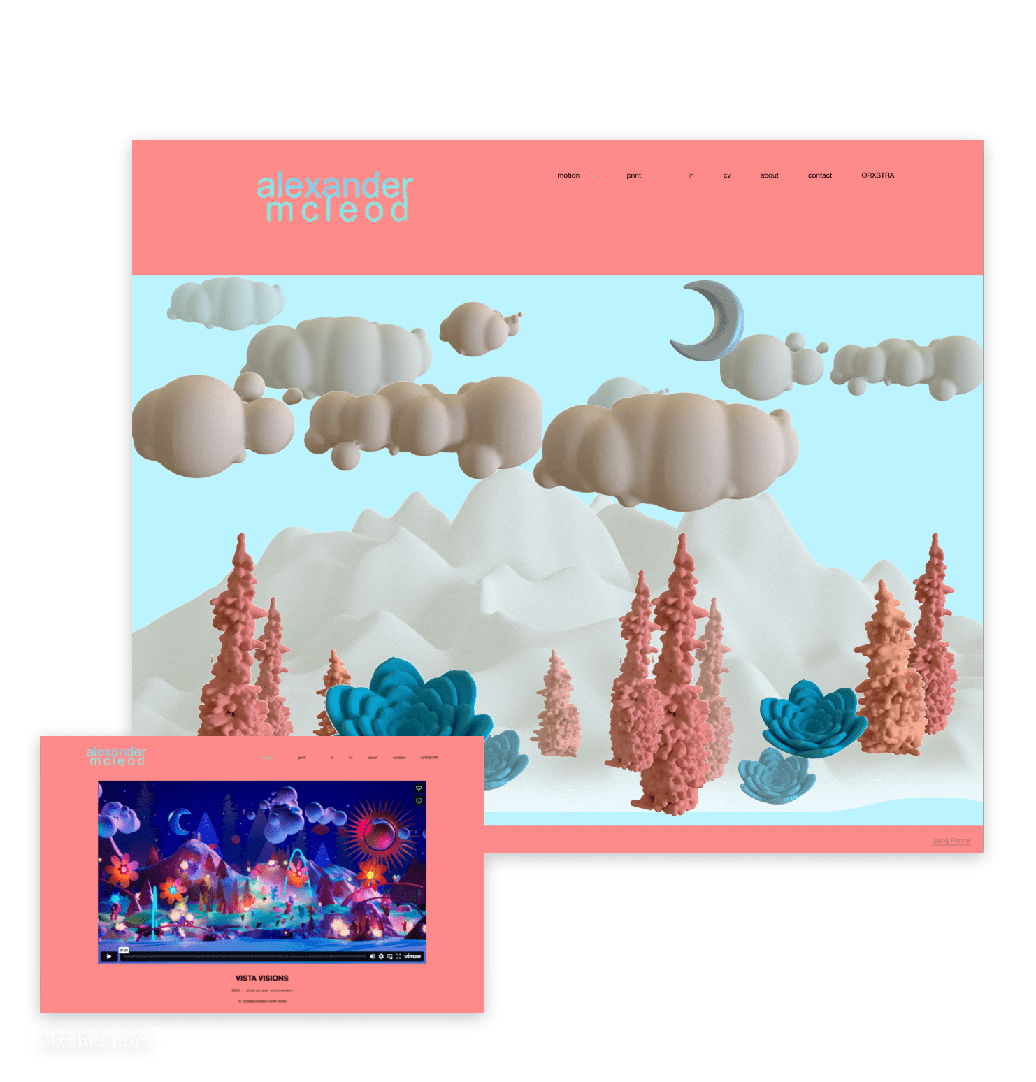
Instead of applying one layout to every project, you design a unique page for each one. Different background colors. Different type treatments. Different image arrangements. Each project page becomes its own world, reflecting the tone of that specific body of work.
This is the most ambitious approach, and it is the one that makes the strongest impression. It communicates creative range and design literacy in a way a uniform layout simply cannot. Digital artist Alex McLeod takes this approach with Format: “Flex block is pushing my practice, making me realize that websites can become living art pieces. There can be sections of my website that are activated and more alive than previously.”
The Layered Collage
Mixed media feel. Staggered elements. Images and text at different depths. Buttons and dividers used as design accents, not just functional components. This approach works well for multidisciplinary creatives, mixed-media artists, and anyone whose practice resists neat categorization.
The collage layout trades polish for personality. It says: this person thinks in layers, in juxtaposition, in unexpected combinations. For the right creative, that signal is more valuable than any amount of minimal elegance.
Every layout in this guide can be built on Format. Iniciar uma avaliação gratuita and design your first custom page with Flex Block.
How to Match Your Layout to Your Creative Identity
Before choosing a layout direction, spend five minutes with three questions:
1. How do you want clients to experience your work? Fast and punchy? Slow and immersive? All at once or one piece at a time? Your answer shapes the pacing of your layout: tight grids for energy, generous white space for contemplation, full-bleed images for drama.
2. What does your work have in common visually? If your images are moody and dark, a clean white grid might fight them. If your design work is colorful and typographic, a minimal layout might flatten its energy. The layout should amplify what already makes your work distinctive.
3. What do you want someone to do after seeing your portfolio? Book a call? Download a rate sheet? Simply remember your name? The answer determines how you structure your calls to action, your contact placement, and how much narrative context you provide alongside the work.
These are not abstract questions. They are design decisions. And the best portfolio websites in any discipline are the ones where the layout answers them clearly.
The Tool That Makes This Possible (Without Code)
Here is where Flex Block enters the conversation.
Flex Block is a free-form, drag-and-drop page building tool inside Format that most members either do not know exists or have not fully explored. It allows you to build custom page content blocks using a snap grid system, where you can place, layer, scale, and overlap elements, including images, text, buttons, dividers, and video, with complete control over spacing, depth, and composition.
That means every layout idea described above is buildable. Not with code. Not with a third-party plugin. Directly inside your Format site.
Here is what Flex Block actually gives you control over:
- Snap grid placement for precise spacing and alignment
- Layering and overlapping of images, text, buttons, and dividers
- In-block image editing, including shape, aspect ratio, and overlays
- Independent background colors per block, so each section can have its own visual identity
- Mobile-specific layout controls, so you can adjust how your blocks appear on smaller screens
- Contact forms you can drag directly onto your canvas and style to match your design
- 50+ starter templates designed in collaboration with working creatives
Format partners with creatives like Brittany Bravo e Alex McLeod to build Flex Block templates that reflect actual creative workflows. Brittany’s editorial collage template and Alex’s digital art landscape are not generic page starters. They are layout philosophies you can adopt and modify.
As photographer Nigel Elliot put it: “I love the control it gives. It feels like building with intention instead of fighting a template. Definitely gives me room to create layouts that feel elevated and tailored.”
Layout Details That Make a Real Difference
Ambitious layouts are only as strong as their small decisions. A few practical considerations that separate good portfolio pages from forgettable ones:
Design for mobile first. More than half of your portfolio visitors are on a phone. Flex Block lets you adjust your layout specifically for mobile, which means you do not have to compromise your desktop design or accept whatever the responsive default gives you. Check every block on a small screen before publishing.
Use white space deliberately. White space is not emptiness. It is pacing. In a portfolio, generous spacing around an image gives it room to breathe and signals confidence. Cramped layouts make good work feel smaller than it is.
Establish a clear typography hierarchy. One typeface for headings, one for body text, consistent sizing throughout. Overly decorative type fights with visual work. Let your images be the star and let your type stay clean, readable, and quiet.
Watch your loading speed. Large, unoptimized images slow your site and hurt the experience for visitors on slower connections. Resize and compress before uploading. A portfolio that loads quickly feels more professional than one with slightly larger images that takes twice as long.
For a deeper look at building a strong and SEO-friendly portfolio for photographers (with tips that apply to any creative professional), Format Magazine has a thorough guide worth reading alongside this piece.
Start With a Template, Then Make It Yours
You do not need to build every page from a blank canvas. The strongest approach for most creatives is to start with a professionally designed template, then use Flex Block to customize the pages that matter most: your homepage, your strongest project pages, and your about page.
This is not a shortcut. It is how professional design works. Constraints give you a foundation. Customization gives you a voice. The combination gives you a portfolio that functions smoothly e feels unmistakably like your own work.
Format’s Flex Block template library includes over 50 starting points, from editorial collage layouts to clean project showcases to bold typographic title pages. Each one is fully customizable. Add elements, remove them, rearrange them, layer them, recolor them. The snap grid keeps everything aligned while you experiment.
And because Flex Block sits inside the same editor as the rest of your Format site, there is no switching between tools, no exporting, no pasting embed codes. You build, preview, and publish in one place.
Your layout should feel like your work. Build it that way.
Start a free trial and turn any Format template into a portfolio that is unmistakably yours with Flex Block. Start your free trial today.
Perguntas frequentes
How many projects should I include in my portfolio? Quality over quantity. Most working creatives benefit from showing 8 to 12 of their strongest projects. Enough to demonstrate range, not so many that the viewer loses focus. If you are early in your career, five strong pieces are better than fifteen mediocre ones.
Should every page in my portfolio have the same layout? Not necessarily. A consistent design language (typography, color palette, spacing conventions) should carry across your site, but individual project pages can and should vary in layout when the work calls for it. Art-directing each project page is one of the most effective ways to show creative range.
Do I need to know how to code to create custom portfolio layouts? No. Tools like Flex Block are built specifically so you can create bespoke, layered layouts without writing a single line of code. If you can use a design tool, you can use Flex Block.
What is the most common portfolio layout mistake? Using the same default grid for every project and never adjusting it. It signals that the portfolio was built quickly, not designed intentionally. Even small variations, like changing image sizes across a grid, or adding a text block to break the rhythm, make a significant difference.