

Most advice about building an artist portfolio website follows the same script: pick a clean template, upload your best images, add an About page, and go. And the advice is not wrong. It just stops dangerously short of the part that actually matters.
Here is the uncomfortable truth: thousands of artist websites look stunning and still get no traffic. Galleries never find them. Collectors never land on them. Curators browse right past them. The work is strong, the presentation is polished, and the site is essentially a locked room with no door.
The problem is not aesthetics. It is everything that surrounds the images but never gets talked about: the missing context, the thin bio, the absent metadata, the portfolio structure that makes sense to you but confuses everyone else. These are the invisible problems that silently undercut an artist’s online presence, and most portfolio guides skip right over them.
This article covers the fixes.
Beautiful but Invisible: The Gap Nobody Addresses
When an artist launches a portfolio website, the instinct is to let the work speak for itself. That instinct is right, creatively. But online, images alone are silent.
Search engines cannot see a painting. They cannot interpret a photograph’s mood, recognize a sculptor’s material choices, or understand the narrative behind an installation series. They read text. They read titles, descriptions, file names, captions, page structure. Without those signals, your portfolio exists in a kind of digital vacuum: visible to anyone who types in your exact URL, invisible to everyone else.
This creates a paradox that is specific to artist websites: the better the work, the more the creator tends to trust the visuals to carry the site. But the visuals, on their own, carry nothing in terms of discoverability.
The gap between how a portfolio mira and how it performs is the real problem. Fixing it does not require compromising your design. It requires paying attention to the parts of your site you probably never think about.
See how Format works for artists →
Images Without Context Are Just Files
This is where most artist portfolio websites fall apart, quietly and completely.
An image uploaded with the file name “IMG_4892.jpg,” no alt text, no caption, no title, and no description is, as far as the internet is concerned, an empty container. It contributes nothing to your SEO. It tells a viewer nothing about your process, your materials, or why this piece exists in your portfolio. It is a beautiful dead end.
And most artist sites are full of them.
What Every Portfolio Image Needs
Adding context to your images is not busywork. It is what transforms a grid of thumbnails into a meaningful body of work. For every piece in your portfolio, consider including:
- A descriptive title. Not “Untitled #7.” Something that gives the work identity. “Winter Study, Oil on Linen” or “Tidal Traces, Cyanotype on Cotton” tells a viewer and a search engine what they are looking at.
- Medium, dimensions, and year. This is standard gallery labeling, and it belongs on your website, too. It signals professionalism and helps the right audience find you through material-specific or technique-specific searches.
- Alt text that describes the image honestly. Alt text is not a keyword-stuffing opportunity. It is a brief, plain-language description of what the image shows. “Abstract oil painting with layered blue and white textures on a large horizontal canvas” serves both accessibility and search visibility. According to the WebAIM Million report, over 95% of homepages have detectable accessibility errors, and missing alt text remains among the most common. For artists, this is a missed opportunity on two fronts: inclusivity and findability.
- A contextual note or short narrative. Even one or two sentences about what inspired the piece, where it was shown, or how it was made adds depth for visitors and signals relevance to search engines. Think of it as a wall label for your digital gallery.
When you start treating portfolio images this way, your site shifts from a visual showcase to a rich, searchable, contextually layered record of practice. That shift is the difference between a portfolio that looks great and one that actually works.
A Before-and-After Example
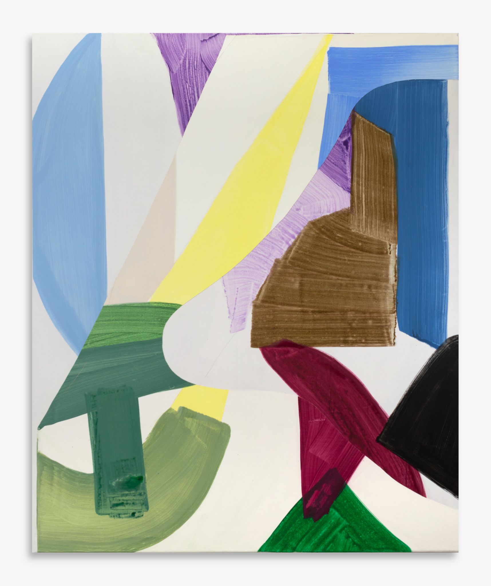
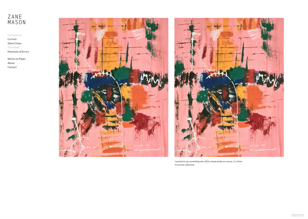
Before: An image with no context. No title. No captions. No alt text.
After: The image has a descriptive title (e.g. “Coastal Erosion No. 3, Mixed Media on Panel, 2025”), a contextual note, and thoughtful alt text (which isn’t visible on your live site, but serves as important context for screen readers and SEO).
The visual presentation can be identical. The difference is entirely in what is beneath the surface. And that beneath-the-surface layer is what search engines, screen readers, and attentive viewers actually read.
Your Bio Page Is Doing the Bare Minimum
If there is a single page on most artist websites that is doing the least amount of work for the most amount of potential, it is the bio page.
The typical artist bio on a portfolio site reads something like: “Jane is a multidisciplinary artist based in Portland. She works in painting, sculpture, and installation. She holds an MFA from [university].”
That is not a bio. That is a placeholder. And it is costing you visitors, trust, and opportunities.
A robust artist bio page is a trust signal. It is frequently the second or third page visitors check after viewing your work. Gallery owners look for exhibition history. Potential clients want to understand your process. Curators want to know your perspective. Search engines need enough text to understand what your site is about and who it is for.
What a Strong Artist Bio Actually Includes
- Your story, told with some personality. Where you come from, what drives your practice, what questions your work explores. This does not need to be long, but it needs to be real.
- Your process. How you work. What materials and methods define your practice. This is often what makes a visitor remember you.
- Education, exhibitions, and recognition. List them clearly. This is standard for the art world and builds credibility in search engine terms (expertise, experience, authority, trust).
- A professional photograph. Not a snapshot. A real image of you in your studio or with your work. This alone increases the trustworthiness of a site significantly.
- A contact pathway. Make it easy for someone to take the next step, whether that is commissioning work, requesting a portfolio PDF, or simply starting a conversation.
The Artist Statement Connection
Your bio and your declaración del artista should work in concert, not duplicate each other. The bio is the que. The statement is the por qué. Together, they give a viewer the full picture.
If your statement lives on a separate page, link to it clearly from your bio. If it lives within your bio page, give it its own section with a subheading. Either way, do not bury it. A strong artist statement is one of the most compelling pieces of text on a creative portfolio, and it deserves visibility.
Navigation That Thinks Like a Gallery
Most artist portfolio websites organize work in one of two ways: everything on a single page, or everything sorted into broad categories like “Paintings” and “Drawings.”
Neither approach is wrong, but both miss an opportunity.
Think about how a physical gallery is curated. Work is grouped intentionally. Series are presented together. There is a flow, a sequence, a conversation between pieces. Your online portfolio can do the same thing, and it should.
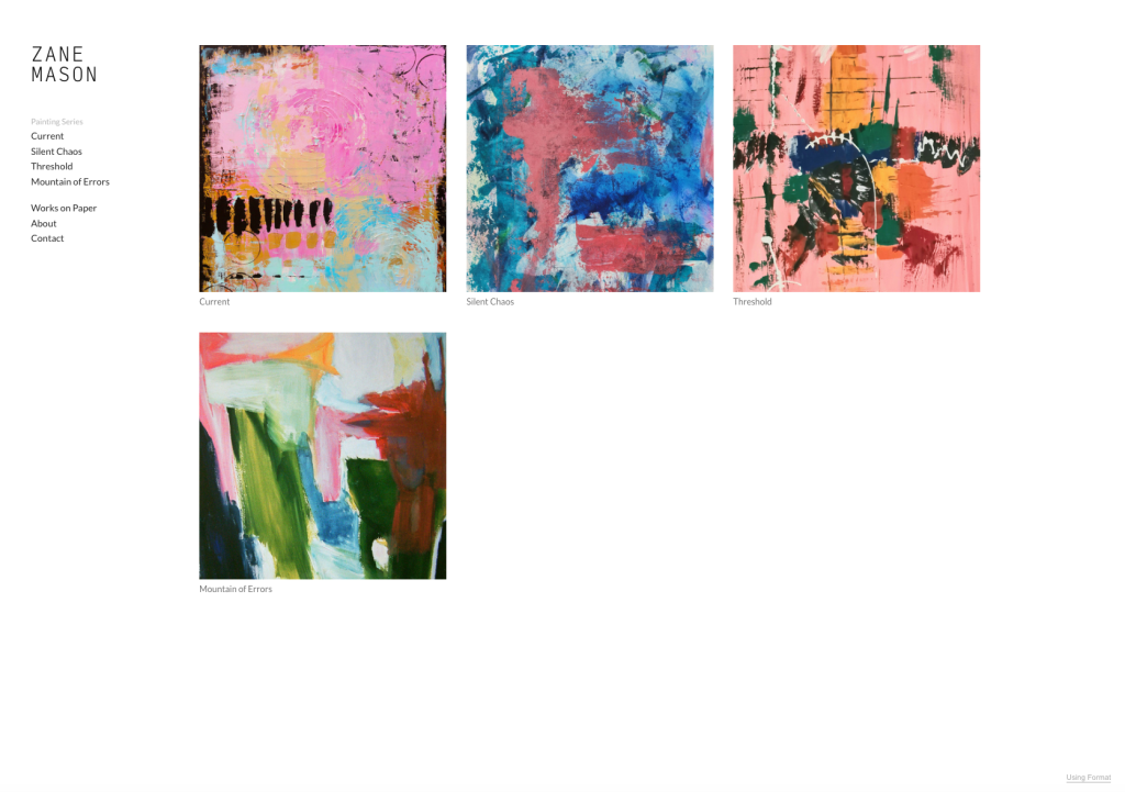
Organize by series or project, not just medium. If you created a body of work around a specific theme, show it as a cohesive series with its own page. Give it a title, an introduction, and contextual notes for individual pieces. This approach:
- Creates multiple indexable pages (better for SEO than a single monolithic gallery)
- Allows you to write targeted introductions with natural keyword usage
- Gives visitors a narrative thread to follow, not just a wall of thumbnails
- Mirrors the way curators and art directors actually evaluate work
Keep your navigation short and clear. Five to seven top-level menu items is usually plenty. Use sub-navigation for deeper categories. If a visitor has to think about where to click, your structure is working against you.
Include a clear landing hierarchy. Your homepage should guide someone to your strongest work within one click. From there, each series page should encourage browsing deeper. A dead-end gallery with no forward momentum is where visitors drop off.
The SEO Blind Spot Artists Miss
SEO is a topic that makes most artists’ eyes glaze over. That is understandable. But the fundamentals are not complicated, and ignoring them has a direct, measurable cost.
Here is what typically happens: an artist builds a gorgeous portfolio site, launches it, and waits for traffic. The traffic never comes. Not because the work is weak, but because the site gives search engines almost nothing to work with.
Page Titles and Descriptions That Actually Work
Every page on your site has a title tag and a meta description. These are the lines of text that appear in search results. On most artist websites, they look like this:
Home | Jane Doe
Welcome to my website.
That tells nobody anything. Compare it to:
Jane Doe | Contemporary Mixed Media Artist, Portland OR
Explore original mixed media paintings, sculptural installations, and commissioned work by Portland-based artist Jane Doe.
The second version includes relevant keywords, location context, and a clear value proposition. It takes two minutes to write and dramatically increases the chance that someone searching for “mixed media artist Portland” will find your site.
Do this for every page. Your About page, each series page, your contact page. Every title and description is a small but real opportunity.
Image Optimization for Speed and Search
Visual portfolios are, by nature, image-heavy. This makes loading speed a particular challenge for artist websites, and Google’s research on page speed shows that even a one-second delay in load time can measurably reduce engagement.
A few practical steps:
- Resize images before uploading. A 6000-pixel-wide file is unnecessary for web display. Most portfolio images perform well at 1600 to 2400 pixels on the long edge.
- Use modern formats. WebP files are significantly smaller than JPEGs at comparable quality. If your portfolio platform supports them, use them.
- Name your files descriptively. “coastal-erosion-mixed-media-2025.jpg” is better than “IMG_4892.jpg” in every way.
- Use lazy loading. This means images load only as a visitor scrolls down to them, rather than all at once. It keeps your initial page load fast without sacrificing image quality.
A platform like Format handles much of this automatically, with built-in image optimization, responsive delivery, and performance tuning designed specifically for visual portfolios. But regardless of what platform you use, understanding why these things matter helps you make better decisions about your site.
Skip the technical guesswork-try Format’s built-in SEO tools free.
Your About Page Deserves Better
We touched on the bio above, but the About page as a whole deserves its own consideration. It is not just a bio container. It is one of the highest-traffic pages on most portfolio sites, and it is a powerful conversion tool.
Según Nielsen Norman Group’s research on About pages, users consistently visit About pages to evaluate trustworthiness before taking any action. For an artist, “action” might mean reaching out about a commission, sharing the portfolio with a colleague, or adding the site to a curated list.
Un fuerte Acerca de la página should include:
- Your bio and artist statement (as discussed above)
- A professional photo of you or your working environment
- Social proof, if available: press mentions, notable exhibitions, client logos, testimonials
- Clear contact information or a link to your contact page
- Links to your active social channels
The About page is not an afterthought. It is the page that turns a casual viewer into a genuine lead. Treat it accordingly.
A Quick Audit for Your Artist Portfolio Website
If you have read this far, you are probably wondering how your own site stacks up. Here is a practical checklist you can run through today:
Imágenes
- Every portfolio image has a descriptive title (not “Untitled” or a file name)
- Every image has alt text that describes what is actually shown
- Key pieces include medium, dimensions, and year
- At least some images have a brief contextual note or story
Bio and About Page
- Your bio is more than three sentences
- Your artist statement is visible and accessible
- You have a professional photo of yourself
- Your education, exhibitions, or notable work are listed
- There is a clear way to contact you from the About page
Navigation and Structure
- Work is organized into series or projects, not just one giant gallery
- Top-level navigation has seven items or fewer
- Each project or series page has its own introductory text
- There is a logical path from the homepage to your strongest work
SEO Fundamentals
- Every page has a unique, descriptive title tag
- Every page has a meta description
- Image file names are descriptive, not generic
- Images are optimized for web (resized, compressed, modern format)
- Your site loads in under three seconds on mobile
If you checked fewer than half of these boxes, that is not a failure. It is an opportunity. Every fix on this list is manageable in an afternoon, and each one makes a real difference.
Where to Go from Here
The fixes in this article are not glamorous. They are not about choosing the perfect typeface or finding the right template. They are about the structural, contextual, and strategic details that make the difference between an artist portfolio website that gets found and one that stays invisible.
The good news is that none of these fixes require a technical background. They require attention. They require treating your portfolio not just as a gallery wall, but as a living, working document that represents your practice to the world.
If you are looking for a platform that takes these fundamentals seriously, Format is built specifically for creative professionals, with built-in image optimization, SEO tools, and portfolio structures designed for the way artists actually work. But regardless of what platform you use, the principles hold: add context, strengthen your bio, structure your navigation, and give search engines something to read.
Your work deserves to be seen. Make sure your website is not the thing standing in the way.
Build a portfolio that gets found-start your free Format trial.