

Why the Reflex theme works for professional creators
The entire point of a portfolio website is to make your work shine. As visual people, we can sometimes get lured into pizazz that ends up detracting from the work itself. The Reflex theme was built specifically for this reason. Its generous white space and clean navigation ensures that the art, design, or photography leads every page, instead of competing with the portfolio’s design.
Now, what’s wildly cool about Reflex is just how, well, flexible it is. You can choose the layout of your gallery pages, having your images displayed in a grid, vertical, or horizontal-scroll. You choose the menu type, the cover image layout on your Collection pages, and more. This is a truly dynamic theme, that you can wiggle around to perfectly suit your creative work.
That makes this theme a perfect fit for artists and designers who want their work front and center with nothing between the viewer and the piece. Since it’s built with Format, creators get a perfectly polished site without touching a line of code. You can browse Format themes to see the full lineup, or use Flex Block to customize any layout.
13 Portfolios that are using the Reflex theme
Here are 13 working artists, designers, and photographers putting Reflex to great use.
Lotte Brockbank

Lotte Brockbank is a joy-inducing illustrator based in London. Her practice moves across illustration, comic books, sketchbooks, and costumes that have seen both stage and screen. All of her work begins with her sketchbook and beams forward from there. Her use of the Reflex theme handles her range of practice gracefully. The grid layout on Gallery pages allows portrait, square, and landscape pieces to sit at their own natural scale instead of forcing everything into a uniform crop. For an illustrator whose output varies so much in format, that flexibility keeps every drawing legible on its own terms.
Lena Aboudy
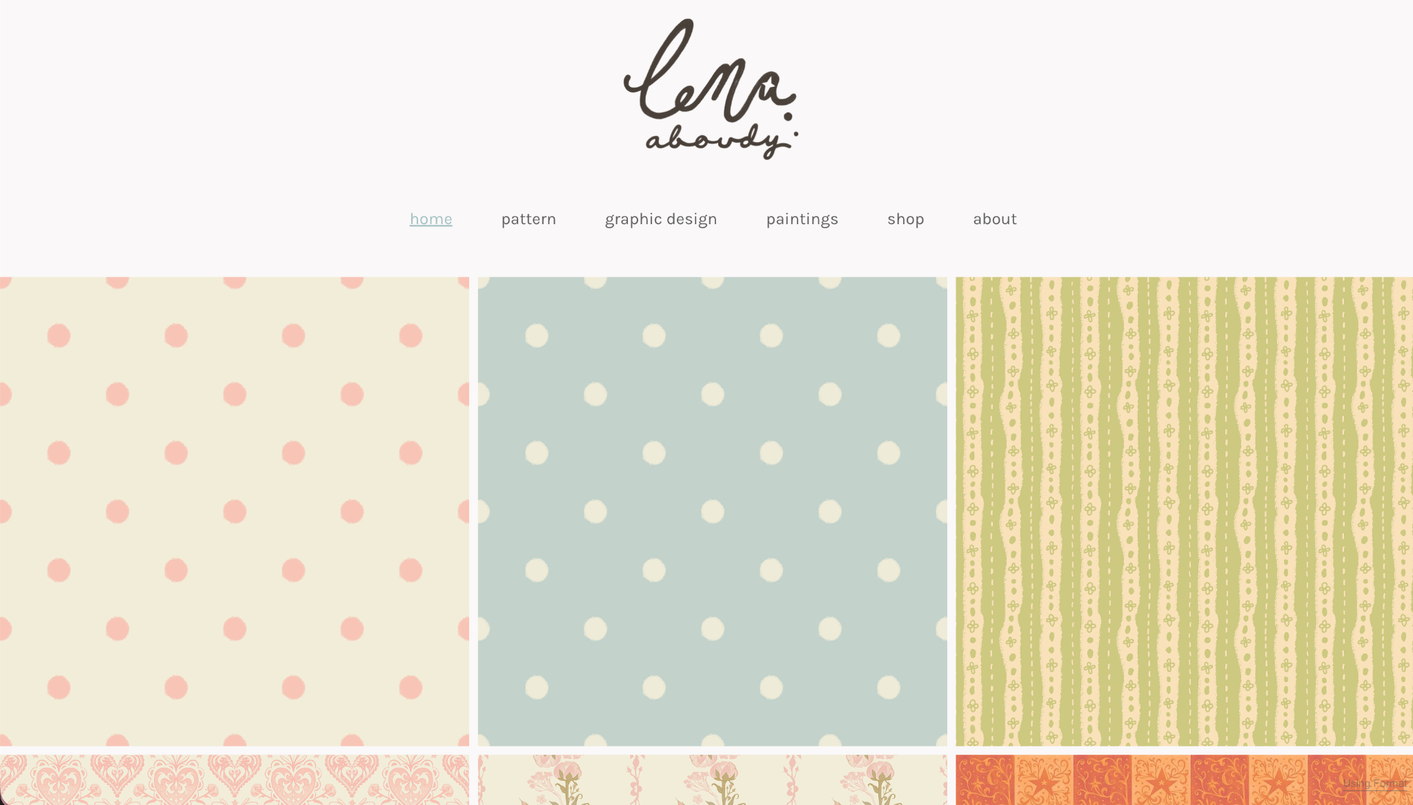
Lena Aboudy works across illustration, graphic design, and pattern-making. She uses a Gallery page for her homepage which shows the wide breadth of her practice cleanly. Lena chose to put her site menu at the top of the page, which makes for clean navigation between the other pages, with each one focusing on a different part of her practice. Reflex was a great theme choice for her, as it pulls together her genuinely varied work into a beautifully comprehensive space.
Barbarous Designs
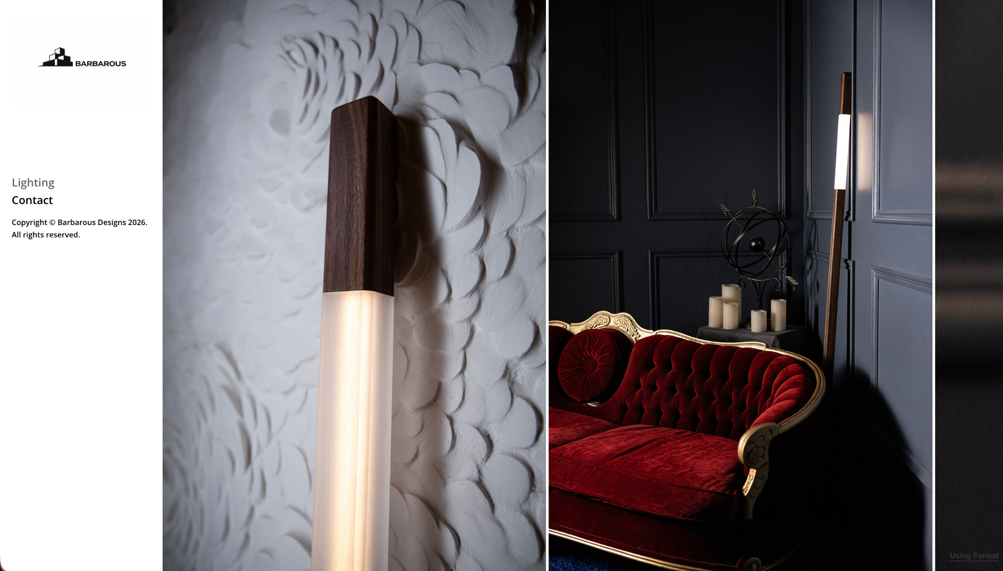
Com sede em Toronto Barbarous Designs is a design studio with a focus on lighting design. Mood and atmosphere are a complete story here. Their portfolio is composed of two pages: a horizontal-scroll gallery page of their stunning lighting collection, and a custom contact page which gives a bit of insight into their inspiration, and a way to easily reach them for collaborations, commissions, or custom pieces.
Frank Lucero
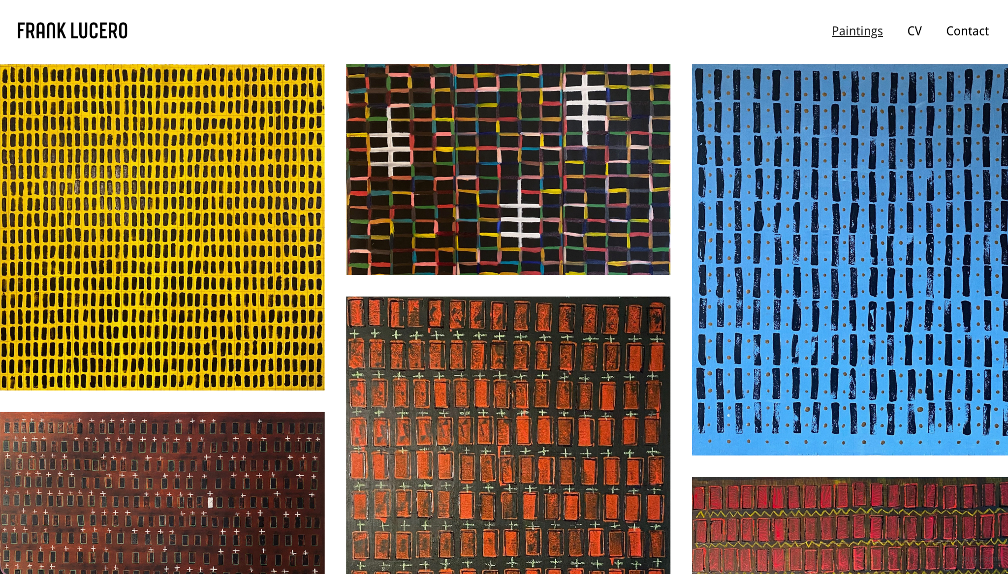
Frank Lucero paints large, moody canvases. His “Mictlán” and the “Cognitive Distortions” series reward a slow look. His site strips everything back to just Paintings, CV, and Contact, letting Reflex’s whitespace do the framing. His homepage is a gallery page with a Masonry layout that gives you an immediate impression of his impactful work. Each painting then can be clicked to see it with generous white space that allows the viewer to truly focus in.
Malcolm Little
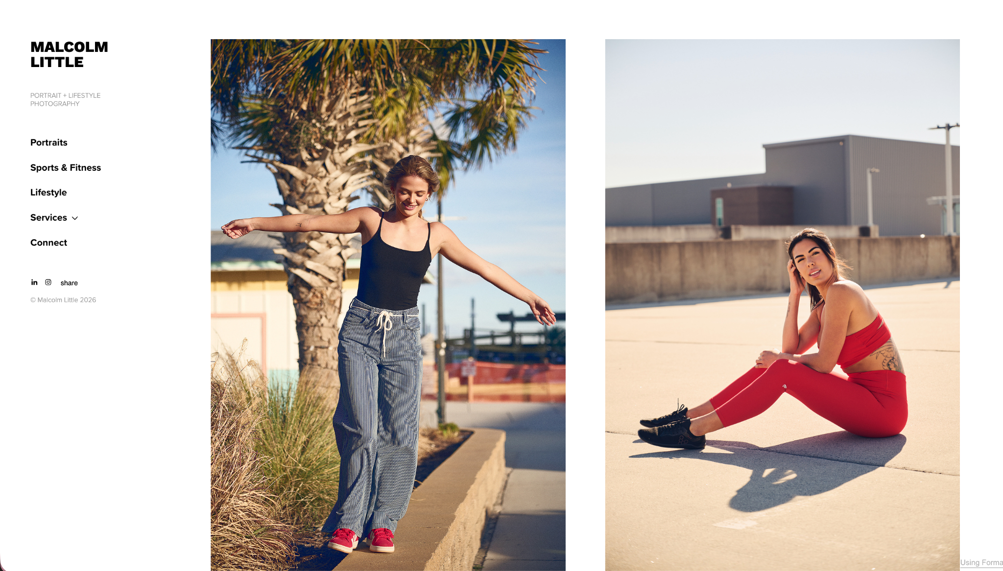
Malcolm Little, known in the Raleigh dance community as Blaze, is a photographer who is an expert in capturing bodies in motion. His site menu puts categories front and center—Portraits, Sports & Fitness, and Lifestyle—so you can have a clear idea of the type of work he specializes in. The clean no-nonsense layout really lets his great work do the talking.
Stein Devos
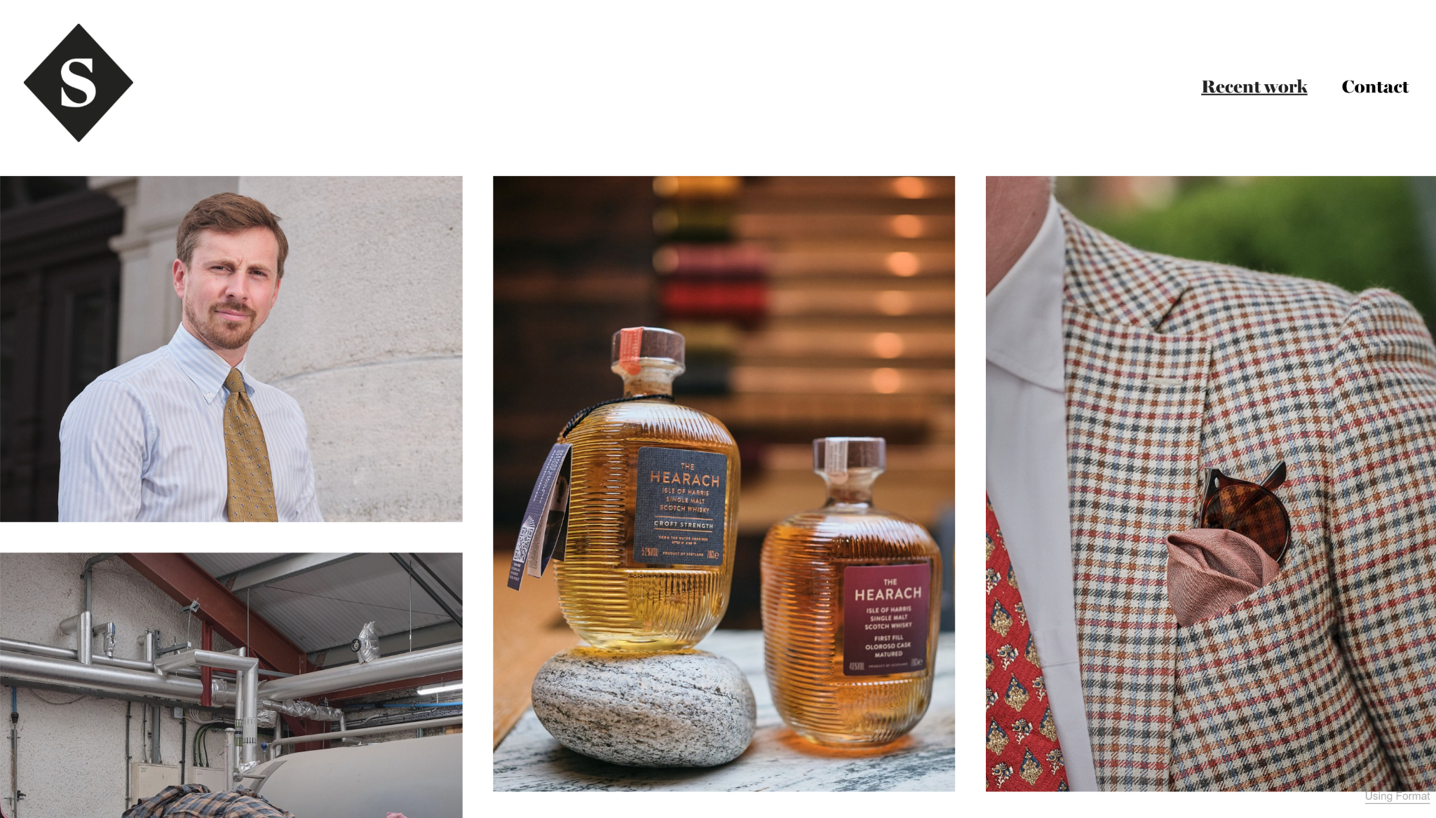
Stein Devos is a menswear and editorial photographer based in Antwerp. His work is the definition of gentlemanly refinement. The clean restraint of the Reflex theme is a perfect match for the elegance and character of his work.
Myla Faith
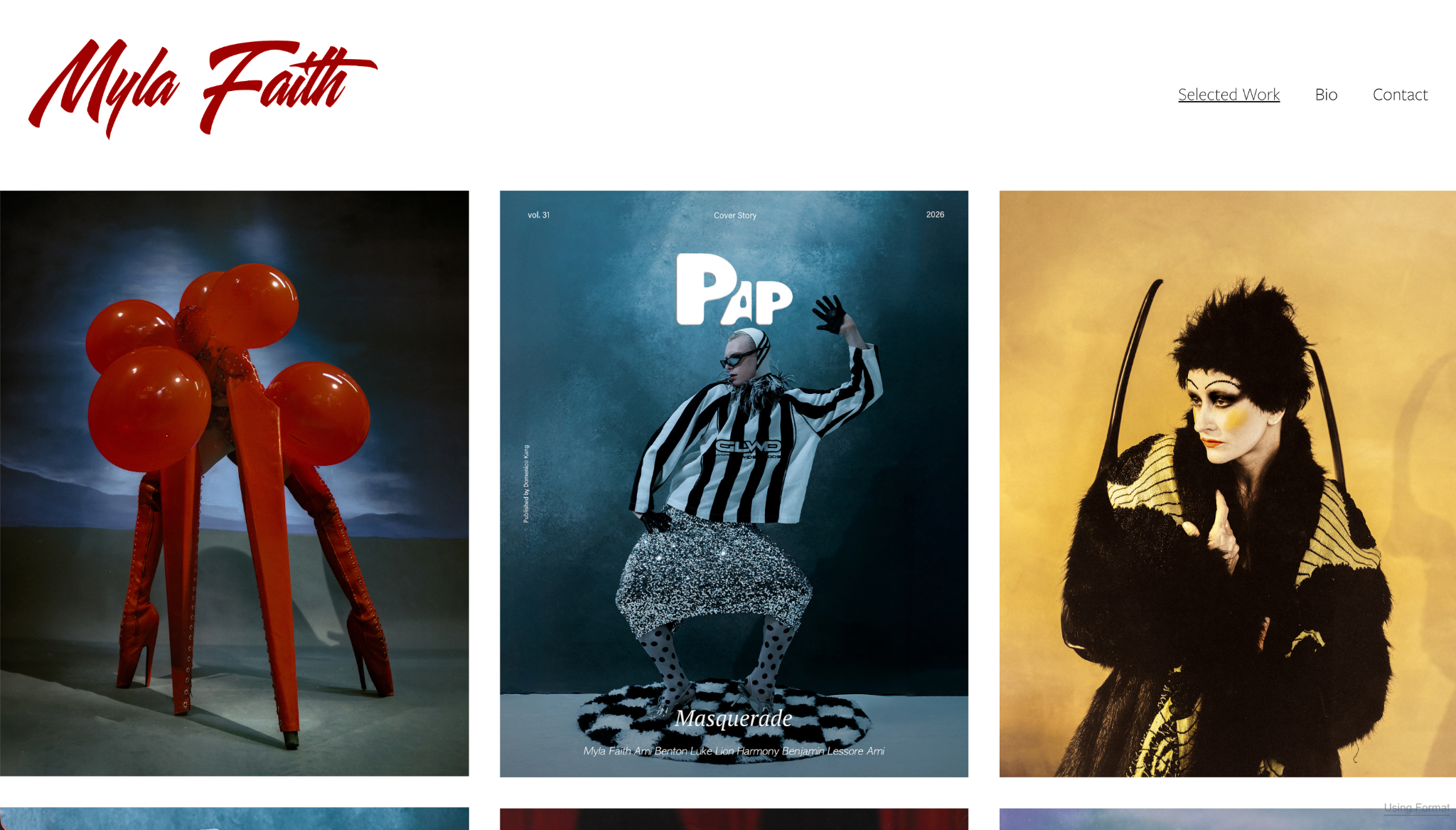
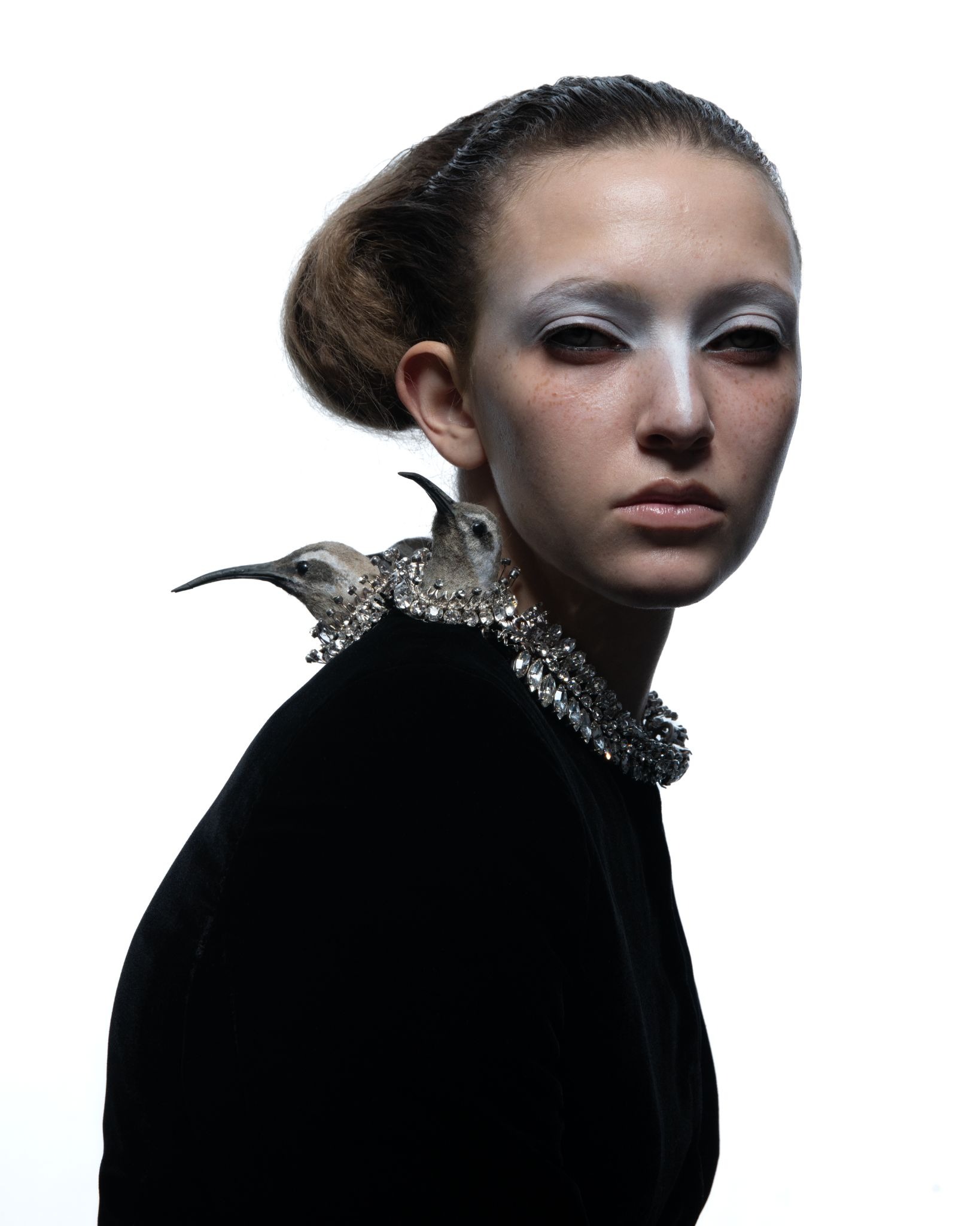
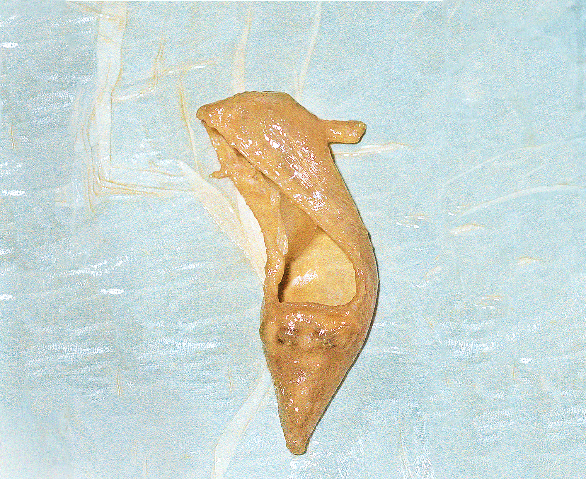
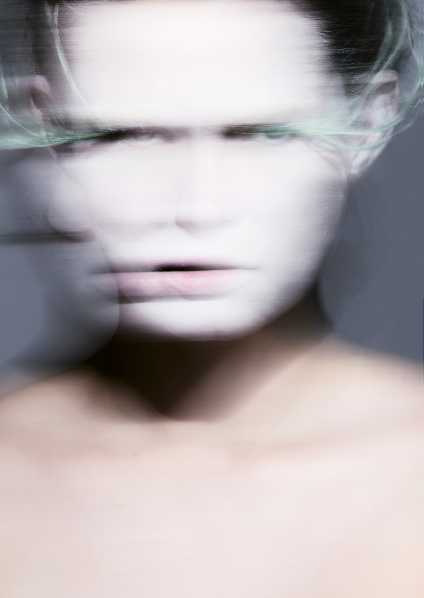
Myla’s Visuals is London-based photographer Myla Faith’s portfolio website that features work from her career that oscillates between high fashion editorial and the theatrical, subcultural edges of performance art. Her work has been featured in Vogue and shown at the Tate Modern. Her impactful images are boldly displayed in the masonry layout of her homepage, alongside just two other pages: her bio and contact.
Whitney Ott
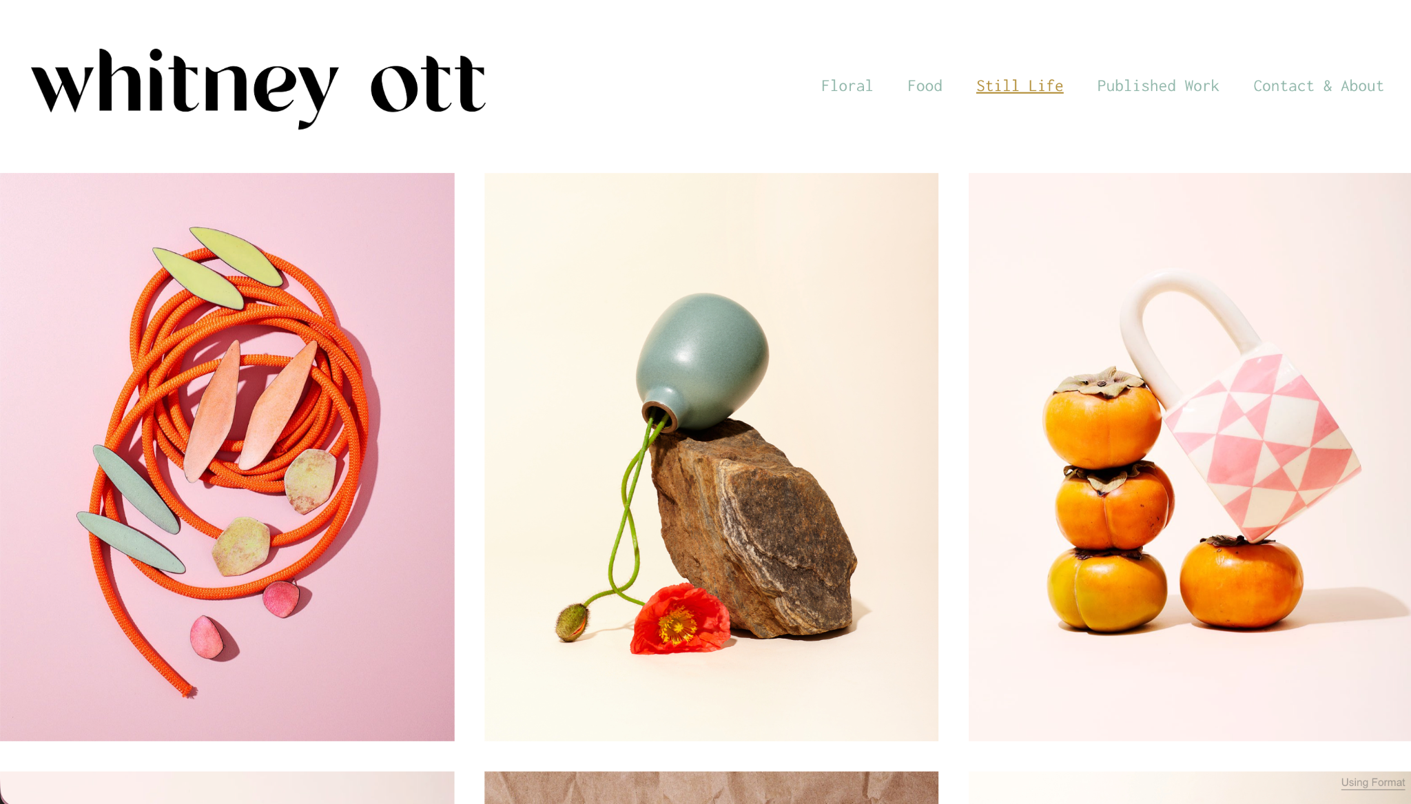
Whitney Ott, based in Asheville, photographs still life, floral, and food work that’s found its way into published editorial pieces. Her homepage is its own work of art, featuring a stunningly balanced grid that gives you a taste of all three subjects. Her minimal top site menu then gives you the opportunity to explore by subject: Floral, Still life, and Food. There’s an additional gallery page where you can peruse her published work, as well. The colors and composition really sing here.
Tony Mukhin
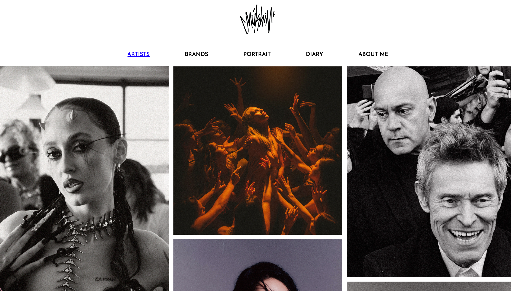
Tony Mukhin splits his site into Artists, Brands, Portrait, and Diary. The brand and portrait sections in particular lean on Reflex’s grid to let campaign work and personal portraiture sit comfortably side by side. It offers a good showcase of both commercial range and a more personal body of work in one place.
Zuza Prokop
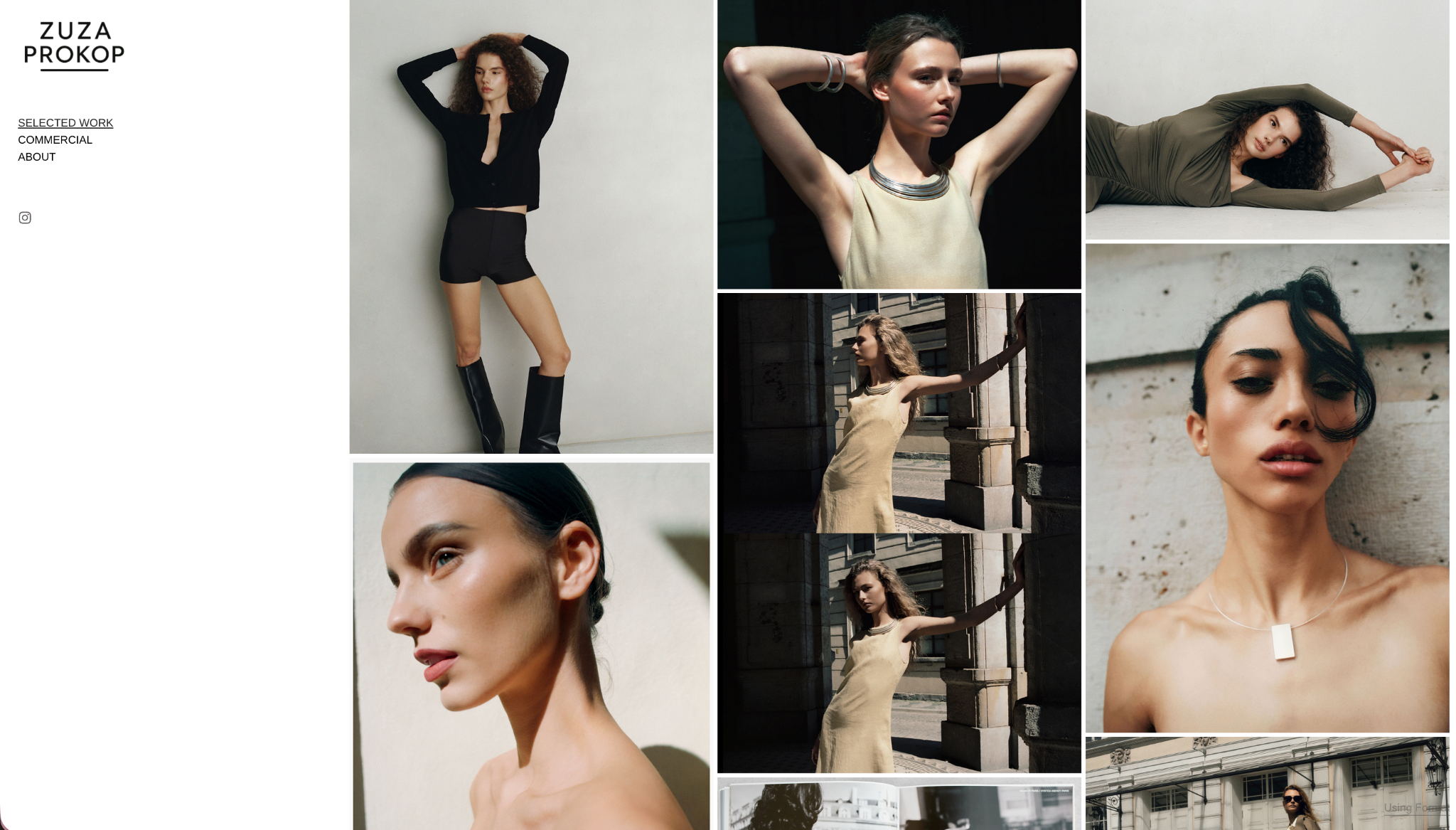
Zuza Prokop is a photographer and curator. Her work in the contemporary art world informs her photography. Her portfolio separates Selected Work from Commercial projects, a distinction that matters for a photographer balancing personal vision with client work. The progressively loading gallery and generous whitespace keep both bodies of work feeling equally considered.
François Alexandre
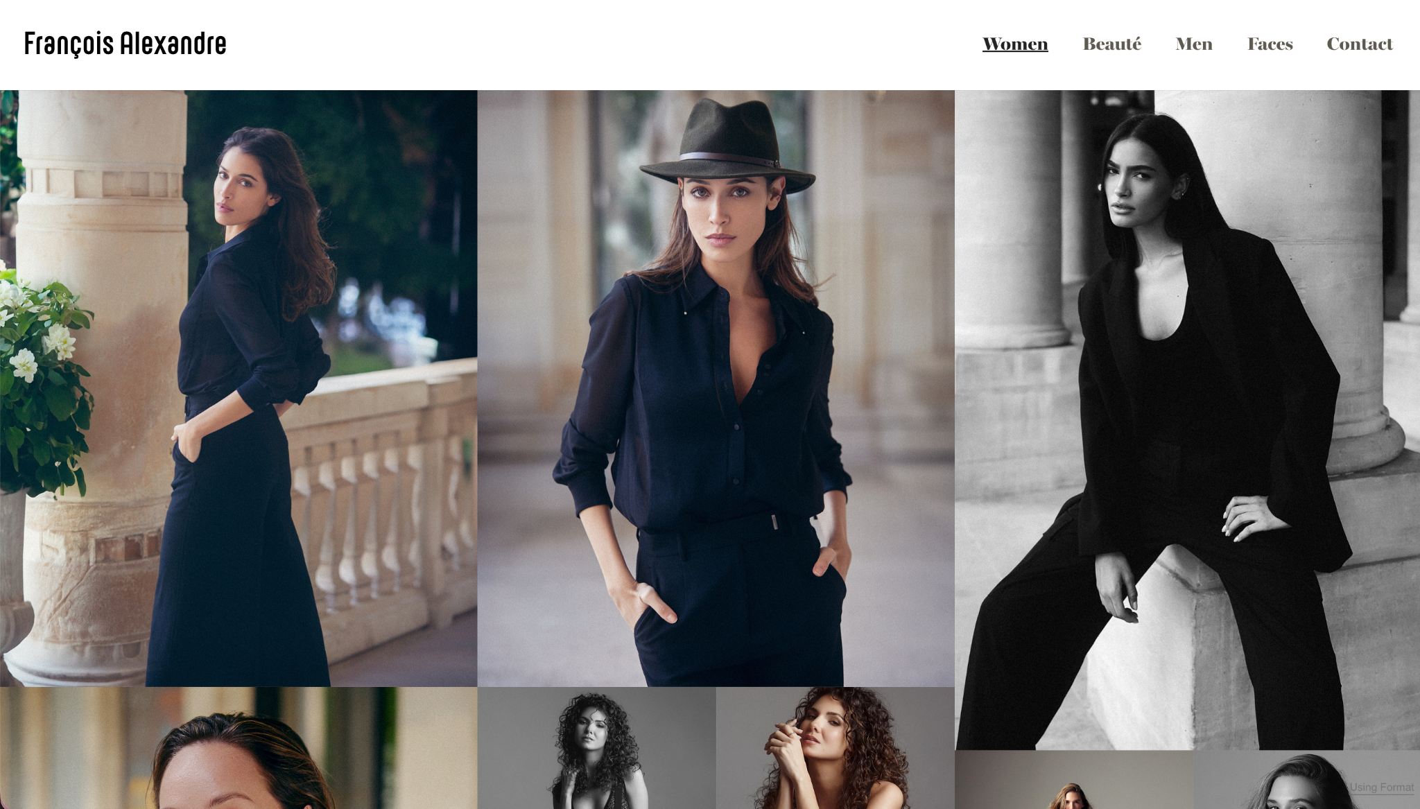
Paris-based François Alexandre photographs fashion, portrait, and lifestyle work, and his site opens with a striking large-scale hero image that sets the tone before a single menu item is clicked. The striking cover image gives way to the featured galleries of beautiful photographs of exceptionally beautiful humans.
Carla Lauly
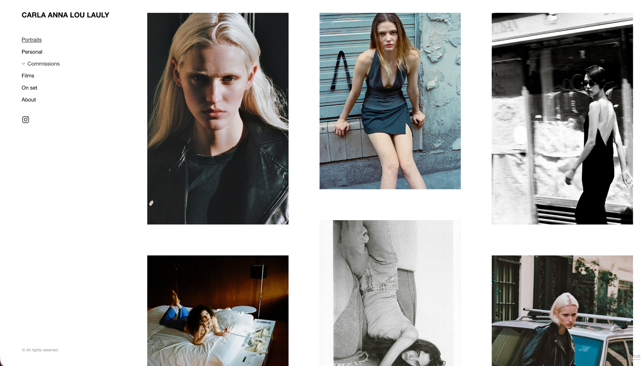
Carla Lauly‘s portraiture and editorial work spans personal projects, brand commissions, film, and backstage photography. A submenu lets her Commissions category expand to reveal individual client collaborations without crowding the main menu, which is a tidy solution for a truly broad client list.
Dave Sekiguchi
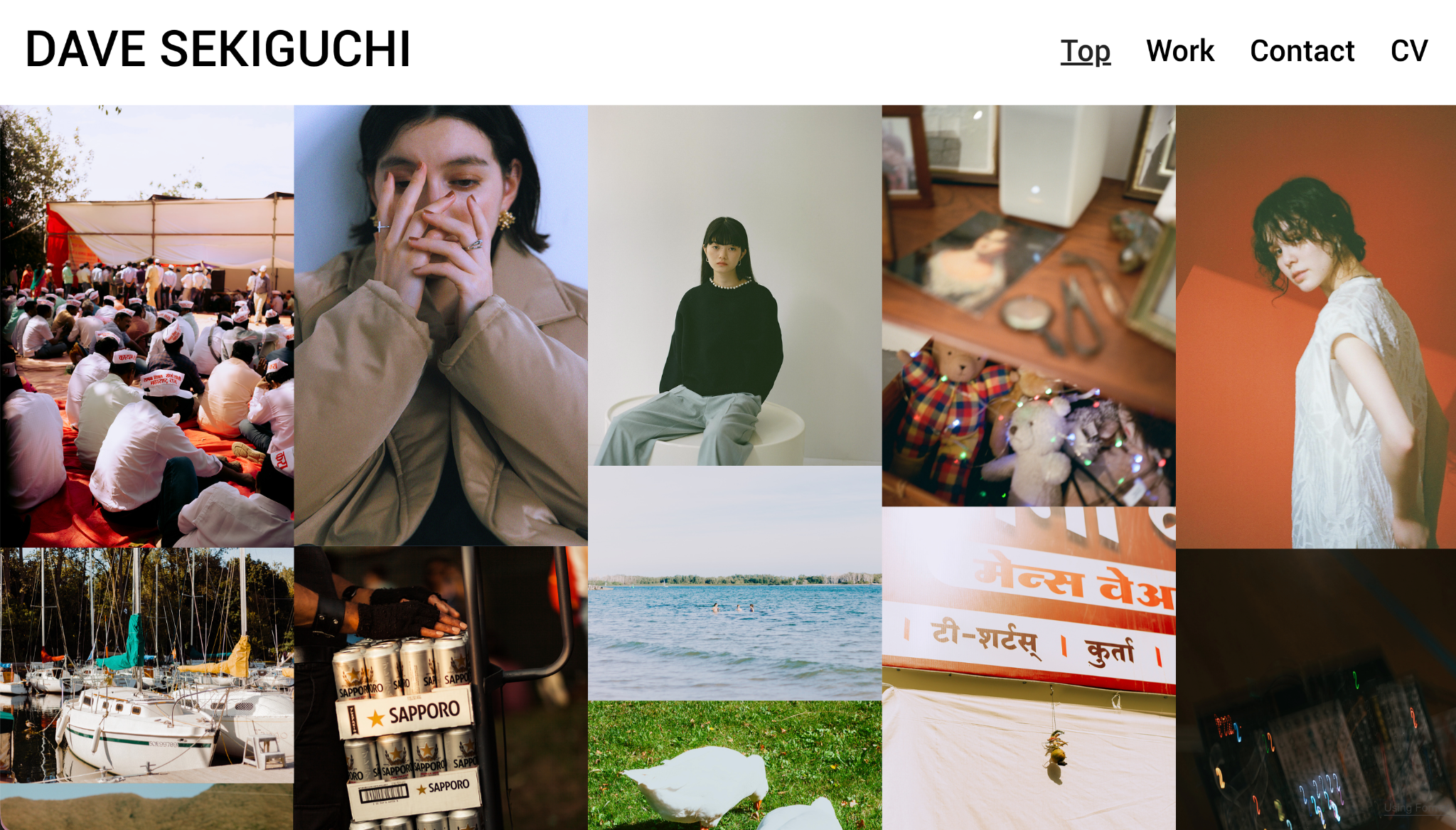
Daisuke Sekiguchi keeps things refreshingly simple in his online portfolio. His homepage is a gallery page showing loads of his photographs in one easy to scroll place. He also has a Work page that links to a few commercial projects he’s done and bare bones contact and CV pages. His portfolio is an example of Reflex at its most stripped down and confident.
What these Reflex portfolios have in common
Across all 13 sites, you see a few themes come through this very diverse crop of artists. The gallery pages do the heavy lifting, really letting the artists’ work be the star of the show. The layout may change, but they all offer an image-first launching pad, and the option to narrow in one image at a time with generous white space around it so that the viewer can really engage. The navigation is clean and easy to follow, and the typography is restrained.
This consistency isn’t an accident. All of these creators’ work is visual spaces, and they treat their portfolio like they would any other piece of their work. It serves as a calling card to be held up to the same scrutiny as the work within it. Reflex gives them a framework that stays out of the way of that judgment, which is exactly what an Criador de portfólio on-line should do.
Build your own Reflex portfolio
The through-line across every site here is the same: Reflex handles the polish so the work can lead. Whether you’re managing a sprawling client list or a tightly curated body of personal work, the theme flexes to fit without asking you to compromise on presentation.
If you’re ready to see it on your own work, Format has discipline-specific paths to get you started: Format for photographers, Format for artistse Format for designers. Iniciar uma avaliação gratuita and pick Reflex in the theme picker to see how your own portfolio looks with a little more room to breathe.
Colaborador
-

Erica Beyea estudou Belas Artes na Ontario College of Art & Design e se formou com louvor na NSCAD University.
Em 2014, ela fundou a Girls’ Art League em Toronto. Ela vive entre o leste do Canadá e a Espanha desde 2017. Atualmente, mora em Zaragoza, na Espanha.