For potential clients and collaborators, a good online portfolio website should provide an in-depth introduction to you and your work. Whether you’re a photographer, illustrator, or designer, you know the importance of making a good first impression.
It can be easy to feel intimidated by all the possible ways you can slip up with your site. Is it too crowded, or too empty? Too simple, or too difficult to navigate? Too much information, or not enough? Ultimately, there’s no one answer for what makes an ideal portfolio.
There are, however, a few common portfolio mistakes that can distract clients from your work. We got Format’s CEO and co-founder Lukas Dryja to explain what eight of those errors are, and how you can avoid them in your own portfolio.
Become your toughest critic and start curating your body of work. Every image should stop your scroll and make you think, ‘wow.’
Mistake #1: Your portfolio needs paring down
Choosing which pieces to include in your portfolio can be a challenge. It’s easy to go the route of including way too much, perhaps optimistically thinking that a larger portfolio will provide a more nuanced look at your work.
But a seemingly endless horizontal scroll of images on your homepage isn’t doing your work any favours—too many images are overwhelming to navigate.
Choose only your absolute best pieces for your portfolio, and leave visitors wanting more, instead of feeling like they’ve seen all there is to see already.
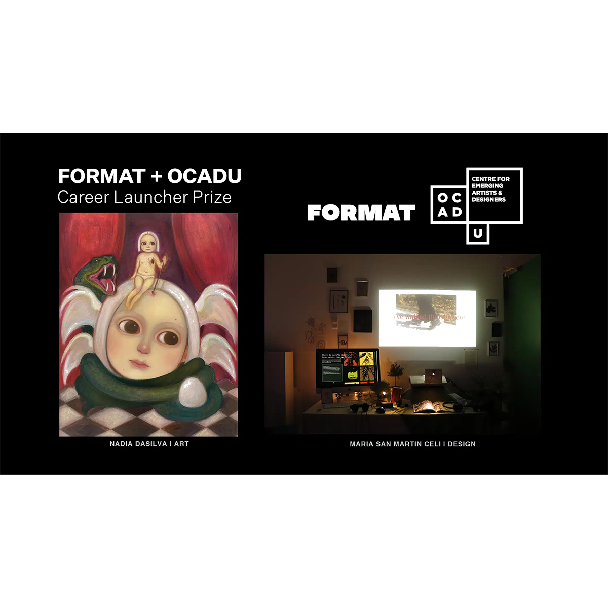
Check out Format’s Spotlight portfolios to see top examples of portfolio websites.
If you saw your portfolio as a storefront, would you stop in and take a look around? It should be easy to see what you’re selling.
Mistake #2: Your portfolio is unclear
“As with any website, your desired result should be spelt out for visitors — clearly and confidently,” Dryja explains. “It might help to think of your site as a brick-and-mortar location. If you saw your portfolio as a storefront, would you stop in and take a look around? It should be easy to see what you’re selling.”
There are many ways you can use your portfolio to clearly communicate what it is you do and, even more importantly, what you want to do. If you’re looking to get hired, it helps to state your availability clearly, including rates and services offered.
A separate page for this information ensures that it doesn’t distract from your creative work. If you’re aiming to sell work, especially anything displayed on your portfolio, think about how you can incorporate that into your portfolio, and note information like pricing and commission possibilities.
If you want to simply use your portfolio to maintain a professional web presence, linking to published work, awards, or features about you is a good idea.
Keep your top three dream clients in mind. Look at the kinds of creative work they feature and envision how they would want to review your work.
Mistake #3: Your portfolio is disorganized
If you’re thinking of your portfolio as an online introduction to who you are professionally, think of how you would introduce yourself in a professional setting. Maybe you dabble in several different areas, but which work is more important, and which is more of a side project? Dividing your portfolio clearly into different areas can help ensure that your work is presented in an easy-to-view way. Consider creating different pages to present the various genres of work you do, or get more specific by displaying projects and clients separately.
If you don’t have many projects to display, put some consideration into the order and arrangement of the work you do have.
Mistake #4: Your portfolio feels lacking
It’s totally possible to create an effective, professional-looking portfolio with a very small body of work. But in order to do this, you need to pick the right portfolio design. A grid-based webpage looks best with a larger volume of images, while a horizontally scrolling portfolio is better suited to fewer images—too many can feel overwhelming. See all of Format’s available templates here.
If you don’t have many projects to display, put some consideration into the order and arrangement of the work you do have. Create a sense of variety and interest by placing different works next to each other. Or consider adding more personal work for a more in-depth idea of what you do.
Knowing the challenges you had to overcome in executing a project can make the work that much more impactful.
Mistake #5: Presenting work without explanation
It can be easy to fall into the trap of thinking that your work should just speak for itself—that people checking out your portfolio don’t care who the person in that photo is, or what magazine you did that illustration for, or who styled that shoot you modelled for.
Providing a bit of background about the projects you’re displaying online helps show off your work in the most authentic light. There’s no need for detailed backstories about your creative process, but a brief note explaining the context around your work gives it more weight and lets people know exactly what role you had in the project.
Really introduce yourself, include a photo, provide some interesting background about who you are and what you’re interested in.
Mistake #6: Not including enough personal information
The About page is one of the most clicked-on links on Format portfolio websites. Make it count. Make sure your bio is personal and authentic, not just a formulaic introduction that readers will forget as soon as they’ve finished reading it, or a vague descriptor that leaves visitors wondering where you’re based and what exactly you do. Really introduce yourself, include a photo, provide some interesting background about who you are and what you’re interested in.
Let possible clients know what kind of work you like to do: if you’re a photographer, what do you prefer shooting? Portraits, events, editorials? Consider using your About page to list relevant professional experience or accolades, or past client testimonials. Use this space to let visitors to your portfolio know why they should want to work with you.
Double-check the spelling of names and places and then get a second pair of eyes on it, all before doing a large promotional push.
Mistake #7: Forgetting to proofread and spellcheck
It may seem minor, but something as small as a typo can ruin the sense of professionalism you’ve cultivated in your portfolio. Misspelled words or grammatical mistakes detract from your work and give your website a sloppy vibe.
Visitors to your portfolio won’t be able to give their full attention to your carefully laid out illustrations or beautifully curated photos if they’re distracted by careless errors. Take the extra moment to check over new edits to your site before sharing it.
From start to finish, your portfolio should create an easy and natural experience.
Mistake #8: Your portfolio doesn’t work as a mobile site
“From start to finish, your portfolio should create an easy and natural experience, whether viewers are browsing with their fingertips or scrolling along with their mouse — something we pride ourselves in offering at Format,” Dryja explains.
When you’re designing your portfolio website, it can be easy to get excited about how great your images look blown up huge on your desktop computer screen. But does that layout look equally awesome on your smartphone? Think about how often you check out websites on your phone or tablet, and what you look for in that browsing experience. You might need to streamline certain aspects of your portfolio to make sure they translate well to a mobile browser.
Show us your portfolio! Tag @useformat on Facebook, Twitter or Instagram.