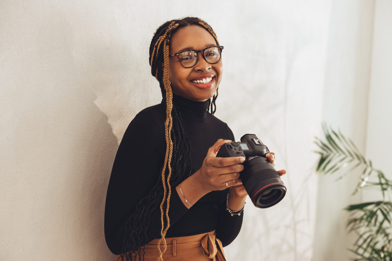
Ibrahim sat down with Format to share his tips for documenting your artwork, and how you can create the optimal setup for documenting your work in your home or studio on a budget.
Can you introduce yourself and your work?
My name is Ibrahim Abusitta. I’m a Toronto based artist.
I went to OCAD University and majored in photography, which is how I got my photo background.
I sort of stumbled into documenting artwork, from artists in my circle asking me to document their art, to being hired by galleries and auction houses. I had the connections to the art world as well as technical photo training, so that’s how I’ve developed my photo practice.
What tips do you have for setting up to document your work?
Some things that I would recommend, for the setup before taking images would be making sure you have the right lighting; that could be a variety of things we can get into later.
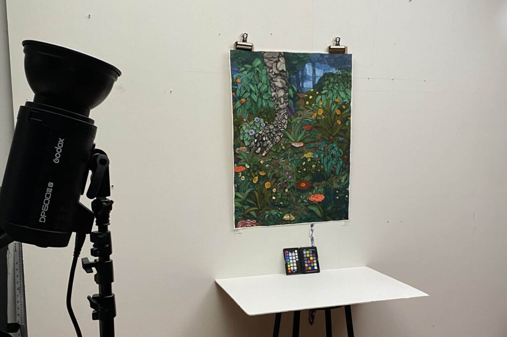
Making sure you have a white card; that’s always helpful. A white card is literally a white flat shape, maybe made of foam core, that you could use to bounce light around. The white card can be used to balance shadows out and make the light more even.
Getting a proper lighting set up is one of the most important things you can do for a successful documentation shoot and a white card is a cheap and easy tool.

What are some mistakes you see when people document their work?
One of the most common mistakes I see when people document their work is they will unintentionally use two very different light sources. For example; they will use the light from a window as well as the light within the room. One is warm (indoor light source), one is cool (the window). The different lights will affect the colors in the artwork differently, so when they go to edit the photo in post production, they will have a very difficult time balancing out the lighting.
Many creatives don’t have access to the type of gear professionals use for their work. What are some affordable, essential gear that you would recommend for those of us who aren’t photographers?
Some essential gear that I would recommend to non professional photographers would be getting Photoshop or some other image editing software. Many will have this for other parts of their practice, but if you don’t you might want to invest. Being able to do post production on images is essential.
Another thing I would recommend, if possible, is a tripod or some sort of makeshift tripod. There are ones for cell phones and for small cameras. There are even tabletop tripods if you want something more affordable. Really, anything to stabilize your camera. What you are doing with this is reducing the movement in the camera for a sharp image.
If there is more room for budget, I would highly recommend a color card, which you would use to really confirm the color balance. Color cards are a bonus but they really help with color balancing your images. A color card is essentially a card with primary colors (yellow, cyan magenta) as well as white and grey. You would take a photograph of it in the setting where you are documenting your artwork. Later on in post production, you select the gray color or the white color in that color card, and it will automatically detect the lighting source temperature, and you will be able to balance your painting or sculpture much more easily.

Do you have any other tips for documentation lighting?
So if an artist doesn’t have a professional lighting kit, there are a few options you may consider to light your work. One would be if you have a window that’s north facing, typically you have daylight coming through there that is soft enough and looks good on your artwork. However, you have to consider the direction of the light; it is not usually evenly lit on the entire work of art, which is where a white card would come in to balance it out. So you would usually put your white card opposing the window and have your work in between it.
The second option would be controlling the light in your room and blocking everything else out whether it has to be at nighttime or you have to black out your windows. Then you would light with lights/lamps/interior lighting instead of using daylight.
A third option would be investing in a couple of lights where you could just put in the same exact light bulb–meaning you would have two of the same lightbulbs to balance the work from the left and the right side.
If you’re using a tripod, you won’t worry about the brightness of the light as much because you can take a longer exposure.
What kind of lights would you recommend? Can you use a normal lamp?
I think you could use a normal lamp and get away with it, especially if you have Photoshop or a similar post-processing tool.
You can use warm lights, or you can use cool lights. The key is to not mix the lights because in post production, you correct all of that. Most professional gear shoots on the cool side. So if it’s possible, just go for some cool light bulbs.

How do you deal with shadows or glare when you’re documenting work?
Typically you need to look at the artwork and assess why the glare is happening and at what angle you stop seeing the glare. The key is to compensate for your position with the camera and the position of the light. Sometimes you need to go higher or lower to the work until you stop seeing the glare from the camera angle.
Then, in post production you can balance things out by keystoning the work to make it feel as if you are right in front of it.
Can you explain what keystone is?
Keystoning is adjusting the angle and pitch of the work in post production. Imagine you’re looking at a rectangle head on. Now imagine you need it to tilt back or to tilt forward. This is something you usually have to do when you project an image from a projector onto a wall and you need things to square out. So keystoning is pretty much shifting the perspective of the corners of a rectangular or square coming towards or away from the viewer until they make 90º angles again.
What advice do you have for focus or sharpness. How do you avoid blurry images?
The key to avoiding a blurry image would be using a tripod. Or a makeshift tripod and setting your camera to a two or a ten second countdown so that once you’ve pressed your shutter release, any shaking that’s happening will subside by the time the ten second timer has reached.
Once you’ve taken your shot, zoom in and confirm that your image is sharp.
You mentioned makeshift tripods, what are some examples of makeshift tripods?
So I’ve had to make all sorts of makeshift tripods in different scenarios. You can use anything sturdy and flat: a tabletop, a stack of books, really anything that would just hold your phone or or camera in place. Sometimes it’s as easy as just having the tabletop and whatever you need to raise or lower the camera.
The fact that you’re not hand holding it means you will have less chance of a blurry image.
How do you capture the surface texture of a work?
My recommendation for capturing surface texture in work would be to have your light source coming from above the artwork, therefore casting a shadow beneath the texture. This is something that we are used to when we receive the work in a gallery setting, so it looks “right” to us. The light source there is always coming from above.
What do you recommend for the composition of photos?
For the composition of the photos I would say to keep in mind that we are just documenting the work, and this is not an artistic shot. So, your composition should maximize the size of the artwork within the frame. The larger your image, the more detail you will capture. You just center it and fill the frame as much as you can.
What if you’re documenting something like an exhibition or an artwork in a particular setting? Do you have tips for documenting in situ?
My recommendation for composing a shot of an exhibition installation is trying not to go too wide with your lens and centering the image to the frame on the vertical axis.
You want to also consider taking the point of view of the gallery visitor as your shot. So no low angles, no high angles, and have variety. Go for detail, go wide, give the viewer the experience of the space.
Do you have tips for photographing three-dimensional work?
My biggest tip for photographing three-dimensional art would be to set up a cove, which is a curved backdrop that allows you to photograph your artwork without seeing a horizon line. A cove is essentially just a piece of seamless paper that you set up on a curved angle from the wall or support. You can go to your local art supply store or a photo rental supply store and get a roll of wide white paper.
If you can’t set up a cove at home another option is having just a wide surface and avoiding the edge of the paper. The key here is to photograph the sculpture without seeing a horizon line. Horizon lines (like where the floor meets the wall) can be really distracting from a 3D piece because then you have these lines visually cutting into the work. Eliminating the horizon line allows you to view the sculpture on its own.
The other recommendation is setting up a tripod keeping your camera in the same place and rotating your artwork at least four times to give the viewer a full three sixty view of your artwork. By keeping the camera in place, your work is moving, not the viewer.

What advice do you have for editing and retouching? What top programs or tools do you use?
My advice for editing and retouching would be to watch a lot of tutorials [on youtube] specifically on the things that you need to learn for this specific task; the biggest one being “how to do color correction.”
The other tool that is often used for documentation is the transformation tool, where you can distort the perspective or warp the edges. This allows you to make your 2D work look square again. It can be really hard to avoid distortion in your photos, so this tool lets you correct that.
And the program I always use would be Adobe Photoshop. If you can get that software it’s very helpful. There are other variations of this program, but photoshop is an industry standard.
Do you have any specific tips when you’re using your cell phone to shoot work?
I have one very important tip for shooting with cell phones, and that is you have to wipe the lens. We handle our phones all day in our hands so our fingers are on the lens constantly. So, the first thing you should do is give your lens a very good wipe.
The other tip is take advantage of the self timer and the focus lock, which you can do by pressing and holding on your screen, so that the camera doesn’t shift focus whenever it sees something new in front of the lens.
Any other tips for documentation?
There’s a lot of automation that can happen between the camera settings, the Photoshop settings, and so for someone who doesn’t have the skills and is still learning, take advantage of some of the auto settings. Same goes for the color correction. If you couldn’t get a color card, you can use an auto white balance and nine out of ten times, it looks pretty dead on. If you ever feel like it’s off, there are manual adjustments that you can do, but at least the auto gets you closest to what’s the best result.
If you don’t have money for a color card there is also something called a gray card, and it’s just a gray color, and that’s what your software will use. Having either a gray card or color card will really speed up your post production and make your color balance easier and more accurate.
Aboveall, try to do the post production either in the space with your work or soon after the shoot when the experience of the work is fresh. Having the artwork on hand to make sure the color balance is as close as possible is a huge bonus.
Do you have any tips for pro photographers who might be getting into documentation?
My big tip for photographers who want to document work is that the best lighting method is shooting your strobes into a ceiling and having it bounce back down onto your work. This enables the light to soften and not be too harsh.
I would also recommend any photographer to use a capture software called Capture One. This way you can shoot from the camera straight to your laptop in a manner they called “tethered.” This is easier than shooting onto your camera and looking at the back of the screen, because the monitor on your digital camera is usually a lesser quality than what you’re actually going to get when you look at it on your laptop. So with this method you can go right to that final image source and know if your image looks good or not.
Enjoy Ibrahim Abusitta’s work via his online portfolio website, created with Format, where you can also contact him for documenting your work. Follow him on Instagram to see his most recent work and coverage of events.