Designing a great logo is about more than just choosing a typeface, adding a few colors and an on-theme icon. A logo is the first impression a company makes on potential customers—a touch point that represents everything a company is trying to convey. It affects how people perceive and interact with a brand, and ultimately becomes the brand’s key identifier.
While designing an attention-grabbing logo is difficult enough, redesigning a famous logo brings with it a whole new set of potential issues. When Gap changed their 20 year old logo back in 2010, the customer outrage was so fierce, the new logo only lasted a week. Instagram’s new logo has grown on most of us, but when the image sharing app unveiled its new look in May 2016, the design was described by one Guardian writer as, “if the camera was murder, and chalk was drawn around its body. Murdered at sundown.”
Many brands have embarked on the perilous journey of redesigning their logos, and while not all are met with outrage, many have hidden meanings or hard-to-believe backstories. We’ve rounded up 10 logo design secrets from famous brands that shed light on the mysteries of designing—and redesigning—logos.
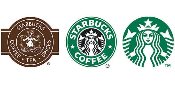
1. Starbucks’ original logo was NSFW
Most people are quite familiar with the long haired, two tailed mermaid that graces every cup of Starbucks coffee. But did you know that she used to be topless? The inaugural 1971 logo featured a topless siren with a more nautical feel and a coffee brown color palette. It wasn’t until 1987, when Howard Schultz acquired the coffee powerhouse, that the siren covered up and the iconic green color palette was introduced.
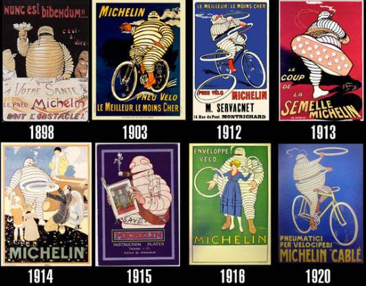
2. The Michelin Man started his life as a drunk
Nowadays, most automotive related companies do everything in their power to distance themselves from associations with alcohol. But thank god one of the world’s oldest trademarks, the first incarnation of the Michelin Man.
He wasn’t always the smiling marshmallow-esque man we now know. He was born in 1898, wore a pince-nez and was seen raising a glass of champagne to toast the tires he represents. He was soon given a rather troublesome nickname: The Road Drunkard.

3. The Nike logo cost less than a week’s groceries
When it was designed back in 1971, graphic design student Carolyn Davidson was approached by Nike’s co-founder, Phil Knight, to create the now-iconic logo. Davidson came up with several concepts, it was the “Swoosh” that was finally chosen as the Nike logo. At a rate of $2.00 per hour, Davidson was just $35 for what came to be one of the world’s most recognizable logos.
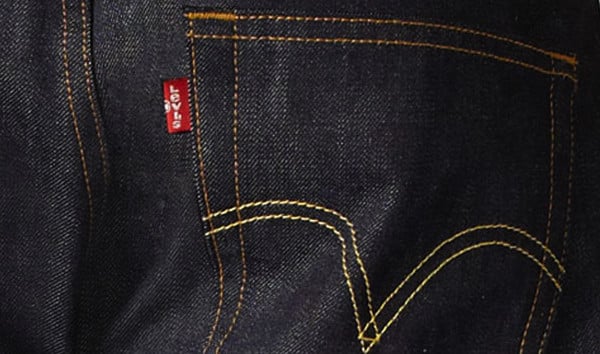
4. A logo designed to for results
Originally known as the Two Horse Brand, it wasn’t until 1936—83 years after the company was established—that Levi’s adopted the now famous red tab. Designed by a sales manager name Chris Lucier, the red tab was introduced to help identify Levi’s from the sea of sameness in the denim market. It has since become one of the most recognizable logos and a standalone brand element.
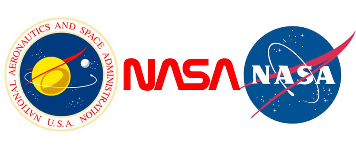
5. The nicknames NASA Vets gave the logos
For the first fifteen years of NASA’s existence, the agency’s logo”—a blue circle featuring the agency’s name, a cluster of stars and a speeding spacecraft—was affectionately called the “meatball”. When a replacement was designed in 1976, it too received a nickname. The simplistic logo was streamlined to spell out NASA in thick, tube-like letters and people began referring to it as “the worm”.
In 1992, under the new leadership of Dan Goldin, the meatball was restored and the agency happily bid adieu to the much-detested worm.
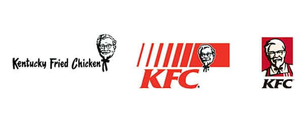
6. It’s always been about the Colonel
In its 65 years as a fast food mecca, the Kentucky Fried Chicken logo has had only 5 redesigns. But one thing never changed—from its first incarnation in 1952, the KFC logo has always featured Colonel Sanders. He became a bit friendlier in 1997, and in 2007 the Colonel started wearing an apron over his slick white suit, but in every logo he’s featured front and centre.
Image via Creative Market
7. The Chupa Chups logo was designed by Salvador Dali
Since it’s creation in 1969, the logo of famous lollipop company Chupa Chups has remained virtually unchanged. But when you have a logo designed for you by Salvador Dali, why would you ever change it?
Dali was good friends with the founder of Chupa Chups, Enric Bernat. When the pair were out to lunch on day, Dali designed the logo in less than a hour. The simple design is world famous, and Dali’s vision of placing the logo on the top instead of the side ensures you always know which lollipop you’re about to enjoy.
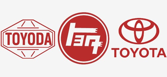
Image via Japan Travel Cafe
8. Toyota’s logo is all about the love
Whether you’re parents drive a sweet Camry, or you’re travelling through town in a Yaris, odds are you’ve seen the three interlocking ovals that represent Toyota. This version of the logo was introduced in 1989 to commemorate the company’s 50th anniversary. It took five years to create the Toyota logo which represents three hearts—the heart of the customer, the heart of the product, and the heart of progress in technology.
9. Google’s first logo was a bizarre concept
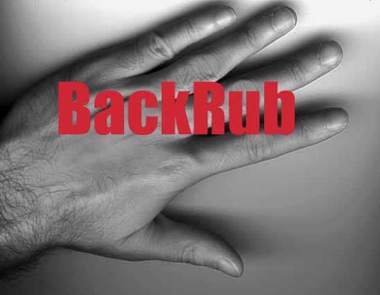
In 1996, before Google was a verb that we used almost daily, it actually went by another name—BackRub. The logo? An extremely awkward image of hand caressing a bare back. Named for the underlying technology of backlink tracking that would mean very little to the everyday user, it wasn’t until 1997 that Larry Page and Sergey Brin decided to change the name to Google.
Imagine, if history had gone another way we could be asking each other to BackRub where the nearest bar is.
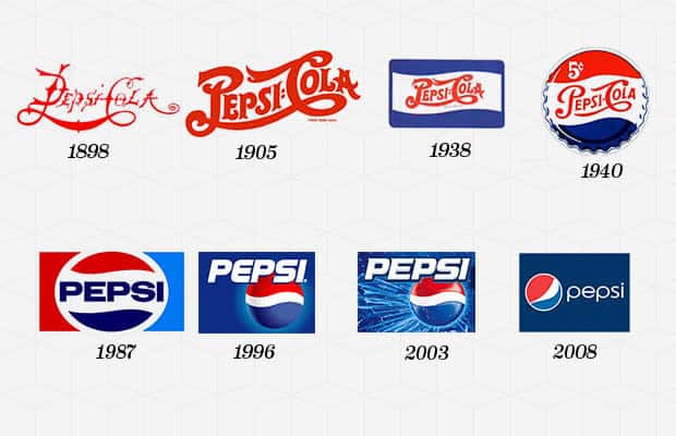
10. Pepsi’s color palette is a patriotic nod towards the war effort
In the 1940’s dropped it’s curlicue typeface and circular logo in favour of a less swirly font and a rectangular logo. Pepsi also changed the bottle crown to feature red, white and blue to support America’s war effort during World War II.
