London-based trio Luke Frost, Jon Rundall, and Therese Vandling are Heretic Studio. As printers, designers and illustrators their collective work can be described as experimental, process-focused screen printing. The image-makers, however, have many other talents, as a collective and independently, and their careers boast projects in graphic and packaging design, as well as publishing.
Heretic Studio’s forays in print include abstract color spectrums, vivid shapes and collage blocking where the reduction of imagery has been replaced by color, creating abstract landscapes. It appears that they like to play with reality, and sometimes escape it by distorting, manipulating and transforming it with some of the boldest colors known to man.
London-based publication Create-Zine caught up with Frost and Rundall, right in the middle of their studio move, to find out a little more about the trio.
This interview originally appeared in Create-Zine Issue Two.

Top to bottom: Illustration for Architectural Review, illustrations for Thomas Girst’s book The Duchamp Dictionary.
Where did you three meet?
Luke Frost: Therese and I met at London College of Communication in the screen printing department. Jon and I have known each other from way back. We had worked on various illustration projects together before Heretic Studio happened.
Your explorations with color use incredibly vivid neon acids married with softer yet bold tones. Why is colour important?
LF: As human beings we are all deeply affected by color, and the screen printing process allows us to use ultra vivid colour palettes. I took a reasonable amount of acid as a teenager and enjoyed recreating the vivid color spectrums of my mind.
Jon Rundall: Before getting into screen printing, I mainly drew in black and white, so printing added a new dimension to my visual thinking.
You focus on distortion, manipulation and transformation rather than depicting reality, why so?
LF: It’s a form of escapism. It’s nice to be somewhere else.
JR: Yes, we all need frequent holidays away from ‘reality,’ as Mr. Huxley said.
You’ve been working on your experimental screen printing project, Spectral Nation, for many years. Why did you embark on it?
LF: Originally we were producing a mixture of illustration and collage. We had the idea of working on an exhibition that was purely about the process. It was to limit us to a few elements and try out different techniques. Every print we produce introduces us to new ideas for our next piece. It is an unending endless endlessness.
Any other favourite projects?
LF: The work we made for The Line sculpture walk has to be one of those dream projects that comes along once in a lifetime. We were commissioned to make a series of 30 experimental screen prints to form the visual language for the project. Printed in three to eight colours, including fluorescent and metallic inks, the experimental prints attempted to convey people’s varying personal interpretations of the walk. One thing that tied all these experiences together was the presence of the water. We looked at the interplay between the sculptures, the environment, water refractions, reflections, distortions, varying angles, viewpoints and perspectives.

Posters for The Line, an art walk in London
You work across a wide variety of disciplines from screen print to graphics, album sleeves and typography, but where do you guys feel most comfortable?
LF: We all have different strengths and skills so we all have different areas we feel comfortable in. We are all very interested in the music scenes and have done loads of work in this area so we feel comfortable there. We love to put our minds to anything. Interesting things happen when you are out of your comfort zone.
Where do you get your inspiration?
LF: Music is a big stimulant, as is general London life, print and interesting chance happenings.
JR: Work mostly grows from an initial starting point. This could be a visual mark, a subject or some words that spark ideas in your head. Non-visual stimuli such as music can provide a feeling that translates into visual ideas. If you let the print process lead the development of a piece of work then sometimes it feels like we act as a kind of visual shepherd guiding the process.

Artwork for Swedish custom wallpaper company Mr Perswall.
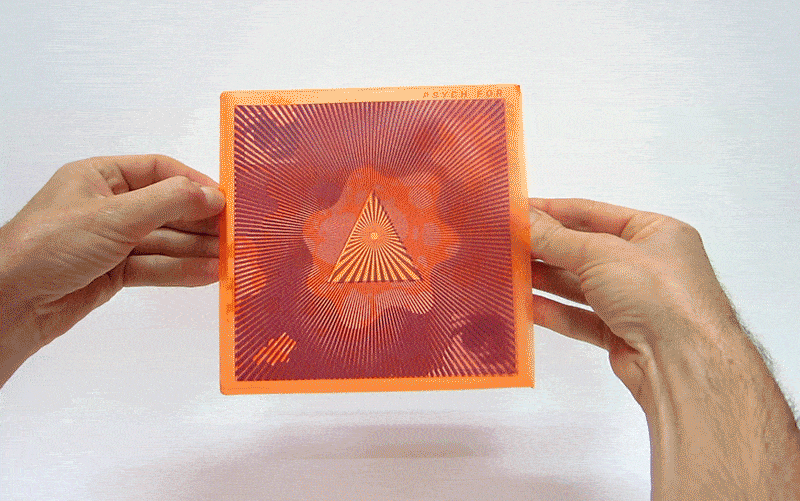
Album cover for Sonic Cathedral’s Psych for Sore Eyes 2.

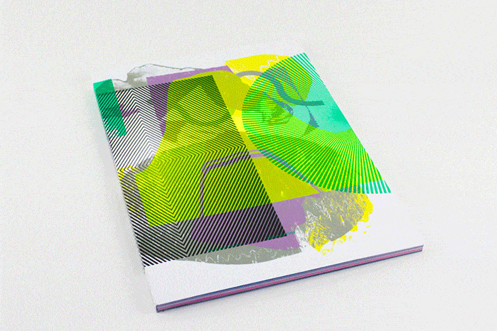
Litho printed cover for Print Isn’t Dead magazine.

Magazine printed for Laboratory Arts Collective.


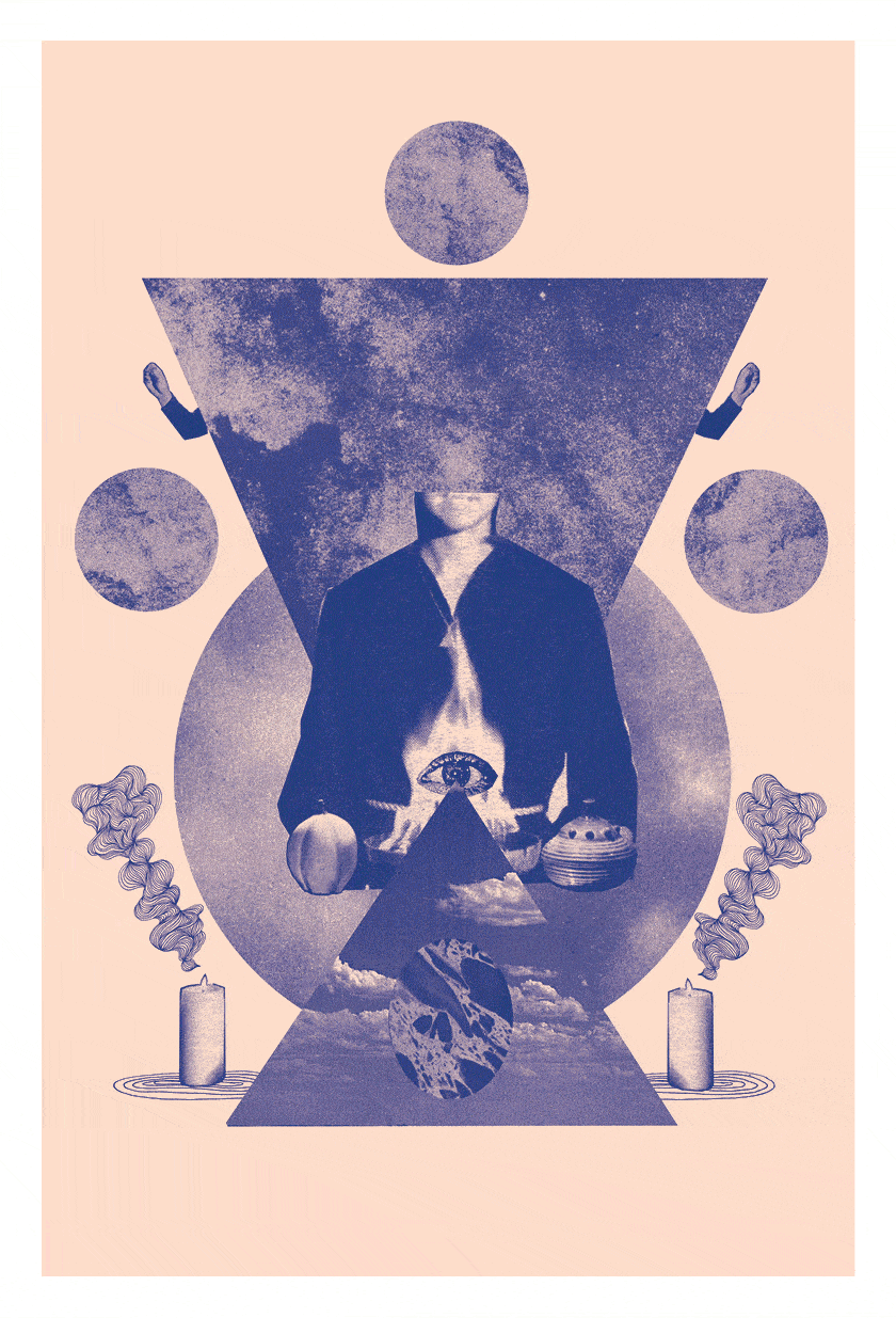
Spectral Nation screenprints.
Cover image: unique hand-printed covers for Print Isn’t Dead.