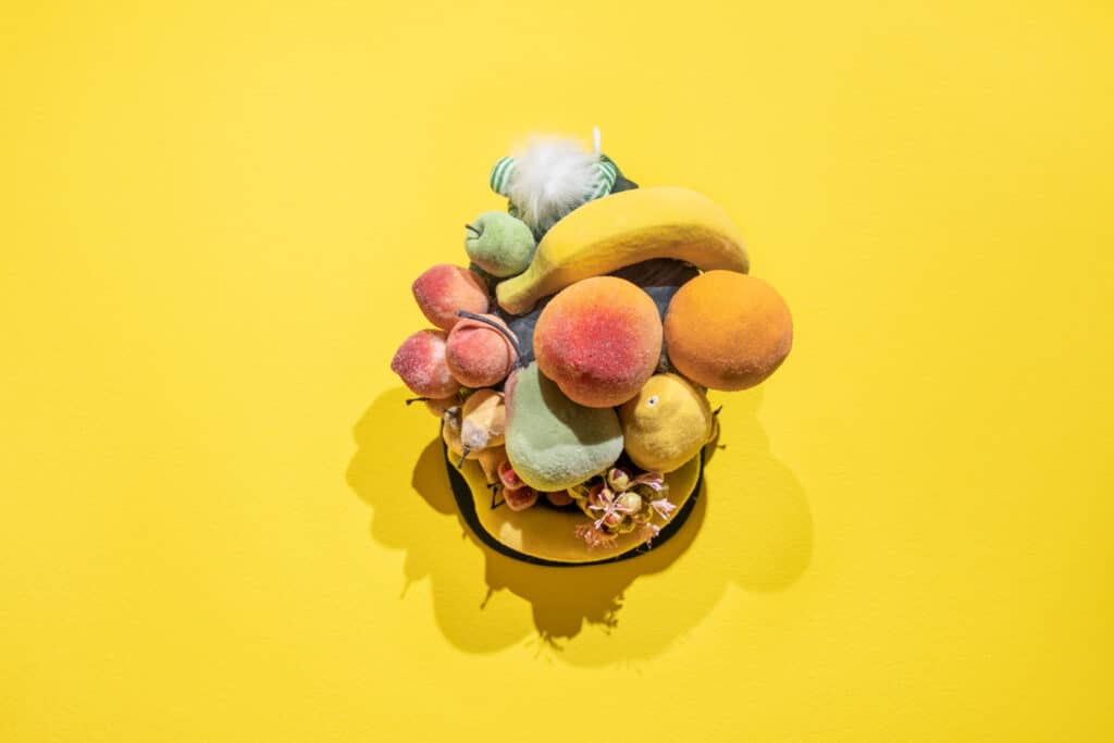
One of the most amazing tools in photography is color. Color adds style and personality to your images, especially if it is used with intent. Complementary colors are a great photography style that can turn basic images into showstoppers.
A complementary color scheme is a great tool for photo shoots, post-production, and your online photography portfolio, and best of all, it’s the knowledge doesn’t cost you a thing! In fact, well-placed color can often elevate your images in ways expensive equipment and lighting can’t, drawing the eye to all the right places. So, what makes colors complementary, and how can you use them to up your photography game? In this guide, we take a deep dive into complementary colors and how you can use them to tell a story in your images, conveying emotion, and perspective in your work.
What are Complementary Colors?
The definition of complementary colors is in the name—colors that pair with one another in a pleasing way. Our eyes and minds have been taught which colors go well together and which colors clash. We’ve also been taught to see certain colors in certain ways, associating a specific feeling with a color. Let’s look at one of the easiest ways to understand and use complementary colors in your photography: the color wheel.

Understanding the Color Wheel
When you think of complementary colors, the color wheel might pop into your head right away, and for good reason. The color wheel was likely a staple of your high school art class, displaying the twelve main colors in a circle or wheel. The colors on the wheel are organized based on warm colors and cool colors, moving from warm to cool and then back again.
Three colors on the wheel are primary colors, which means you can’t create these colors by mixing other colors together. The three primary colors on the wheel are red, blue, and yellow. When you mix two primary colors together, you get a secondary color. For example, if you mix red and blue together you get purple.
If you mix a primary color with a secondary one, you get a tertiary color. Tertiary colors are hyphenated based on the colors that are mixed together, such as red-orange if you mix red and orange together or blue-green if you mix blue and green together.
Understanding how colors can be mixed together will make it easier for you to refer to the color wheel when you are trying to identify complementary colors. Consider investing in a small portable color wheel image from your local arts and crafts store. You can also save an image of the color wheel on your phone or buy a stock photo of a color wheel. This way, you will have easy access to the color wheel and can refer to it on the fly, such as on a shoot or with a client.
Identifying Complementary Colors on the Color Wheel
To find complementary colors, look at the color wheel. Choose a color and then trace a diagonal line directly across from it on the circle. The color that you land on is its complementary color. The most common complementary color examples are:
The blue complementary color is orange
The orange complementary color is blue
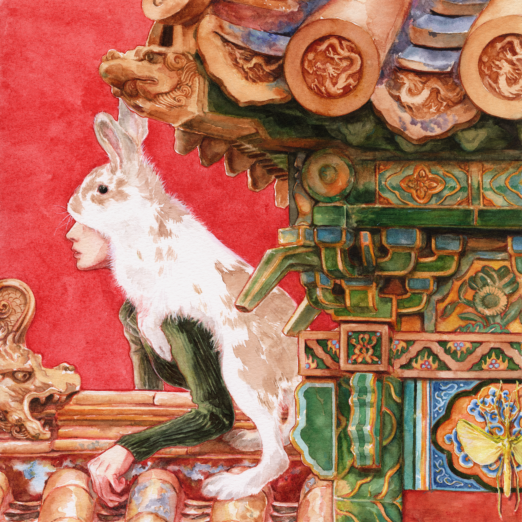
The green complementary color is red
The red complementary color is green
The purple complementary color is yellow
The yellow complementary color is purple
Now that you have a solid understanding of complementary colors and how to identify them on the color wheel, let’s dive into complementary color photography.

How Do You Use Complementary Colors in Photography?
Complementary colors enhance one another when they’re placed side by side or integrated into the same composition. However, when you mix them together completely, you get a neutral color. That’s why it’s important that you use complementary colors in a strategic way so they are effective and do not neutralize your composition.
There are a few key ways you can tap into the power of complementary colors in your images, including:
Link Complementary Colors with Emotion
Colors are often used in photography to convey emotion and feeling to viewers. Certain colors are synonymous with specific emotions in the design world, and will often trigger a certain response from clients and consumers. This color psychology can come in handy when you are selecting complementary colors for your images.
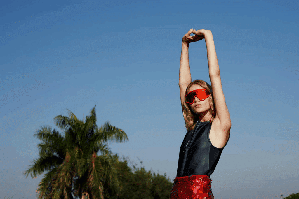
For example, the color blue tends to be associated with stability and calm, while the color orange tends to be associated with warmth and energy. So, if you bring these two colors together as complementary colors in an image, you will be contrasting the calm of blue with the warm of orange, a stand out combination that gives you a lot to play with.
There are also complementary color schemes that we have been trained to associate with specific celebrations, such as red and green with Christmas, and orange and black with Halloween. These complementary color schemes may come in handy if you’re designing a holiday-themed shoot or campaign, but otherwise, you may want to steer clear of them or risk confusing a client who isn’t interested in Christmas colors. Keep in mind the emotional associations to color we have so you can play around with complementary colors in an intentional and thought-provoking way.
Use One Complementary Color as an Accent Color
Rather than give both complementary colors equal real estate in your images, choose one to be the lead color and one to be the accent color. Use a small amount of the accent color so it stands out against its complement. You’d be surprised by how little of the accent color you need to create a nice contrast. This will keep your images balanced and intentional.
For example, you may use purple as the lead color and yellow as an accent to balance out the composition. Or you may opt for green as the lead color and accents of red to avoid an overly Christmas or holiday vibe to the image.
Soften One or Both Complementary Colors
Another way you can create complementary photography is to soften your colors by adding tints like white, tones like grey, or shades like black. Softening one or both complementary colors will make the image eye-catching without being overwhelming or overdone. You can soften your colors in post-production or choose softened complementary colors for a shoot.
For example, you might opt for green as your main color and a softened shade of red as the complementary color. Or you could soften both blue and yellow to create a complementary color scheme that is still striking, but not too in your face.
Go for a Split Complementary Color Scheme
This option is great if you have a large composition to work with or you are trying to create a color scheme for a photo campaign, shooting images that will fit together as a series or group. To create a split complementary color scheme, also known as a double complementary color scheme, start by selecting the main color. Then, select two colors that are on either side of its complementary color on the color wheel. This color scheme will create interesting images that feel like they are part of a family.
So, say you choose red as your main color. Red’s complementary color is green, so you would use blue-green and yellow-green to create the split complementary color scheme.
Embrace Saturated Complementary Colors
If you’re looking to create bold images or stir up a strong reaction, saturated complementary colors may be your dream scheme. Highly saturated complementary colors can convey chaos, attention, and bold emotions, so go for it if you feel they would be a good fit for a particular image or for the style of a particular client.

Using Complementary Colors in a Photo Shoot
When you prep for the shoot, think about the emotions you are trying to convey. Ask yourself, do I want to create a sense of calm and warmth? Do I want to create something bold or saturated? Consider how complementary colors can help you tell a story in your images. There are a few concrete ways you can create a complementary color photo shoot:
Create a Mood Board with Complementary Colors
Get a blank board or area on your wall and build a mood board with a color wheel. You can even create your own complementary color wheel where you position together complementary colors so they are easy to identify. Paint sample cards from your local hardware store are also great for playing around with complementary colors, including softened or muted colors.
You can also add images by other photographers to the mood board for inspiration and guidance. Look for images by photographers that use complementary colors and note how they made the scheme work together.
For example, if you’re planning to do still life photography with complementary colors, do a search online for similar images. Note how other photographers have used complementary colors as accents or in specific areas of the composition to highlight an element of the still life. Then, borrow their approach and make it your own.
Do a Test Shoot with the Complementary Color Scheme
When you’re creating complementary photography, you want the colors to be accurate and precise in the image. Elements like the time of day for the shoot, studio lighting, and your camera’s white balance can all affect how the complementary color scheme appears in your photos. Do a test shoot before shoot day to ensure you are happy with how the complementary colors look. Note the time of day, the light settings, and your camera settings during the test shoot so you can easily replicate the same environment on shoot day.
Use Complementary Colors for Props and Wardrobe
Finding a location with complementary colors can be a challenge, especially if you have a clear color scheme in mind. Focus instead on using props and items that are in the shades you’re looking for to create a complementary look. Choose a wardrobe for the shoot that reflects the complementary color scheme so the colors stand out on the model and feel essential to the images you are creating.
For example, perhaps you’re excited to create a family portrait using a complementary color scheme. You may want to dress the family in clothing in complementary colors or include props in the portrait that works with the complementary color scheme.

Applying Complementary Colors in Post-Production
Post-production is a great opportunity to add complementary colors to your images, as it gives you a lot of flexibility and space to play around. If you have some experience editing your photos in Adobe Photoshop, you may be familiar with editing color. But you may not have thought about it in terms of complementary color or creating a harmonious balance of color in your images. Similar to a photo shoot, using complementary colors in post-production requires a keen eye and leaning on a few tools in Photoshop to achieve your desired effect.
Use a Color Harmony Calculator for Color Accuracy in Photoshop
This handy tool can help you find complementary colors based on the exact color in your image. It’s a great option if you’re trying to pair complementary colors on an image or design element with text overlay. It can also help you get an accurate reading of the colors in your image, and play with complementary colors when you edit.
Look online for a color harmony calculator. Most design apps have a free color harmony calculator you can access, such as one by Canvas. Then, open Photoshop so you can edit the image.
For example, maybe you have an image that you are using in a brochure and you want the text to pop, so you’re in search of a complementary color to the most dominant color in the image. To use the color harmony calculator when you edit images in Photoshop:
Select the eyedropper tool in Photoshop and choose an area of the image that contains the dominant color.
Open up the color picker and get the hex code for that color.
Open the color harmony calculator and select “complementary” as the harmony you’d like. Input the hex code of the dominant color. The calculator will then give you a code for its complementary color.
Enter that code into the hex code field in Photoshop so you can find and select the complementary color. Select that color for the text color on the brochure.
Using a color harmony calculator will give you complementary colors in minutes, and make it much easier for you to create complementary photography in post-production.
That said, when you use a color harmony calculator you are moving from the subtractive color model, which are the colors you see through your camera lens, to an additive color model, which are the colors you see on your computer screen. You may get a weird or off result when you run the dominant color through the color harmony calculator, which is to be expected. If so, don’t be afraid to tweak the complementary colors to fit your preferences.
Edit the Hue and Saturation in Your Images
The Hue/Saturation Adjustment Layer in Photograph is another great way to use complementary colors in post-production. Play around with this layer to create eye-popping complementary photography in minutes.
If you have a particular color in the image you want to work with, go to Select>Color range.
Then, choose your preferred color from the “Master” dropdown menu.
Move the Hue slider to change all of the colors in that color range, finding the complementary color you’d like to use. You can also change the lightness and saturation of the color ranges in this layer.
Tweak the color by using the Paint feature to brush over it with a new layer. Play with the opacity and flow settings on the brush to change the intensity of the effect. You can also try different blend modes.
If you notice one color is popping too much during this editing process, add more of the color’s complementary color to control it using a Color Balance adjustment layer. This layer has three sliders you can use to manage the primary hues in your image. You can also control the shadows, mid-tones, and highlights in the image using the drop-down menu at the top of the dialogue box.
Showcase Your Complementary Color Photography in an Online Portfolio
Now that you’ve embraced the creative potential of complementary photography, you’re ready to execute this photography style at your next shoot or your photo editing session. Once you’ve created stunning complementary photography, don’t let your images sit on your computer, hidden from the world. Show off your complementary color photography in an online portfolio website.
Don’t have an online portfolio yet? Use a website builder to build one in 10 easy steps and feature your complementary photography in style.
Pick one that has gorgeous templates to choose from, and offers features like a built-in blog and online store, plus client proofing.
This way, you can impress existing clients and peers, and attract new clients with your eye-catching complementary color images.
Want more photography hacks?
Photography Project Ideas to do at Home During COVID-19
How to Get More Photography Clients
How to Create Glitch Art Photography