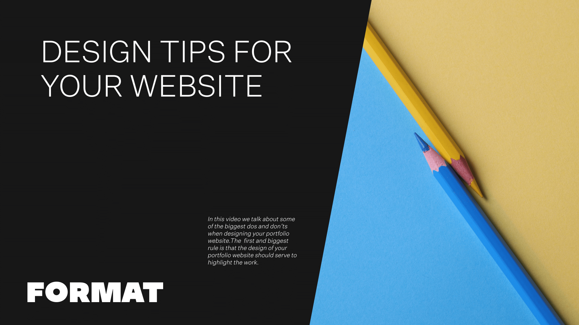
In this video we talk about some of the biggest do’s and don’ts when designing your portfolio website. The first and biggest rule is that the design of your portfolio website should serve to highlight the work. Think of the design of your site like the foundation of a house–the structure is critical, but it serves to support. If the structure is too distracting–there might be a problem.
When someone is coming to your site, you have a few precious moments to engage them with your work.
Interactive Homepage Layout
Stay away from landing pages unless they are serving a specific purpose or provide a huge impact. Instead of a static image on a page, I like to set the homepage of sites to a collection page. This way, when someone comes onto your site they are immediately met with an overview of your best images–and better yet, because a collection page is a page of image links, visitors to your site are immediately engaged because the page is responsive to clicks.
Thoughtful Font and Color Choices
Fonts and colours are another big consideration. If used well, they can help to set the tone of your site: from formal to friendly or even unconventional. But if overused, they can distract from your images, which should be the key focus.
When thinking of fonts and colours, think accents. For example, instead of using an extreme font throughout your site, reserve this for your site logo and header texts. Make the body text of your site something clear and easy to read- this way visitors will focus on the content instead of the font.
Colors can be tricky too. Because it is a portfolio site, colours should generally be neutral so that your work stands out. Use colours to accent different areas of your page, which will compliment the work. Coordinated headings, mailing lists and slideshows will tie the design of your site to your featured work. Format also offers some color-responsive themes, such as Coral and Spruce, which will automatically grab the colours from the edge of your photos and create color-responsive frames around your images. These can be great for bright, poppy work, like Fashion photography or food photography sites–or, can be employed as a subtle backdrop to black and white photography, with each frame picking up the subtle shifts in greyscale.
Curate Your Best Work
Above all, curation is key. The biggest mistake I see on members’ trying to include every work they’ve ever created. Instead, put your best foot forward with your best images, and if applicable, divide images into series for quick and easy consumption. We recommend that gallery pages be approximately 20 images to show the breadth of work in the series, but short enough to keep viewers engaged. Tie all of your galleries of work together with a collection page for easy viewing and a great user experience.
I hope this video has been helpful. Please reach out to our team for more tips on creating your portfolio website.