Accessibility is an important component of good site design, but what exactly does this mean when put into practice? Accessible web design affects every facet of how we interact on the web, from online shopping to reading news articles and blog posts to viewing online portfolios.
Accessible web design is commonly associated with creating online spaces that are easy to navigate by those with a range of differences in abilities. However, accessible web design is also important for your branding and business.
It’s easy to overlook accessibility when designing your website, especially if you don’t live with specific accessibility needs, so we’ve put together an article to use as a starting point when designing your portfolio site. Every site will have its own specific accessibility needs to consider, so you can use the points below as helpful suggestions, rather than a strict guide.
And when you’re finished with this article and want to start working on your own site, you can also have a look at our Format Help Article: Improving your Website’s Accessibility
Understanding Accessibility
What is web accessibility? Web accessibility is the implementation of specific web design choices, tools, and technologies so that people with disabilities can have equal access to online content, just as a non-disabled person would.
As advancements in assistive technology are made, and as much of the world continues to shift its services and goods online, the demand for accessible web design has increased. Thus, creating an accessible portfolio site not only helps the people visiting your site, it also supports your business and brand.
Below, we’ll cover some tips on how to make some of the most common aspects of your portfolio site’s design more intuitive, accessible, and impactful for visitors.
Text and Typography
Text content is how you tell your story and promote your brand. Contact forms, about pages, pricing structures—whether you’re running a business or creating a simple online portfolio, your site is likely to have some form of text information on it, so it’s important to make sure any text is easy and clear to read for all visitors.
- Font Type and Size: Avoid fonts that are too small or too decorative to read easily. It’s best to stick to a simple sans serif or serif font for the body text on your site, and not to use too many different font types. Fonts that are very decorative or very small can make it difficult to read and can lead to reading fatigue for potential clients, as well as make it difficult for people with reading disabilities to navigate your site.
- Text Spacing and Formatting: The spacing and formatting of your text can also greatly affect your site’s overall user experience. Avoid very long paragraphs with small, crowded text, and ensure you’re using proper text formatting, like headings and subheadings.

Color and Contrast
Color and contrast can be important facets of your branding, but choosing appropriate colors and contrast settings for your site’s accessibility is of utmost importance. While the palette of your site should look appealing, it should also complement your content—color can be used to tell a story, convey information, as well as create visual interest, but the overuse of color can lead to eye strain and frustration.
- Choosing an Accessible Color Palette: Avoid picking colors for your site background that are too vividly saturated, or that clash with one another. While complementary colors are good practice in design, a highly saturated red background with green text won’t be as appealing to your visitors and will make it difficult to absorb information.
- Color Contrast Ratios: Your text should stand out on a page, without any room for confusion. While it’s important to avoid a color palette with highly saturated, contrasting colors, it’s also essential to avoid the opposite.
Different types of text content on your site—site menu, hyperlinks, captions—should be clearly visible for what they are. It may be tempting to pick a soft neutral color palette for your text, but there should be enough variation in the different colors so they stand out from the background and from one another.
WebAIM has a free Contrast Checker tool you can use to check if the contrast between your site’s colors meets current accessibility standards.
Images and Media
Images and media are integral parts of any well-designed website, but even more so for portfolio sites. To ensure that your work can be enjoyed by anyone visiting your website, there are a few extra steps you can take.
- Alt Text: Also known as Image Descriptions, alt text is text used to describe images on your website. This text is not visible on your website but can be read by screen readers for visually impaired people. As well, alt text is incredibly good for your SEO and can really help your search rankings!
Within the Format site builder, you can update your image descriptions from a single page, making the implementation of alt text quick, simple, and convenient.
- Captions, Transcriptions, and Subtitles: For video, having short captions describing your content works similarly to alt text for visually impaired people. Transcriptions can be helpful for those who are hearing-impaired and prefer to have text to read alongside visual content.
It’s important to remember that hearing-impaired doesn’t always mean fully deaf and that transcriptions can help people with a range of hearing levels and situational difficulties. On-video subtitles are a great alternative to transcriptions if you’re looking for something less obtrusive, and can also help viewers who might not be in a space to turn up their volume, like a subway or public café.
Navigation and Structure
Having a beautiful site is only the beginning. Ensuring that your site is not only beautiful but also easy to navigate with consistent messaging and structuring, can leave a lasting impression on visitors and potential clients. It can be easy to overlook something as simple as navigation and structure when you’re focused on the visuals of your site, so consider keeping the following points in mind when working on your accessible site design.
- Creating Logical and Consistent Navigation: In order to make your site easy to read and easy to navigate, you may want to consider limiting the color choices, font types and styles, and dynamic formatting options when designing your site navigation. Site navigation is more than just your site menu, but also any links and linked images on your site’s pages.
Consider to sticking to one or two different font options when designing your site menu and site body text. This will help contribute to a consistent look and feel to your site that visitors will be able to navigate more easily.
As well, you may want to ensure that any links on your pages are formatted differently from your regular text, by either italicizing, underlining, or bolding the hyperlinked text, as well as making sure the color of your hyperlinked text is different from your regular body text.
- Using Headings and Proper Document Structure: For the text content on your site’s pages, it’s important to look at the structure of your content, not just the content itself. Using headings and subheadings, and using proper document structure like indentations, line breaks, and text formatting can help to effectively relay information to your visitors.
If you are using a lot of text, you may want to consider breaking it up further by using smaller text sections, columns, bulleted lists, or adjusting your line spacing. It will be easier for visitors to digest your content if it is broken down into smaller, more formatted sections.
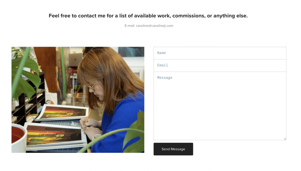
Forms and Interactivity
If you’re accepting professional work through your site, you may want to consider taking extra steps to ensure that your contact forms are readable and easy to interact with.
There shouldn’t be any confusion about where to input information, what to click on, or what your visitors are filling out. Confusion in these areas is not only an accessibility concern but can also lead to a direct loss of revenue for you, the business owner.
- Ensuring Keyboard Accessibility: Some of your site visitors may not have access to or the ability to use a traditional mouse, and may instead use a keyboard for the majority of their web navigation. This means it’s important to make sure that the most important aspects of your site—your site menu, content, and forms—are accessible via keyboard commands.
By default, Format sites allow you to use the tab and enter keys to navigate between site menu links, images on gallery pages, contact form input fields, social links, and more. This allows your site to be more accessible to all visitors.
- Offering Multiple Ways to Get in Touch: Providing an email address you can be reached at in addition to your contact form can be helpful for users who might have their own assistive technology and require the full capabilities of a drafted email in order to properly contact you.
Having an email address on the same page as your contact form can also help in the case that someone needs to loop in (i.e. cc’ing) business partners or clients when contacting you, or if they need to share media that can’t be shared via your contact form.

Mobile and Responsive Design
More than half of all web traffic comes from mobile devices, so it’s important to make sure your mobile site is easy to navigate, read, and enjoy by everyone. It’s important to take into account things like auto-scaling content, touch-friendly navigation, and adaptability on a multitude of devices.
Format makes this easy with fully responsive website themes, meaning your content will automatically adapt to the best possible layout to fit the screen size or browser window your visitors are viewing on. This takes a lot of the guesswork out of designing for multiple devices and saves you time so you can focus on getting your site up and running.
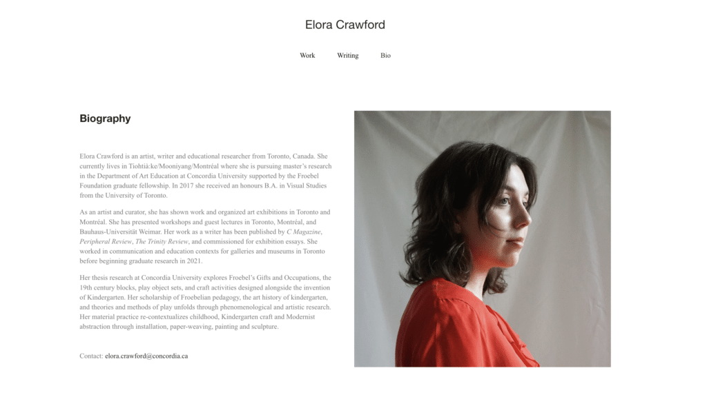
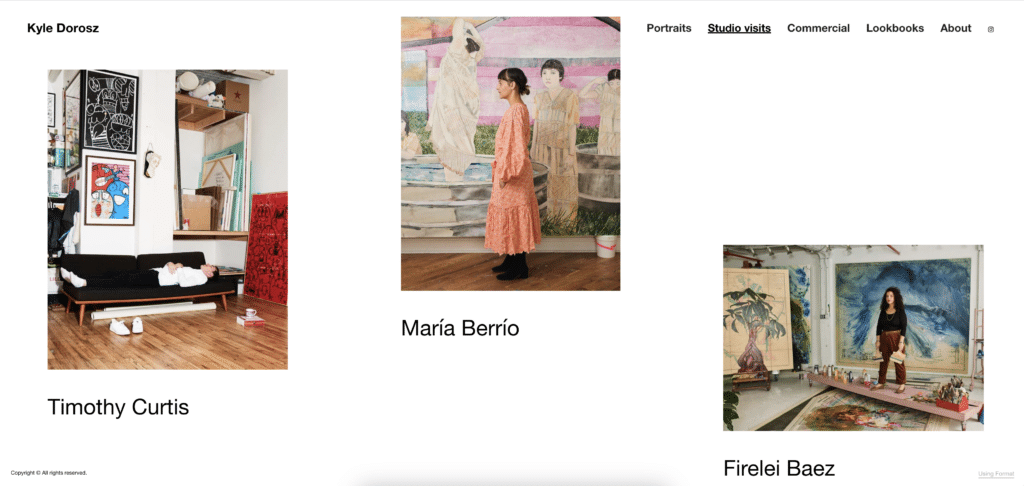
In full transparency, though the portfolio websites we shared above offer examples of good accessibility, they do not fully meet WCAG requirements. These members may also make changes to their website design in the future which may further improve or regress their site’s accessibility.
And there you have it—all the tips and tools you need to get started in making your site design more accessible. Whether you use some or all of these tips, or if you decide your site’s accessibility needs are a bit different, taking the time to make your portfolio site more accessible can help visitors view your work properly, book appointments and send messages with ease, and leave a positive impression of your brand.
We encourage you to try designing your own site from an accessibility perspective. If you find yourself wanting to incorporate some of the points further up in this article into your own site but don’t quite know how or where to start, you might find it helpful to visit the Getting Started collection in our Help Center, where you can find even more tips to help you design your site.
And for more help regarding accessible web design, check out our Help Article, Improving your Website’s Accessibility.
We’ve equipped our members with creative control over the design of their sites, from individual color and text configurations to wider-scope design options concerning site navigation and page structure. With fully adaptive sites, accessibility on mobile devices is made easy. Format is committed to making the web more accessible, and with the tips shared in this article, you can help make your site a more welcoming, accessible place for all.