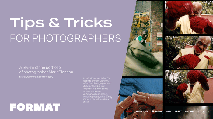
Today we are reviewing the website of Mark Clennon. Mark is a photographer and director based in Los Angeles. His work spans across numerous publications and clients, including Apple, Nike, Time, Esquire, Target, Adidas and more. By following the tips and tricks discussed in this video, photographers will gain valuable insights on how to build a website that effectively represents their work, highlights their achievements, and provides a visually pleasing and user-friendly experience.
Homepage as an Overview of Your Best Work
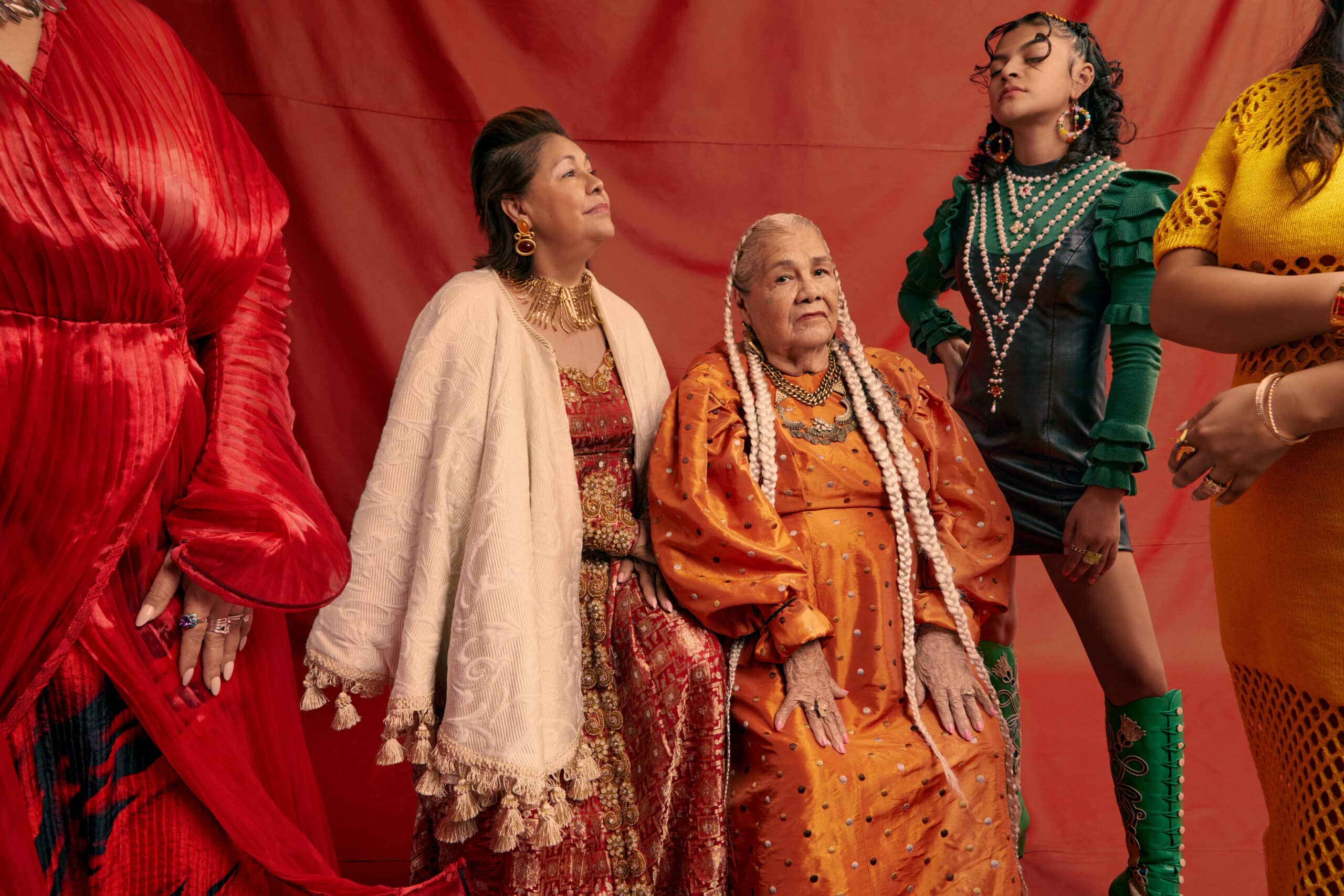
Mark’s site opens onto a tiled overview page highlighting some of his best work. This allows visitors to his site to get an instant snapshot of his style. Mark’s homepage is a different gallery layout from the rest of his site. To achieve this, he has used a custom page with a tiled image set. Image sets allow you to embed galleries of images so that you can have layouts that vary from your theme. With this image set you can also click on images to scroll through in slideshow mode. This makes for a great user experience because visitors can direct their own viewing experience of the page.
Theme: Kiln
The design, typography and other visual elements of your site should reflect the style and tone of your work without distracting from your images. Mark is using the theme Kiln. This theme allows you to set your site menu to the top or bottom of the page. Mark has opted to set his site menu to the bottom of the page and to format his site logo as large, bold text. This gives his site a contemporary edge that suits his photography.
Navigation: Use Collection Pages to Highlight Select Clients
Mark has kept the navigation of his site clean and clear: Client Work, Editorial, and Diary. When we enter a page like Client work, Mark has used a collection page to create image links to different client projects. This allows him to show the depth and breadth of his work, and is also a nice way to call out his impressive client list.
When you click through on one of the image links, each gallery page is a 2-column masonry layout featuring a short, curated selection of images. Highlighting only a small, tailored selection of images for each project shows confidence and keeps the viewer engaged to look through other galleries.
About Page: Show Them Who is Behind the Camera
About pages are the most visited page on your site because people visiting your page want some context on you and your work. Mark’s About page features a good, succinct bio that covers his professional journey, background, and connects his photography style back to his identity.
This page also features lists of clients and credits as well as speaking engagements. This type of list format is really smart, because it allows visitors to skim your experience quickly.
At the bottom of the page, Mark has included a number of embedded videos which feature different behind-the-scenes aspects of his practice. When possible, including a video of a profile, interview–or anything that gives more context to your practice, is really nice to have as it engages visitors in a different way than text and images can. Mark’s about page goes from broad to specific, allowing visitors to get deeper into his practice as they engage with the page.