Perhaps the single most important aspect of any modern piece of graphic design is beautiful typography. Looking to brush up on your font designs, leading typography, and how to work those typefaces? With the help of this typography guide, you’ll be able to generate typeface templates and cool typography that will totally transform your text.
Plus stylish typography is a great addition to your online design portfolio—clients love a designer that can make typefaces really sing.
So let’s get to work!
Watch Your Headlines
In typography graphic design, headlines are extremely important. They are the first words the viewer will see (in some cases, the only words) so making sure the kerning and letter spacing is properly set on them is crucial. The audience will notice bad kerning; this can impact your entire piece. If you are kerning a sans-serif font in a typeface, try applying at least an equal amount of tracking before you even start spacing your characters. Don’t slack off when kerning numbers, either! The numeral one can be especially problematic if you don’t kern it tightly.
Never Use Small Caps
Avoid using small caps in a piece. You may think they make for great typography, but chances are they’ll look subpar. Even more important: never manually shrink your caps down and call them small caps. This looks sloppy and unprofessional. Besides, those aren’t true small caps. If you want to utilize them in your work, then take some time and familiarize yourself on what small caps actually are, their function, and when to use them.
Use Three Fonts, Never More
Do not use numerous fonts in typography design. It is distracting, undesirable, and will only serve to weaken your design portfolio. Instead, remember that less is more! Stick to three or fewer fonts and your design will look much tighter and more professional. It will also make tracking and kerning your fonts much easier, as you won’t have a nightmare landscape of fonts to worry about.
Remember: Not All Fonts Cost Money
While there are many amazing typefaces out there worth paying your hard-earned cash for, the internet is also bursting with high-quality fonts that won’t cost you a dime that are still perfectly viable for use in print, advertisements and other professional endeavors. Be sure to pay attention to the permissions on any font you are interested in.
Avoid Stretching and Squashing
Sometimes you’re tempted to take a font, press CTRL-T, and squash it down into a more condensed shape. If you aren’t attempting to achieve a very specific effect in your piece, avoid skewing it this way at all costs. Creative typography is great, but warping text generally looks awful, and ends up looking quite amateur—not what you want in your design portfolio.
Go With Font Families
Generally speaking, font designs will have a variety of styles within a set. Helvetica is a great example: you’ve got Helvetica Standard, Neue, Rounded, Condensed, Bold, Black, and more. They have this variety for a reason: they work perfectly together when fused into a design. If you can avoid additional fonts in your piece in favor of using a font family, do it—the result will be tight, attractive, and readable.
Mind Your Kerning
When it comes to understanding typography, this is perhaps one of the most necessary skills to develop. You cannot afford to skip properly kerning your typeface if you intend to design a professional and engaging creation. Sure, it can be a pain at times to get things just right, but there are plenty of learning opportunities in this regard. Be sure to kern individual problem letters individually to maximize the potential of your design. Master kerning and you’ll have some of the best typography in the business.
Use Logical Hierarchy
Taking the time to establish clear and concise hierarchies is crucial for good typography. It can help your readers more easily identify the order at which they should be visually scanning your piece and can improve understanding and readability. Make sure your headlines, sub headers and paragraph text each have their own weights and that their spacing and line-height works well together. Generally, the headline should use the biggest font, the sub headers the second-biggest font, and the body copy the smallest font. Easy!
Check Your Contrast
If your colors aren’t working together, your entire piece will fall apart. To alleviate the potential nightmare of poor readability, lay out your background on the digital canvas before you even select a typeface. That way, you can be certain that the chosen font and colors work well together and have great contrast before getting too far into the design process. You can also try working in only black, white, and gray, as many digital painters do; it will instantly highlight contrast issues in the piece and help you set up readable, scannable type.
Embrace the Grid
When it comes to aligning text in font design, there is one surefire way to be certain everything works visually: grids. Setting up a grid will make your character spacing, kerning, and tracking immediately noticeable, and make the process of perfecting your type a breeze. It helps to remove guesswork and generate a super-tight and readable piece of typography that will beef up your portfolio to truly professional-grade.
Practice Your Handwriting
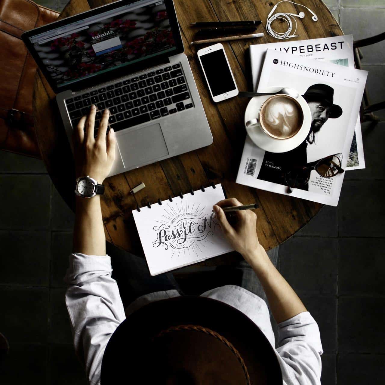
These days we often jump straight to digital when we create (which is perfectly fine), but in the process, we neglect the true roots of written language. If you want to make your typography really stand out, take at least a few minutes (an hour is even better) every single day to work on handwritten lettering. Get out a ruler, set up your guide-lines, and start producing original concepts that no font can possibly match. When you’re done and pleased with the result, hit up a scanner and then tighten your work digitally. A unique, personalized handwritten typography design is an amazing thing to add to your design portfolio.
Blur Your Text
Here’s a creative typography treatment everyone should try once: try to apply a layer style on your font to set up a strong blur effect. You’ll have an easier time noticing the contrast in your letterforms rather than judging it based solely on staring at the lettering itself. This can go a long way to accentuating where the whitespace lies, and make arranging your font spacing much easier. You could skip the blur layer if you want, and instead try squinting your eyes or slightly crossing them to remove visual focus. The end result will be approximately the same.
Make Your Own Font
While time-consuming, creating your own font design from scratch can be extremely rewarding. Taking the time to hand-craft a font will give you an original asset to use in your work, sure, but it will also give you a whole new understanding of typography design. (You can even make some cash off it if you’ve crafted some truly beautiful typography—it could turn into a nice little freelance design job!)
Flip The Text
Often when we design, a change in perspective can help us notice tiny imperfections that can mar the work. Artists do this all the time with sketching, and it proves just as powerful a trick when laying out typographic elements. So just flip things around! Take your text and flip it horizontally or vertically, and you’ll soon find that you can notice little inconsistencies in spacing you otherwise would have totally missed. This can really lend a hand in tightening your typeset and pulling that little bit of extra impact from a font and improve your work as a bonus consequence.
Don’t Forget to Add All This Typography to Your Online Portfolio!
These tips should go a long way to turning your text into truly great typography and attract new clients to your digital doorstep. Don’t forget to add your completed art to your online portfolio website!
If you don’t currently have one, you can use a website builder to create one in just a few minutes. Pick an online portfolio that has plenty of designer-friendly features, including clean, modern templates and client proofing (along with cool typography, of course).
We can’t wait to see what beautiful typography you conjure up!
Need some typography inspiration?
45 InDesign Tutorials for Stunning Designs
The Best Design Contests, Competitions and Awards for 2018/2019
How to Make a Poster Eye-Catching and Effective


