Bloomberg Businessweek has become known for challenging design conventions both online and in print. Over the past couple of years, they’ve championed bold design treatments and clever covers (for example, this illustration of two airplanes having sex was particularly infamous). But now it’s time to get serious.
In June, the 88-year-old business publication launched a print and online redesign “with more global resources, multiplatform access, and a cleaner, easier-to-navigate design.” In a time of fake news and a president who’s at war with the press, journalism can no longer afford to be glib or ironic.
“More than ever, our readers need journalism to be more authoritative, more urgent, and more indispensable,” editor Megan Murphy says of the redesign. Murphy also stresses the magazine’s focus on serious reporting. “One thing that hasn’t changed is our commitment to outstanding journalism. We know that if you don’t believe in our stories, it doesn’t matter how we present them or on which device.”
The updated aesthetic is definitely pared down. On their website, a boldly minimal layout creates a reading experience that feels more like the simple act of flipping through a magazine. The focus of this unified multi-platform experience is now firmly on the content—design is still a clear priority, but it never distracts from the words. “I think we probably lost some readers with the redesign, but I think we also gained some,” current creative director Rob Vargas said of the magazine’s dramatic reinvention.
To find out more about Bloomberg Businessweek’s new look, we called up design director Chris Nosenzo and feature/news designer Alexander Shoukas. Shoukas lead the redesign of the website, while Nosenzo focused on the app.
We wanted to know what motivated this relaunch and the design process behind it. In fact, Format’s very own product designer Lauren Barless, fresh off Format’s own redesign, conducted the interview.
Nosenzo and Shoukas are a pretty impressive duo. Before joining Businessweek Nosenzo worked on The New York Times magazine, while Shoukas lead his own design practice in Amsterdam, and has also worked at Fantastic Man and The Gentlewoman.
They told us about the challenges of redesigning a long-running publication, bridging the gap between print and digital, and how the American political climate post-election impacted Bloomberg Businessweek’s design ethos.

Bloomberg Businessweek has gotten tons of attention over the past few years for the controversy it’s generated under Richard Turley’s creative direction. Why do you think that the magazine’s irreverent style caused such a stir?
Alexander: My interpretation of it was that they kind of struck something which is the tension between a business magazine and, you know, loud design, which is typically not something that was in the genre before. Really focusing on communication design, having real sort of attitude behind it as opposed to just depiction straight up, which is sort of what happened before.
I’m not sure I can exactly speak for why people interpreted it the way they did, but I think our general attitude in making things was like, every week you have a new set of stories and we’re going to take a new set of risks. Some of them are going to work and some of them are going to not. But we’re going to keep trying, keep pushing, and doing work that we think is really exciting. There’s definitely this idea that you just wanted to push as far as you could and see what you could go with. There’s something liberating about that.
In the redesign, it seems like there’s been a conscious choice to rein in that wildness a little bit. What informed that decision?
Chris: The way I think about it, if you look back at the start of the magazine, it’s a reaction to the abstractness of the world after the financial crisis. That kind of irony worked in that generation, and now there’s a desire for something more direct. I think especially after the election we felt like, not only have we been sort of telling these same jokes for a long time, but maybe it was time for a different approach to communicating with our readers.
Alex, do you have anything to add to that?
Alexander: Yeah. There’s kind of the—let’s call it like the previous Businessweek. It was actually, in a way, like two elements of work, something wild or ironic or irreverent. But there was also like a sharp wit in the approach, and that’s something I think we definitely plan on holding onto.
Chris: I think also the moves we’re trying to make are more narrative than aesthetic, if that makes sense. The innovation we want to put is a little more about how the words are arranged and maybe what color they’re in, or what kind of effects we’re applying.
You both mentioned this sort of new time that we’re living in. Obviously it’s a very polarized point in time in the Western world. Do you find that the design of a news website or an app can affect the way that readers understand current events?
Alexander: Yeah, absolutely. I’ve increased my subscriptions over the last six months, and I feel like more people are paying a lot more attention than they did before. There’s definitely a responsibility for media outlets towards their readership, because it just feels like the stakes are higher at this point. That was also informing the more sober approach, the more direct approach that we wanted to take with the redesign.
In fact, the question that came up between Chris and I before the idea even came to the table is, should we be making these jokes? Are they still funny, given the climate of a situation? So yeah, it absolutely comes with a sense of responsibility.
It sort of sounds like the changing times triggered the need for the redesign. What would you say the mission behind it was?
Chris: I think the times lined up with the exhaustion of what we had been setting out to do, and this idea of pushing up a certain set of ideas about what the aesthetics of the magazine should be. I think that we capped off that well at the same time that the need for what a magazine would be for was changing.
Alexander: The climate was changing, but we felt maybe at the same time it was time to evolve.
Can you walk us through the design process? How did you guys begin?
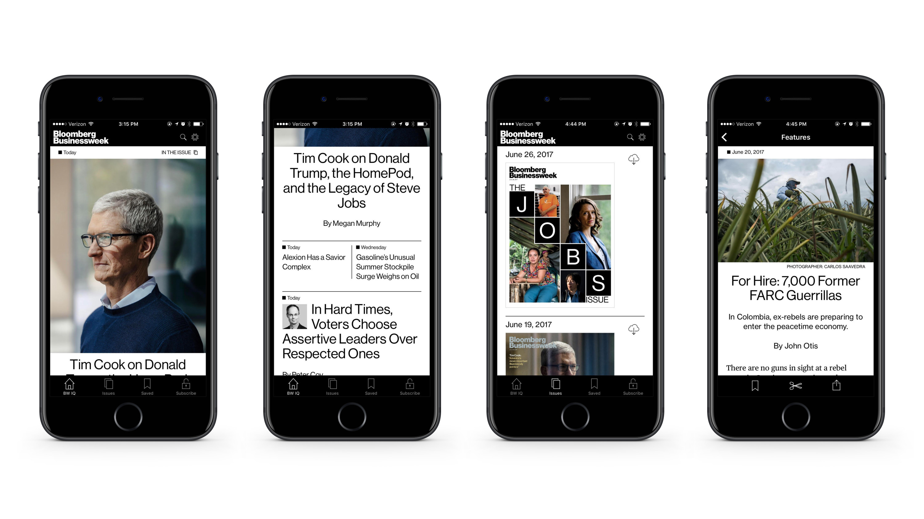
Chris: The first thing that was really exciting about it was that we’d never really had a good cross platform experience. We always put a tremendous amount, like almost all of our effort into the print product, and the digital has been more downstream. So I think the big idea was like, okay, let’s take this effort that goes into one product and sort of re-allocate it between three.
Alexander: Just to rewind a bit, at the month prior to the redesign, Businessweek was essentially a print product like Chris is describing. Our stories would be published online, but they would essentially be taken from the magazine, from our digital team, as opposed to the digital side being really integrated into the Businessweek process. So one of the main mandates that came with the redesign was, we’re going to make a new app and we’re going to redo the website together with redesigning the magazine. That immediately put us in a position to think holistically in terms of design, and figure out a way to apply this across all media.
How did the different design teams come together to work on the redesign?
Alexander: Chris and I came from print backgrounds and certainly Rob, our creative director, is a print designer. So it started with us thinking in terms of a redesign for the magazine on its basic elements, meaning the elements that make up the story or the sections that we have. Then Chris and I dove into the digital interpretations of those.
Chris: I think Alex and I knew we wanted to have a shot at redoing the web and app and bringing a more magazine sensibility to it. There’s been a lot of things on web that we wished had more of a print reading feel to them. That was the ethos we brought to it, and we had to learn some new programs. We had to get acquainted with a lot of new parameters, but we just dove in.
Alexander: On a general level, especially in the print magazine world, there can be a lot of disdain towards the web in terms of what it can provide with design, or what it’s capable of. But it’s at a point now where the technology can meet the needs of having typographic details, impressive image moments, and using scale in a new way. It finally feels like it’s at a point where you can really engage the design and have that magazine feeling translate to the web. The redesign was really an opportunity for us to begin to engage that and try and set up a foundation that we can build on.
Are there any specific details that you guys are particularly proud of; anything that stands out as a major improvement?
Alexander: Just the fact that a reader who gets the magazine could transition from the magazine to their phone and then to their iPad, or a desktop browser. That they’ll have a consistency in the aesthetic and detail of the visual presentation of the magazine, that was the primary goal.
Before, you would have the magazine and then have some kind of interpretation of it online. You might have a couple of images or an illustration. But now you’re actually getting the same body copy. You’re getting the same typographic treatments, right down to the details. I think that should be the goal for any magazine at this point, because the technology is getting to a point where you can do that.
Chris: And there’s little things that I really love that we figured out. Like, for most websites you’ll do a paragraph and have a line break in between every paragraph. You have the text and there’s a break of space in the chunk of text. Taking that away and just doing an indent like you would in print; it’s such a small design decision, but I love that we could make these really low level, subtle moves that really make it feel like a magazine and not like a newspaper.
Trying to figure out ways to bring that magazine sensibility to the digital side has been really, really nice and been really rewarding, to take this ethos and these concepts that we love for print and try to work them out in this new platform.
Alexander: It also speaks to the content. The way we look at it here, is that Bloomberg is the how and the what, and you can see the clear facts. Whereas Businessweek goes in a little bit deeper with the why. That’s when you get your more long form reads or features. Those details that Chris was describing are also meant to give the reader that feeling of a more paced reading experience, as opposed to the quick three line, two sentence paragraphs that you would expect from a news experience.


Read more about design at Bloomberg Businessweek in our interview with creative director Rob Vargas.