Ah, web fonts. One of the most crucial—and challenging—aspects of great web design. Not sure how to figure out which website font is best for your site? We’re going to take you through the ins and outs of picking the best web fonts to help you convey exactly what you want to convey to your audience. Ready? Let’s go!
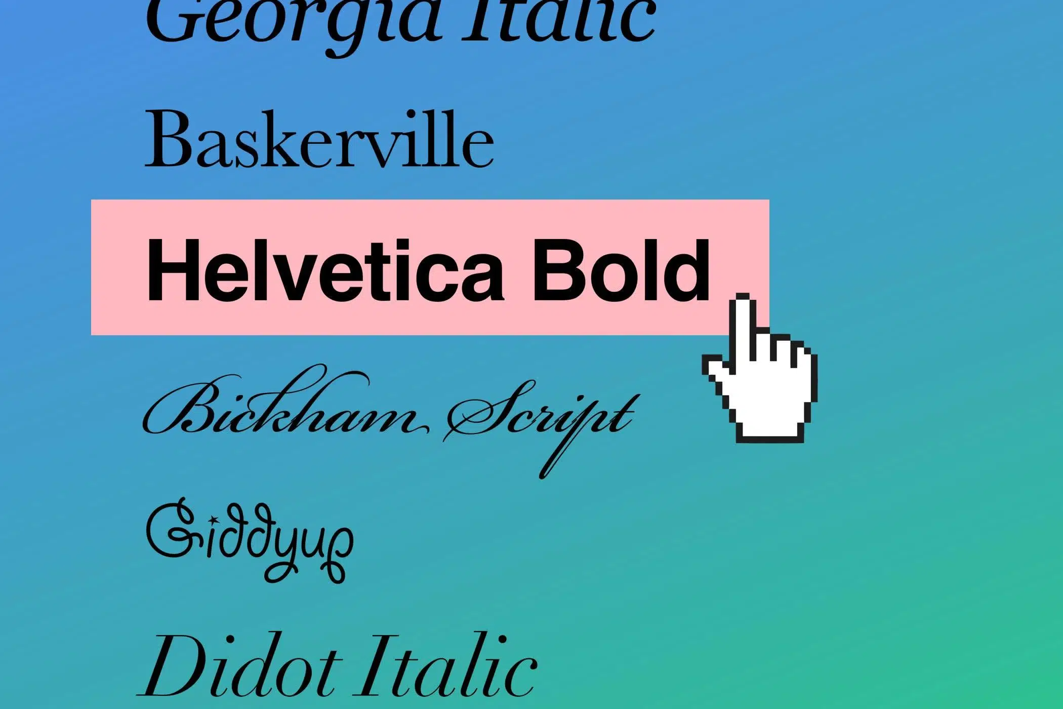
Web-Safe Fonts 101
Having the right website fonts can boost your site’s credibility—or destroy it. Each web font has a certain power over its reader. The shape, size, curvature, flourish, and boldness of each web font conveys a message, and it can attract or repel. Most of these effects happen subconsciously, so, while your viewer may not consciously react to your choice of website font, it will work on them in a way that will influence their relationship to your brand.
So what makes it a web-safe font?
Readable
Sometimes when you’re searching for new fonts online, you can get swept up in the excitement of some of the wilder typefaces. But you need to reel yourself in a little bit and search with a more discerning eye. Is the font even readable? You might be able to read it, but will everyone be able to read it? Also, will this font display properly on everyone’s devices, or just the newest and the best ones?
Simple
Watch out for too much embellishment or floweriness. Surprisingly, too much sweetness in web fonts can actually repel people, or make them not take you seriously.
Streamlined
Bulky fonts carry a lot of baggage and can impact readability. Thinner is better (but not too thin—that decreases your readability as well).
Smart
Some fonts can harm your credibility. Avoid website fonts that replicate crayon or chalkboard letters. These fonts read as juvenile and immature.
How to Pick The Best Web Font
Now that we know what to look for when you’re searching for fonts online, it’s time to figure out how to narrow down your selection. Here’s a few tips:
Go Back to the Brand Guidelines
Web fonts, like clothing, can say a lot about who or what is wearing them. Before picking a website font, you need to consider your goals for your site, or the goals of your client. Consult the brand identity guidelines to see what kind of vibe you should be going for.
Consider Your Audience
You really need to consider exactly what type of audience you want to attract.
Let’s say you’re designing online invitations for a cute bridal shower in the middle of a farm field: everything will be taupe, and everyone will be clad in silk slip dresses and coronets of wildflowers and baby’s breath and drinking out of mason jars. This clearly calls for a wispy, whimsical web font, right?
Or, for example, if you’re making promo materials for a hyper-alt underground DJ set event—where everyone will be wearing toques, giant undone winter jackets, straight-legged denim, and white Stan Smiths—you probably want to use a streamlined, minimal font with very little flourish, no?
So, let’s figure out who your audience is. What are the demographics? Are they young? Are they old? Are they professional or still in college? Do they have money, or are they more budget-conscious? Are they parents? These are all questions that you need to ask yourself during your design and creation process.
Ask yourself these questions and try writing down some describing words for…
Who you want to appeal to
How you want to be perceived
Once you’ve got two working lists of adjectives, make sure to refer back to them when you begin looking for the best fonts for the websites you are working on.
Have Lots of Sources on Hand to Choose From
There’s tons of great places to find free fonts online. Need some ideas of where to start? Check out our guide to the 34 best free font websites. You’re sure to find something perfect for whatever site you’ve got on the go.
Now, onto the actual font options!
Need Something Sensible? Go With Serifs
Let’s say that you’re designing a website for a burgeoning business and your client wants to appear trustworthy, practical, and no-nonsense. If a stately look is what you’re going for, we suggest going with the serif family of fonts. A serif is any small part of the letter that sticks out. Serifs fonts have the small projections on the letters (while the sans-serif family has none). Here are some of the best serif website fonts:

Times New Roman
It’s a classic, clean, and traditional. It exudes no-nonsense and straightforwardness. The serifs are present, which add an air of class, but nothing pretentious or extra.
Trajan
This web font gives off a respectful air, thanks to the length and leanness of the letters. So, if you’re designing a website for a law firm or a consulting business, for example, this is probably a good web font to consider.

Baskerville
A 2012 study revealed that Internet users rated this website font as the most persuasive. It has the length of Trajan with the class of Times New Roman. If you’re looking to come across as reliable and trustworthy, it’s definitely one of the best web fonts for you.
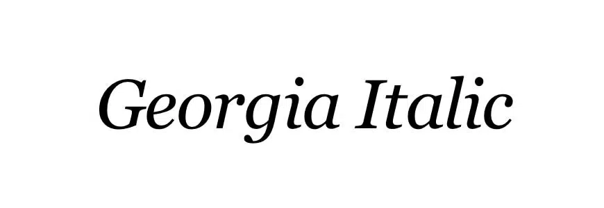
Georgia Italic
This web font is clean and direct, but it has a warm, comforting feel to it that puts folks at ease. There is a slight lean to these letters, which adds a bit of intimacy.
Want a No-Frills Web Font? Try a Sans-Serif
If you have a bit more of a down-to-business vibe or practical energy? Well, for that we suggest trying the sans-serif family. Here are some of the sans serif web fonts we recommend:
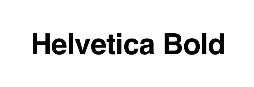
Helvetica Bold
Maybe you’re designing a website for a hardware company and your client wants to project an air of stability? This would probably be the best website font for that. The thicker body of the letters and flat edges read as sturdy.
Franklin Gothic
Here is a web font that reads like it is on a mission. Bold and true, the long and squared nature of the letters make it strong and effective.
Calibri
A Microsoft Word stalwart, this web font is clean, clean, clean. There are no frills to this font at all.
Myriad Italic
This one reads as modern, stable, and dependable. It’s the thinnest of all the sans-serifs mentioned; a slight lean adds a touch of warmth.
Going for an Of-the-Moment Feel? Use a Modern Web Font
This next group of web fonts are the more modern guys. These are great for logos or headings (less so for body copy). Here are some of our go-to modern—yet still web-safe—fonts.

Futura
This strong web font is thicker in body, but its sharp points are very slick and pretty. It gives off an air of assertiveness and style.
ITC Avant Garde Extra Light
Now this is a cool web font. It’s thin and minimal, which comes across as considerate and trustworthy. It has a very progressive vibe.
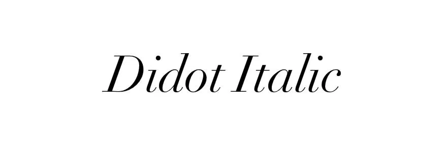
Didot Italic
Style is the name of the game for this bad boy. It’s a good font for a fashion website: clean, minimal flourish, efficient. It oozes insider.
Century Gothic
Tread carefully, as this website font is easily misused. It has a very chic look, all thin and rounded, so it should probably only be used in a heading or logo for short words relating to something high-end or luxury. Anywhere else and it can look a little dated.
Aiming for Elegance? Script Web Fonts are For You
The script family of website fonts look like cursive writing, which can stir a lot of feelings and associations up within your readers, so make sure this dainty style is a fit for your brand. Their flourishes are from a different time, so use wisely.

Bickham Script
This cool web font is like if Marie Antoinette were working for Hallmark. It’s one of the thicker web fonts, but with a little less flourish than some of the other script options. Bickham is associated with elegance and refinement, so if you’re designing a website for a wedding or prom venue, consider this mademoiselle.
Edwardian Script
The name gives it all away. Very ornate and frilly, but not as plump as some of the others, this web font represents affection and romance. A perfect match for designers looking to stir up feelings of love and beauty in your reader.
Lavanderia
A bit youthful and quite modern and creative, so buyer beware: you wouldn’t want to misuse this one and end up hurting your credibility. It is a very thin font with a fair amount of extra twirls and circles, which gives it that artsy look.
Game for Something Outlandish? Throw In a Display Web Font
This family of web fonts is called display, and encompass a diverse array of styles. Since they are very unique and eye-catching, use them in moderation!
Cooper
This guy is thick, with rounded serifs, creating the impression of approachability and niceness. We would suggest using this casual web font for a daycare website or maybe for a local doughnut store site.
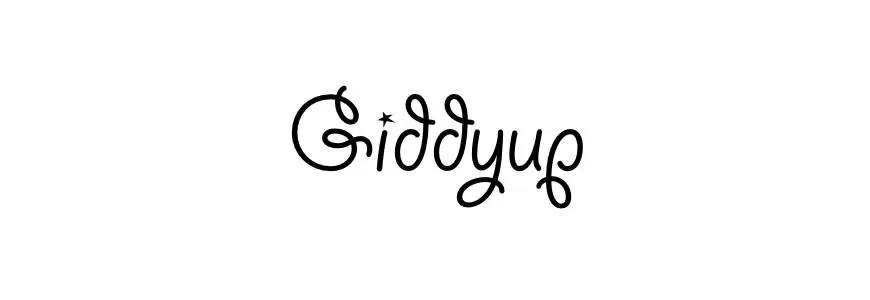
Giddyup
This one reads like Pier 21 meets mom’s kitchen. If you’re designing a website relating to children or cooking, consider this web font for the header or logo. The round corners and slight twirl read as a bit whimsical.
Valencia
This font feels like a few shots of espresso. It’s expressive and a bit intense. We’ve seen a few cafes utilizing its tall, thin style to sell beans. Use with care, because high-intensity fonts can repel easily.
Spaceage Round
Unique but still relatable, this cool web font would be a fit for a clothing website or buzzy restaurant. Offering thick verticals with narrower horizontals and minimal space between letters, this is a pretty cool web font.
Make Sure Your Web Fonts Work Well Together
One final note: a lot of different fonts can still stir up similar associations for your viewers, so don’t be afraid to use more than one. But try and pick a web font family and work within it. Choose something cleaner for the logo, something bolder for the titles or headers, and something straightforward for the body copy.
Show Off Your Work
Once you start integrating all these cool web fonts into your work, you’ll be creating gorgeous sites in no time. Don’t forget to add your website design work to your online design portfolio—showing off your web font mastery is sure to woo new website design clients and land you sweet freelance design jobs
Don’t have an online portfolio website yet? Find a website builder with a bunch of cool templates—and, of course, killer fonts!—that can showcase your work to perfection. Look for one that has client proofing built in, too; that way, clients can vet web designs, right from your site. (We also recommend picking an online portfolio that lets you try it out first, no strings attached.)
Can’t wait to see your work!
Want some more design career advice?
10 Things You Need to Do After Design School
Make Better Design with These 4 Insights From Wade Jeffree
8 Graphic Design Projects to Cure Your Creative Block