Not sure how to make a poster? Here are some easy poster design techniques you can use to create your own cool poster to promote your upcoming project or event.
So you’re finally ready to hold an art exhibition to introduce your photography to the world. But how do you get the public to come to your event? A great poster is a good place to start.
If you’ve never had to make your own poster before, you’ve come to the right place. We’ve rounded up some simple tips on how to make a poster stand out—and make sure your next event is packed with potential customers! Let’s dive in.
What To Put On a Poster
A clean poster attracts the eye. Begin by listing all the information you need on your poster, such as the event’s name, location, date, and time. There’s probably more you’d like to include, but keep it simple so you don’t overwhelm your poster with visuals. Posters with too much copy and imagery are less effective than posters with less copy and imagery.
Consider promoting a two-week art show at a local gallery. For a short term event, you don’t need to include much information to make your point. Avoid including extraneous information like artwork thumbnails and artist bios. The goal here is to simply entice people to attend your event. You’ll have plenty of opportunities to inform them once they arrive.
Write an Attention-Grabbing Headline
Your poster headline needs to snag people’s attention. It has to not only catch their eye but also get them to actually stop and read the information that you’re trying to share with them.
While you could go with a simple, descriptive title like “photography show” or “art exhibition,” it’s probably in your best interest to provide a little bit more context. Try to summarize what your event is all about in a few short, snappy words that will let people know what they can expect if they choose to come to your event. You can be creative or keep it simple, as long as you make sure that your headline isn’t misleading or confusing.
Create a Visual Hierarchy
How to make a good poster requires knowledge of visual hierarchy. A visual hierarchy is a way of displaying information based on its role in the intended design. It determines the text’s size and placement. Flow of information and visual hierarchy determine where your viewer’s eye is drawn first.
You’ve already gathered all the information you need for your poster, like event details. The next step is to prioritize this data. If your poster design has little text, a bold graphic or icon will suffice. If the design is heavily text-based, then the text should be the main focus. You’ll need a big headline and chunky text for that design.
This text hierarchy has three basic elements: headline, subheading (a statement or piece of information that supports or reinforces the headline), and body text (the rest of the text content). The headline should be the largest element, followed by subheadings of medium size and body text in the smallest font. There should be only one headline, but you can have as many sub-headings or body text as you want. Keep it simple and give the viewer’s eye plenty of room to rest.
Sketch Out Your Design
As an artist, you probably already know the value of creating a detailed rough draft before you get to work on the final piece. The process for making your own poster is no different.
Once you have a grasp on what information you’re including, it’s time to come up with a concept for the design of your poster. Think about how you want to present your event to your audience, and what you want to communicate to them in order to pique their interest. You may want to sketch out a few different designs so that you can figure out what works and what doesn’t. If you prefer to design your poster digitally, consider wireframing your design before you get started in Photoshop or your preferred program.
Need some inspiration? There are tons of innovative poster designs out there making use of dramatic black-and-white minimalism, creative photo placement, and retro styling to lure in audiences. Browse design contest winners or cruise gorgeous online design portfolios for more ideas on how to make a great poster. Feel free to download some poster templates to get started, especially if you’re having trouble visualizing your poster layout. Don’t be afraid to try new things and push boundaries to grab your viewer’s attention.
Select Your Color Palette
The color palette you choose can dramatically alter the appearance of your poster and influence viewers in subtle ways. Colors can completely change the tone of your poster and how it is received by your audience.
It’s tempting to use the brightest and boldest colors possible to make your poster stand out. However, bold colors aren’t appropriate for every poster design, so consider the poster’s purpose. A poster for a live band might look great in black and white, but a poster for a vegan food market might look better in colors that are calmer and earthier.
Another trendy color scheme these days? Earth tones. If you’re unsure of what colors to use for your project, look to design trends for inspiration. You can have a lot of fun experimenting with new color combinations and seeing how they affect your design. Just try it and see!
Test Your Typography
Whether your poster design is text heavy or more image based, you’re going to need to include some sort of writing, and that means choosing the right fonts to reinforce the concept of your poster. Using clever typography choices can be a super effective method of creating a minimalist design that still stands out and creates a lasting impression. Here are some tips and ideas to help you select the perfect font for your poster design.
Check for Readability
Can the headline text on your poster be easily read from a distance? Could the average person easily read the words without the font style getting in the way? When communicating the details of an event through poster design, the legibility of your text is extremely important.
Match Your Fonts
While you don’t have to use the same one or two fonts throughout your poster design, you should make sure that all of the fonts go together and match each other (and your poster design concept) in terms of mood and aesthetic.
Consider the Context
Use fonts that are appropriate for your design based on the content you are presenting. Just because you like a certain font doesn’t mean that it is well suited to your poster design. For example, a medical fundraising event would call for a very different set of fonts than what you might use on a concert poster for a hard metal band.
Limit Your Font Selection
It’s up to you how many different fonts you include on your poster, but keep in mind that the more fonts you use, the more visually confusing your poster may become.
Don’t Be Afraid to Experiment
Have a short, snappy headline? If so, you might have room to have a bit more fun with your font choices. You could try using a decorative or otherwise unusual font to really grab the attention of your viewers. However, always prioritize the goal of your poster design rather than choosing to include a font just because you like how it looks. A graffiti-style font would work great for an urban-themed event, but not as well for a corporate retreat.
These are just some of the things that you should be aware of when it comes to selecting fonts for your poster design. There are tons of other elements that go into choosing or designing the write font, like kerning (the spacing between letters), leading spaces (the distance between two adjacent lines of type), font size, weight (light, regular, and bold), line height (the distance between two lines of text), and case (upper, lower, small caps) when laying out your typography for your poster design.
How To Make Cool Poster Designs by Acing Your Imagery
Earlier, we talked about what things to put on a poster and what to exclude in order to avoid overcrowding. Now we’ll get into how you can create an outstanding image that compliments the textual elements of your poster design.
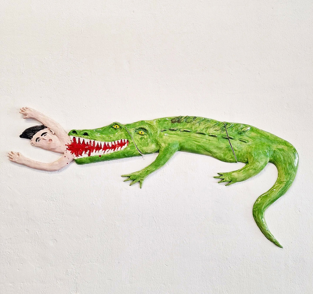
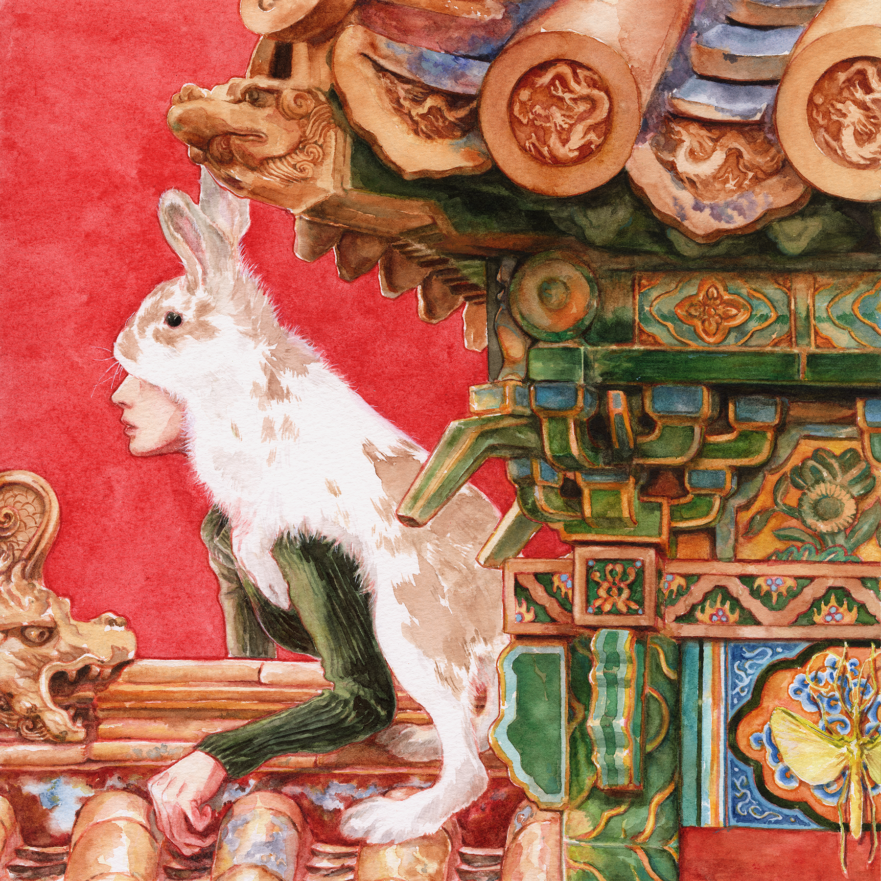
There are many different ways that you can go when it comes to the imagery you include on your poster. You could use a hand drawn illustration, a photograph that you took, a stock image, a collage, a digital painting, and so much more. By adding visual elements as well as text, you can bring your poster design to life. Keep in mind the importance of the quality and composition of the images that you choose. Here are a few tips for selecting the best images for your poster design.
Check Your Image Size and Resolution
The last thing you want is to spend a bunch of time and effort creating the perfect poster design, only to print them out and find that your images have come out blurry. Figure out what size you want your poster to be, then calculate the image size required to print in high definition. A good rule of thumb for printing images is to ensure that your image resolution is a minimum of 300 DPI (dots per inch) to avoid a pixelated poster.
Match Your Color Mode to Your Printer
Find out if your printer uses CMYK or RGB as its color mode. If you create your poster using CMYK but print it using RGB (or vice versa), the color palette that you put so much time and careful consideration into choosing will likely come out looking quite a bit different from what you had envisioned. It’s always a good idea to figure out your color mode before you start designing your poster, otherwise you may have to go back in and manually adjust your colors prior to printing.
Check the Copyright
If you’re using an image that you created, you can go ahead and use it without fear. However, if you’re using someone else’s image, even if you got it from a stock photo site, you need to carefully read the copyright information to determine whether you are legally allowed to use the image in your poster design.
Make Use of Negative Space
Just because you have room on your poster doesn’t mean that you should include additional information or images. Instead, use the negative space to bring the viewer’s attention to what you include in your poster design. This can help you to create impact without overloading the viewer with too much visual information. Consider experimenting with this fundamental aspect of design and seeing where it takes you!
Use Simple Shapes in Place of Images
Some designs use geometric shapes to create visual flow and grab the viewer’s interest. These sorts of designs can be fun and impactful, plus they can help to push you out of your comfort zone when designing posters.
Design Your Poster With Your Audience in Mind
If you’re wondering how to make a good poster that effectively targets your audience, you need to start by understanding who your audience is. Your poster design will likely be quite different when creating a poster for a farmer’s market as opposed to a night club event, and that’s because those two events appeal to a different target audience. Once you’ve figured out who your dream client is, every element of your poster design should be carefully selected with them in mind. A poster design that doesn’t speak to your audience should be tweaked so that it is more likely to catch the attention to the people it is made for.
If you’re looking for examples of what design choices are suited to different types of events and audiences, take a look at posters in your neighborhood. Pay attention to what type of event is being advertised, who the audience for this type of event would be, and what design choices are effective (or not so effective) at targeting that audience.
Include a Good Call to Action
Your call to action (CTA) is intended to get the person looking at your poster to act on the information you’re providing. In order to inspire action, your CTA needs to be visible, if not the most attention-grabbing part of your entire poster design. It could be a colored square with a QR code asking them to RSVP to the event online, or it could be something as simple as a sentence asking them to show up to a certain place at a certain time. Your poster design should lead your viewer’s eye to your call to action and encourage them to do what it says.
Now that you know all about how to make good posters that grab the attention of your audience, it’s time to start designing. Don’t forget to share your poster online as well as on your art portfolio website. Here’s wishing you a sold out event, all thanks to your amazing poster design!
Want more ideas on how to create great design?
5 Designers Reveal How to Get Clients With Your Portfolio
Ten Steps to Creating a Personal Logo That Stands Out
8 Graphic Design Projects to Cure Your Creative Block